QT音乐播放器②----窗体布局与区域划分、底部工具栏设计、进度条设计
简介:
基于QT5.12版本的Quick QML项目----音乐播放器(爆肝中......)
上一讲链接:https://blog.csdn.net/2301_80668528/article/details/151680989?spm=1001.2014.3001.5501
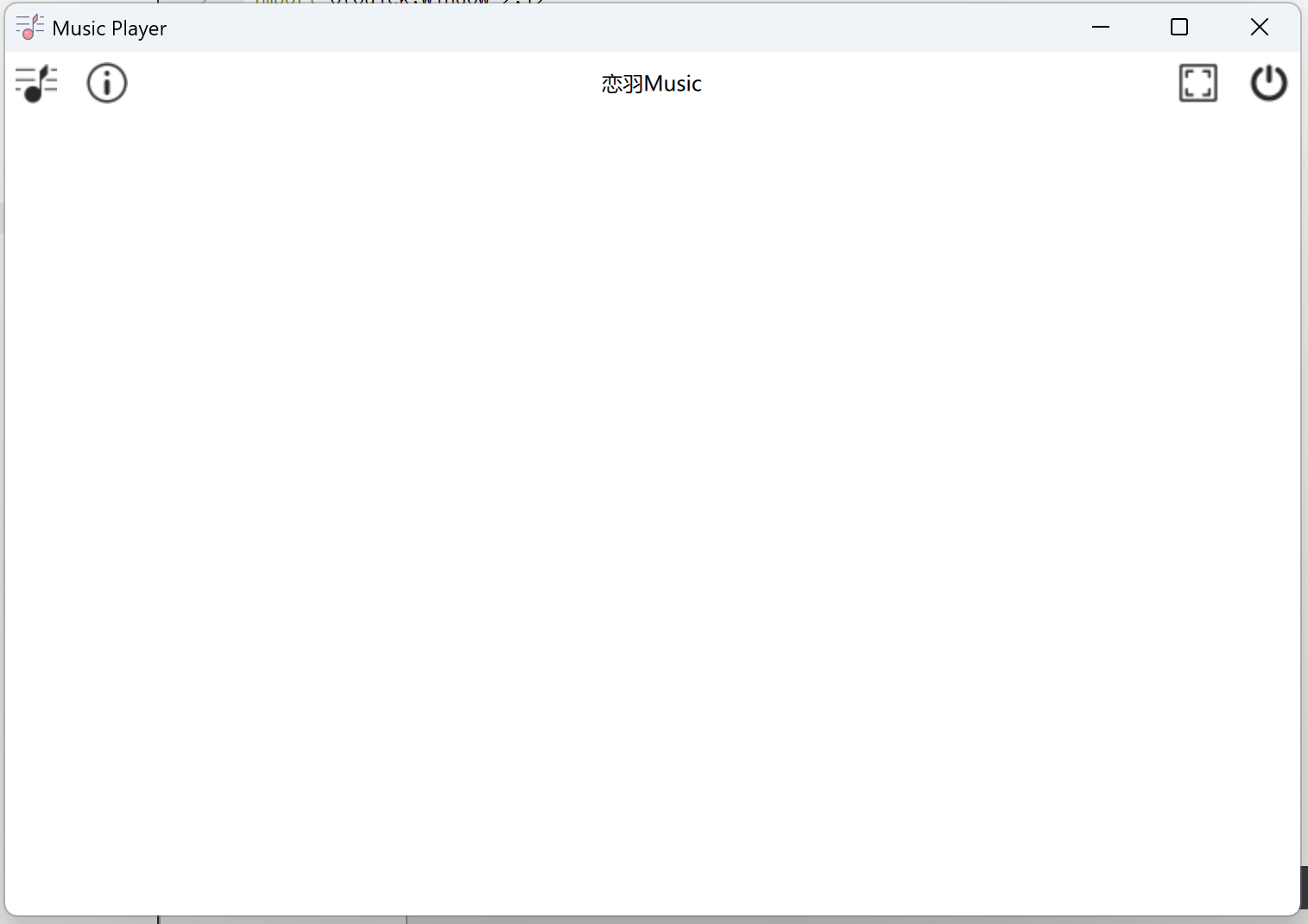
上一讲效果:
PS:如有错误,欢迎指出^\/^
原视频出处:https://b23.tv/gFnMsLg
完善上一讲的其他按键布局:
添加两个ToolButton:
①小窗按键:
/* 按键:小窗 */
ToolButton
{
    icon.source: "qrc:/images/small screen.png"
    width: 32
    height:32
    background: transparent
}
②最小化按键:
/* 按键:最小化 */
ToolButton
{
    icon.source: "qrc:/images/Minimize.png"
    width: 32
    height:32
    background: transparent
}
顶部工具栏整体代码:
/************ 顶部工具栏begin ************/
    ToolBar
    {
        //设置背景色为透明色
        background: Rectangle
        {
            color:"#00000000"
        }

        //工具栏适应窗体的总宽度
        width:parent.width
        Layout.fillWidth: true

        /* 水平布局 */
        RowLayout
        {
            //子元素的所有边缘(左、右、上、下)自动与父元素或参照元素的相应边缘对齐
            anchors.fill:parent

            /* 按键:音乐Logo */
            ToolButton
            {
                //添加icon
                icon.source: "qrc:/images/musicLogo.png"    //文件路径
                width: 32                                   //宽度
                height:32                                   //高度
                background: transparent                     //背景设置为透明色
            }
            /* 按键:关于 */
            ToolButton
            {
                icon.source: "qrc:/images/aboutBlack.png"
                width: 32
                height:32
                background: transparent
            }
            /* 按键:小窗 */
            ToolButton
            {
                icon.source: "qrc:/images/small screen.png"
                width: 32
                height:32
                background: transparent
            }

            Item
            {
                Layout.fillWidth: true
                height:32
                //设置文本
                Text
                {
                    anchors.centerIn:parent        //将Item放在父类中心位置
                    text: qsTr("恋羽Music");        //设置Item文本
                    font.family: "微软雅黑"          //设置字体
                }
            }

            /* 按键:最小化 */
            ToolButton
            {
                icon.source: "qrc:/images/Minimize.png"
                width: 32
                height:32
                background: transparent
            }
            /* 按键:全屏(黑) */
            ToolButton
            {
                icon.source: "qrc:/images/full_screenBlack.png"
                width: 32
                height:32
                background: transparent
            }
            /* 按键:电源 */
            ToolButton
            {
                icon.source: "qrc:/images/power.png"
                width: 32
                height:32
                background: transparent
            }
        }
    }
    /************ 顶部工具栏end ************/
一、窗体布局与区域划分
将窗体一共分为三个区域:顶部工具栏、中间区域、底部功能栏
(上一讲为顶部工具栏设计)
其中,中间部分分为:左边菜单栏、右边显示栏
1.将顶部、中间部分、底部进行纵列布局ColumnLayout{}
    //纵列布局
    ColumnLayout
    {
        //指定宽高
        anchors.fill: parent

        /************ 顶部工具栏begin ************/
        ToolBar
        {
            //设置背景色为透明色
            background: Rectangle
            {
                color:"#00000000"
            }

            //工具栏适应窗体的总宽度
            width:parent.width
            Layout.fillWidth: true

            /* 水平布局 */
            RowLayout
            {
                //子元素的所有边缘(左、右、上、下)自动与父元素或参照元素的相应边缘对齐
                anchors.fill:parent

                /* 按键:音乐Logo */
                ToolButton
                {
                    //添加icon
                    icon.source: "qrc:/images/musicLogo.png"    //文件路径
                    width: 32                                   //宽度
                    height:32                                   //高度
                    background: transparent                     //背景设置为透明色
                }
                /* 按键:关于 */
                ToolButton
                {
                    icon.source: "qrc:/images/aboutBlack.png"
                    width: 32
                    height:32
                    background: transparent
                }
                /* 按键:小窗 */
                ToolButton
                {
                    icon.source: "qrc:/images/small screen.png"
                    width: 32
                    height:32
                    background: transparent
                }

                Item
                {
                    Layout.fillWidth: true
                    height:32
                    //设置文本
                    Text
                    {
                        anchors.centerIn:parent        //将Item放在父类中心位置
                        text: qsTr("恋羽Music");        //设置Item文本
                        font.family: "微软雅黑"          //设置字体
                    }
                }

                /* 按键:最小化 */
                ToolButton
                {
                    icon.source: "qrc:/images/Minimize.png"
                    width: 32
                    height:32
                    background: transparent
                }
                /* 按键:全屏(黑) */
                ToolButton
                {
                    icon.source: "qrc:/images/full_screenBlack.png"
                    width: 32
                    height:32
                    background: transparent
                }
                /* 按键:电源 */
                ToolButton
                {
                    icon.source: "qrc:/images/power.png"
                    width: 32
                    height:32
                    background: transparent
                }
            }
        }
        /************ 顶部工具栏end ************/


        /************ 中间区域begin ************/
        /* 菜单栏 */
        Frame
        {

        }
        /************  中间区域end  ************/


        /************ 底部功能栏begin ************/
        Rectangle
        {


        }
        /************  底部功能栏end  ************/

}2.设置顶部工具栏ToolBar与中间部分间距为零
spacing:0 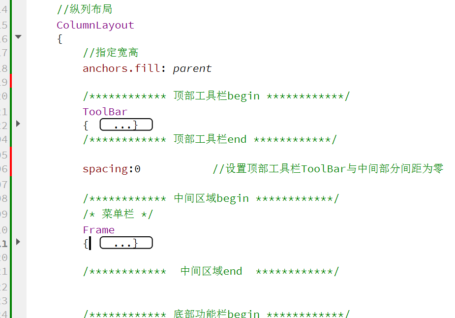
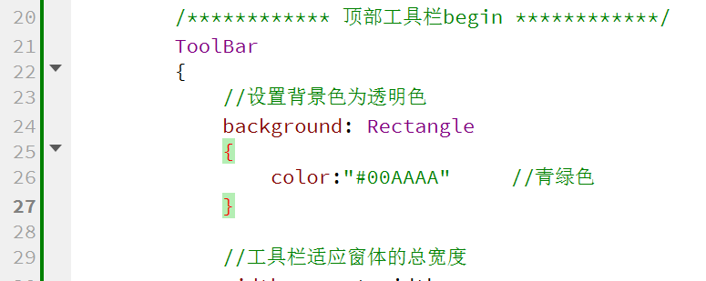
3.为方便观察,将顶部工具栏ToolBar背景色设置为蓝绿色
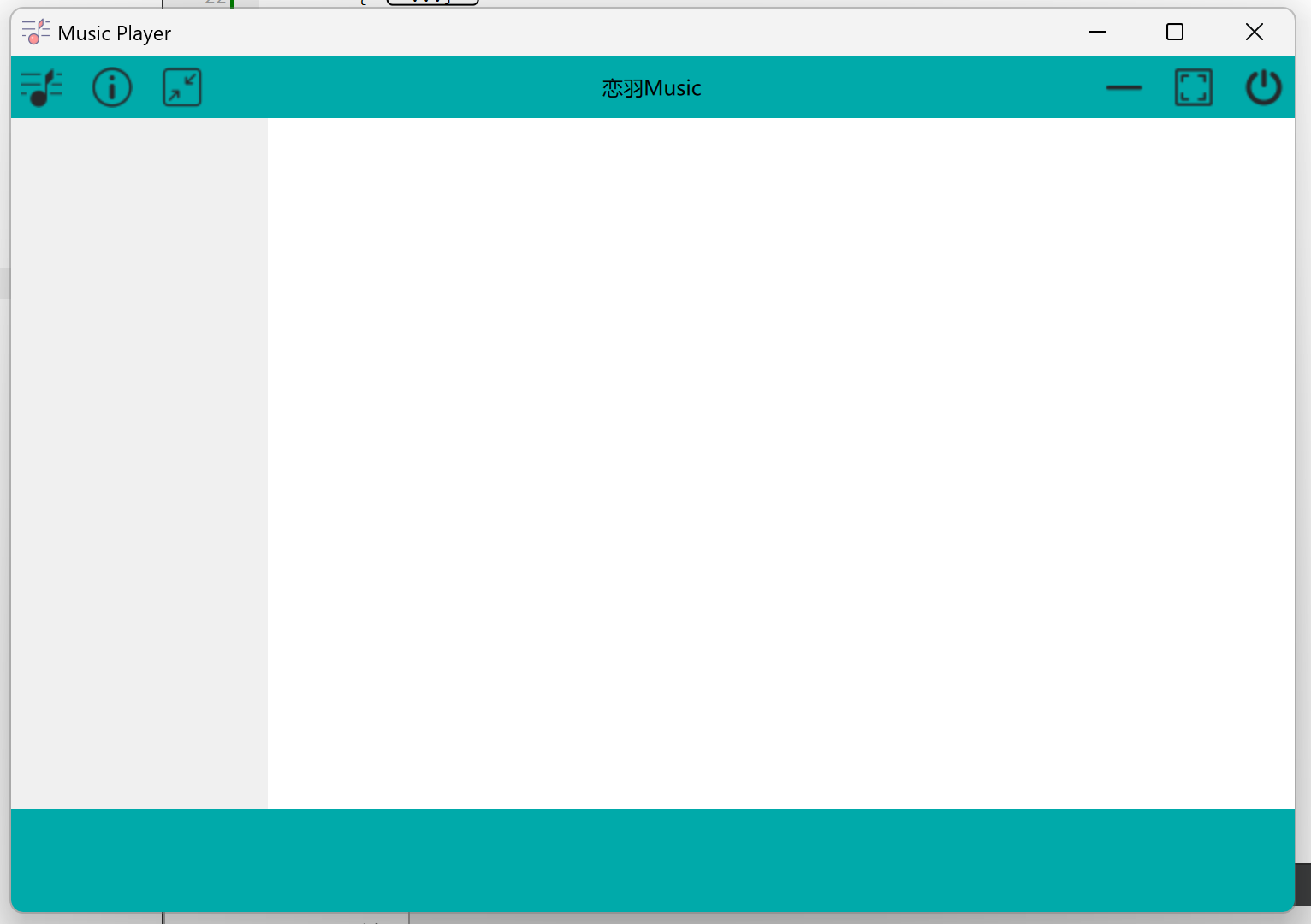
3.设置底部功能栏Rectangle宽高、颜色
Layout.fillWidth: true
height:60
color:"#00AAAA" //蓝绿色 4.设置菜单栏Frame属性
Layout.preferredWidth:150       //首选宽度,优先级: preferredWidth > fillWidth
Layout.fillHeight: true         //适应父元素高度
background: Rectangle
{
    color:"#f0f0f0"             //灰色
}
padding: 0                      //设置空白区域为0
Ctrl+R运行:
二、底部功能栏
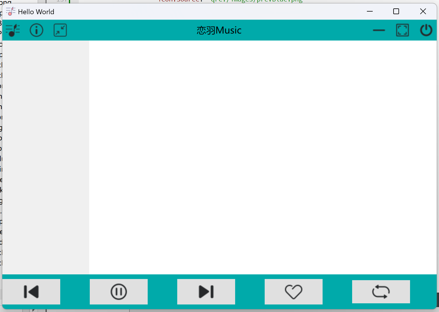
1.添加底部功能栏Rectangle所需的按键和播放进度条,并水平排布RowLayout
(1)添加五个按键:①上一首②播放/暂停③下一首④收藏歌曲⑤播放模式
//水平布局
RowLayout
{
   anchors.fill: parent

   /* 按键:上一首 */
   Button
   {
       icon.source: "qrc:/images/prevBlue.png"
       icon.width: 32
       icon.height: 32
   }
   /* 按键:播放、暂停 */
   Button
   {
       icon.source: "qrc:/images/stopMusicBlue.png"    //默认为暂停按键
       icon.width: 32
       icon.height: 32
   }
   /* 按键:下一首 */
   Button
   {
       icon.source: "qrc:/images/nextMusicBlue.png"
       icon.width: 32
       icon.height: 32
   }
   /* 按键:收藏歌曲 */
   Button
   {
       icon.source: "qrc:/images/likeBlack.png"
       icon.width: 32
       icon.height: 32
   }
   /* 按键:播放模式 */
   Button
   {
       icon.source: "qrc:/images/playInTurnBlue.png"
       icon.width: 32
       icon.height: 32
   }

}
Ctrl+R运行:
(2)添加进度条(加载“下一首按键与收藏歌曲按键之间”)
/* 进度条 */
Item
{
    Layout.preferredWidth: parent.width/2
    Layout.fillHeight: true
    Layout.fillWidth: true
}
(3)添加底部功能栏中最左/最右侧Button与界面边缘的间隙(Item)
//避免按键贴边措施
Item
{
    Layout.preferredWidth: parent.width/10
    Layout.fillWidth: true
}
底部功能栏整体代码:
/************ 底部功能栏begin ************/
 Rectangle
 {
     Layout.fillWidth: true
     height: 60
     color: "#00AAAA"

     //水平布局
     RowLayout
     {
         //子元素的所有边缘(左、右、上、下)自动与父元素或参照元素的相应边缘对齐
        anchors.fill: parent

        //避免按键贴边措施
        Item
        {
            Layout.preferredWidth: parent.width/10
            Layout.fillWidth: true
        }
        /* 按键:上一首 */
        Button
        {
            icon.source: "qrc:/images/prevBlue.png"
            icon.width: 32
            icon.height: 32
        }
        /* 按键:播放、暂停 */
        Button
        {
            icon.source: "qrc:/images/stopMusicBlue.png"    //默认为暂停按
            icon.width: 32
            icon.height: 32
        }
        /* 按键:下一首 */
        Button
        {
            icon.source: "qrc:/images/nextMusicBlue.png"
            icon.width: 32
            icon.height: 32
        }

        /* 进度条 */
        Item
        {
            Layout.preferredWidth: parent.width/2
            Layout.fillHeight: true
            Layout.fillWidth: true
        }

        /* 按键:收藏歌曲 */
        Button
        {
            icon.source: "qrc:/images/likeBlack.png"
            icon.width: 32
            icon.height: 32
        }
        /* 按键:播放模式 */
        Button
        {
            icon.source: "qrc:/images/playInTurnBlue.png"
            icon.width: 32
            icon.height: 32
        }
        //避免按键贴边措施
        Item
        {
            Layout.preferredWidth: parent.width/10
            Layout.fillWidth: true
        }

     }

 }
/************  底部功能栏end  ************/
Ctrl+R运行:
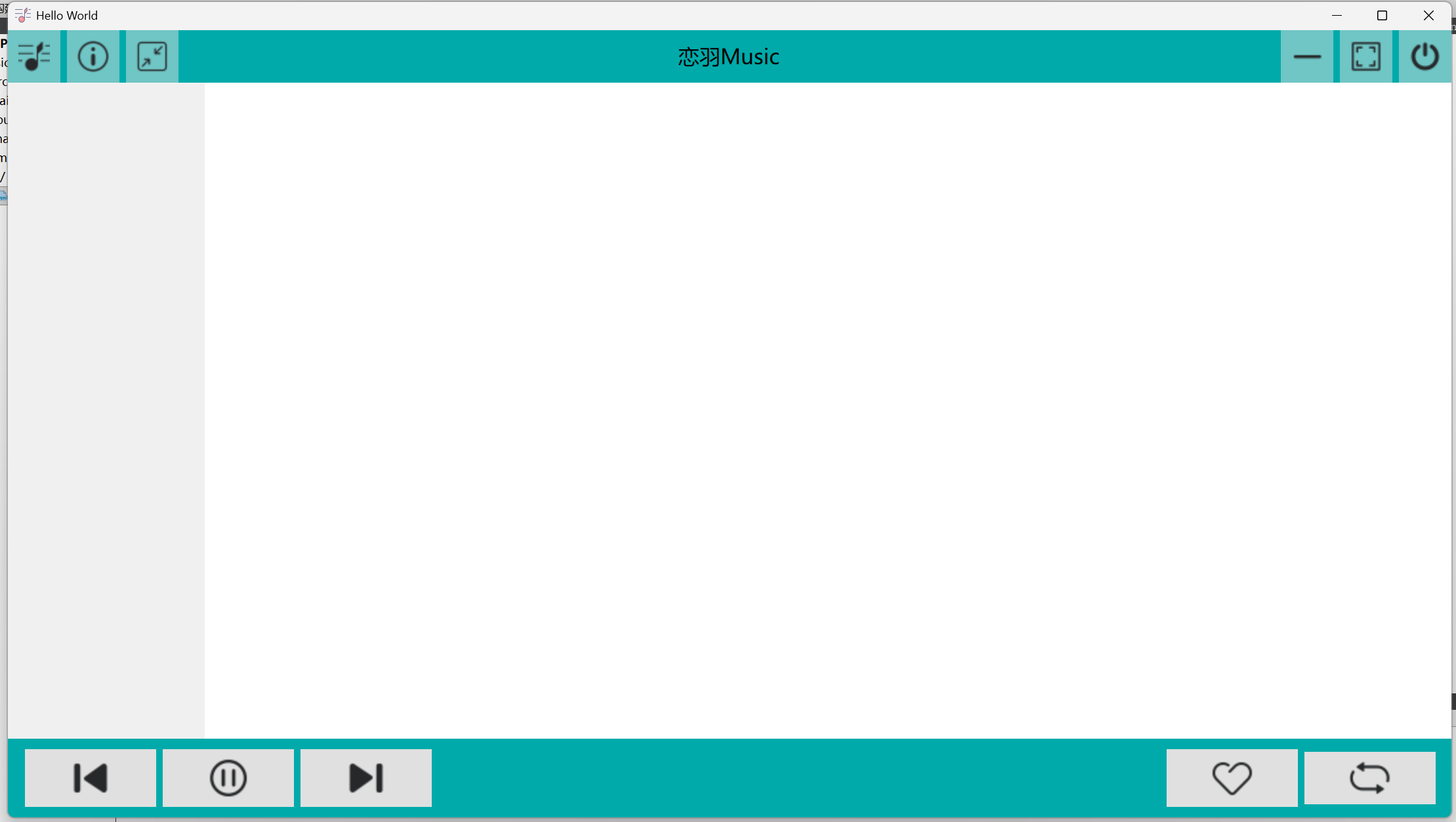
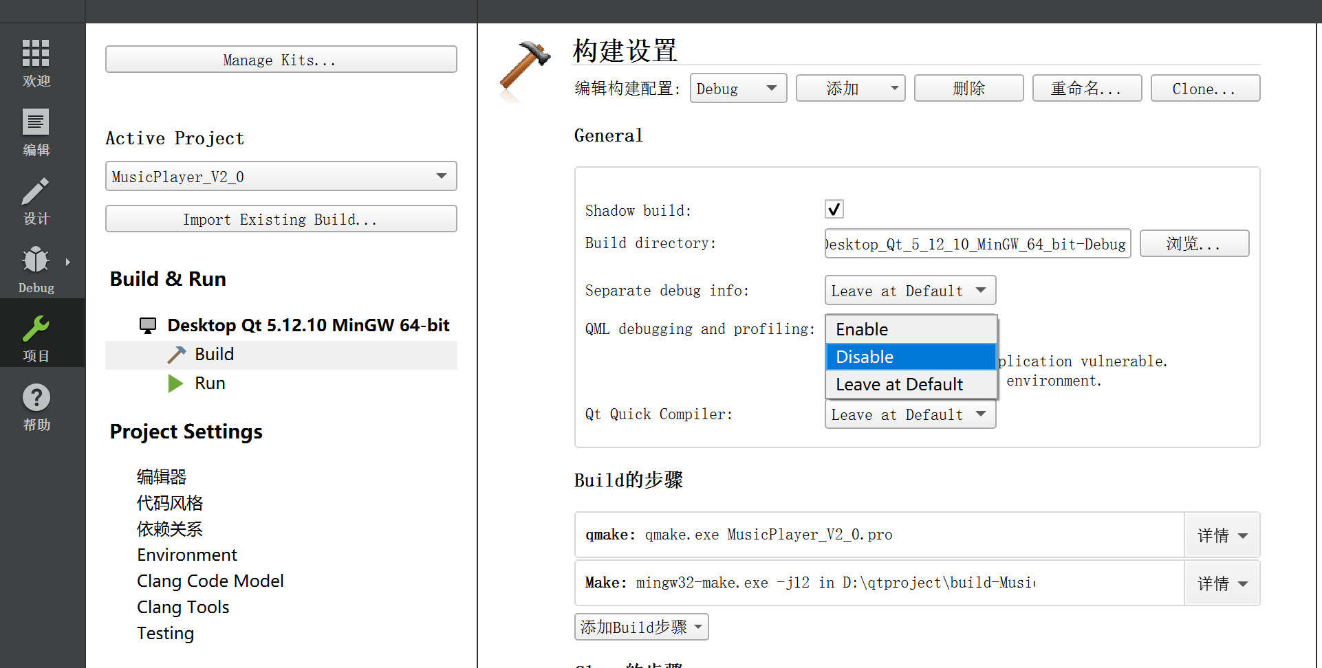
注意:由于在Qt5以上版本默认开启QML调试器,运行时可能会出现以下报错:

解决方法:
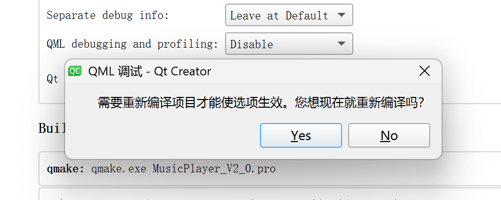
在界面"项目"->“🔨Build(🔨构建设置)”->"Enable QML debugging and profiling"选择“Disable”:
->“Yes”:
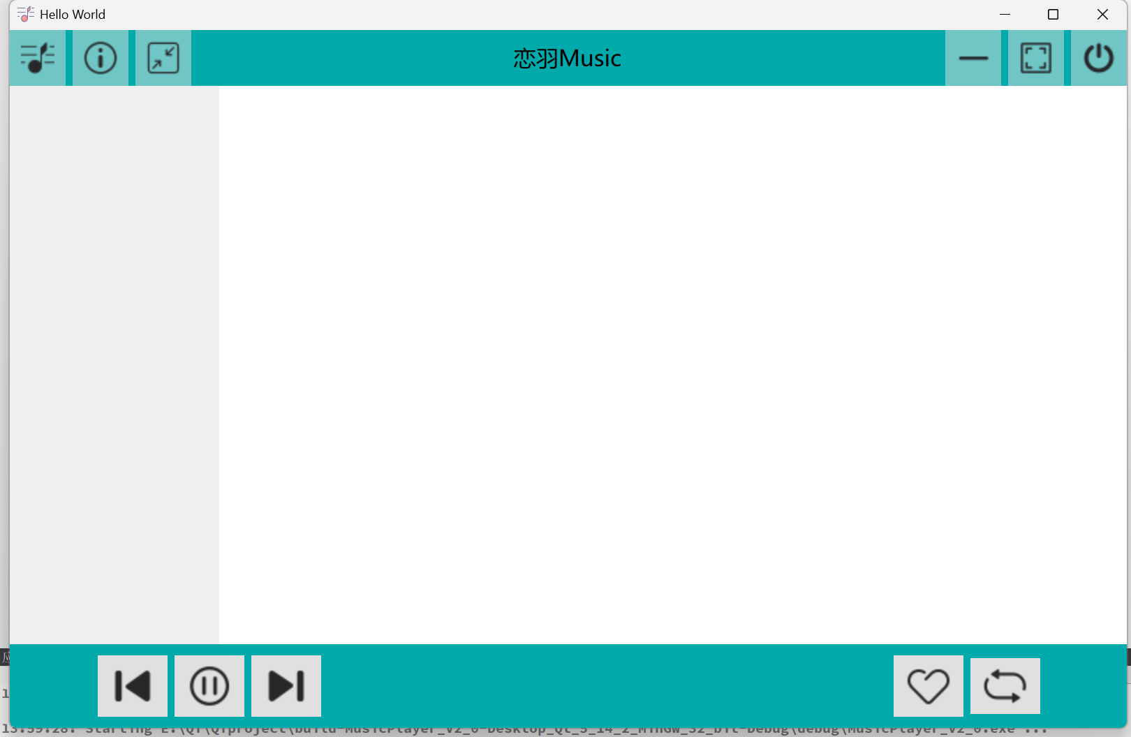
2,设置Button宽度
在每个
Button
{
}
中添加的代码行:
Layout.preferredWidth: 50Ctrl+R运行:
.3.添加进度条
在
/* 进度条 */
Item
{
Layout.preferredWidth: parent.width/2
Layout.fillHeight: true
Layout.fillWidth: true}
中继续添加代码:
/* 进度条 */
Slider
{
    width: parent.width      //宽度跟随Item宽度而变化
    Layout.fillWidth: true
    height: 25
}
Ctrl+R运行:
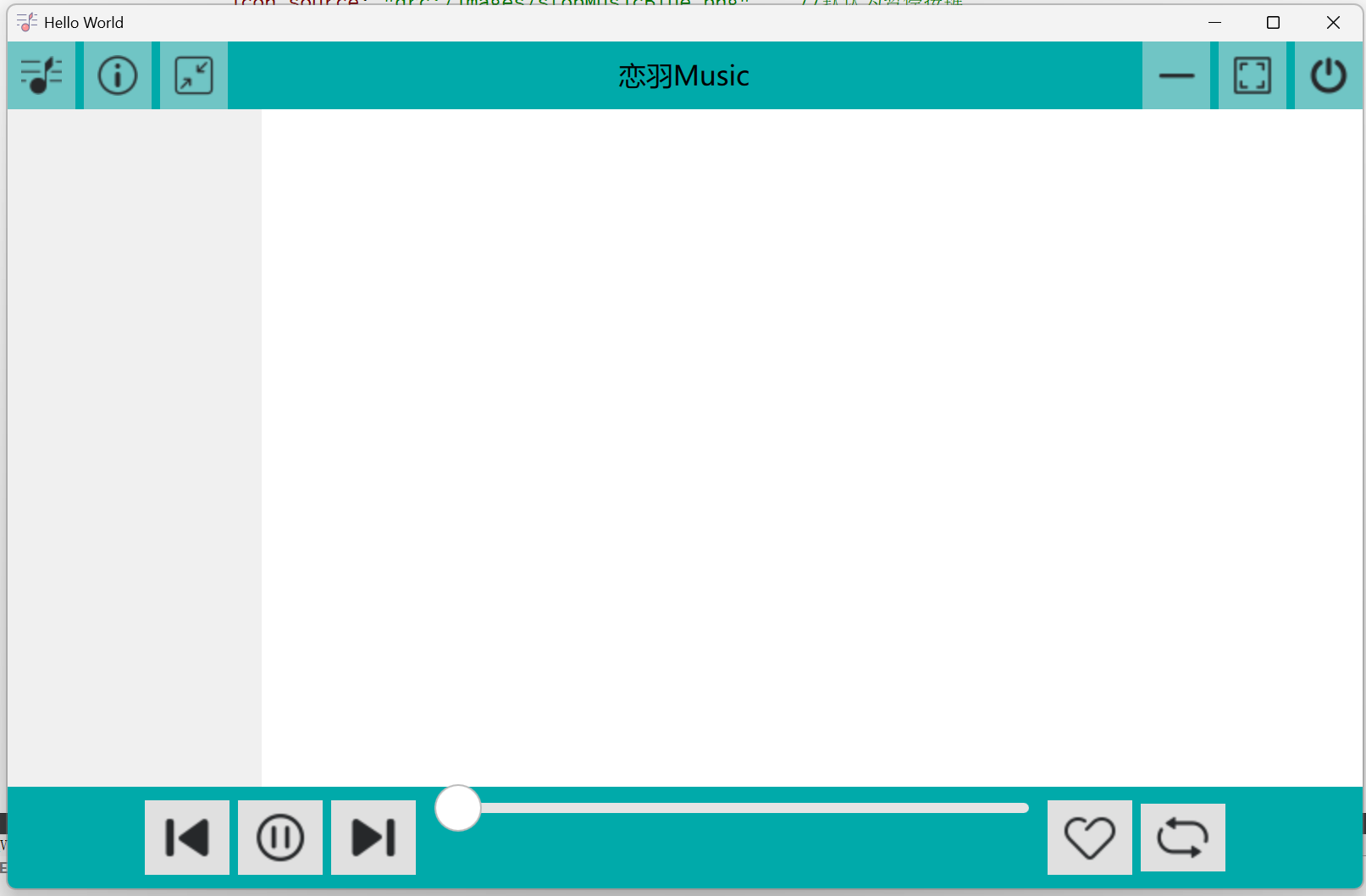 测试----能否正常拉动进度条
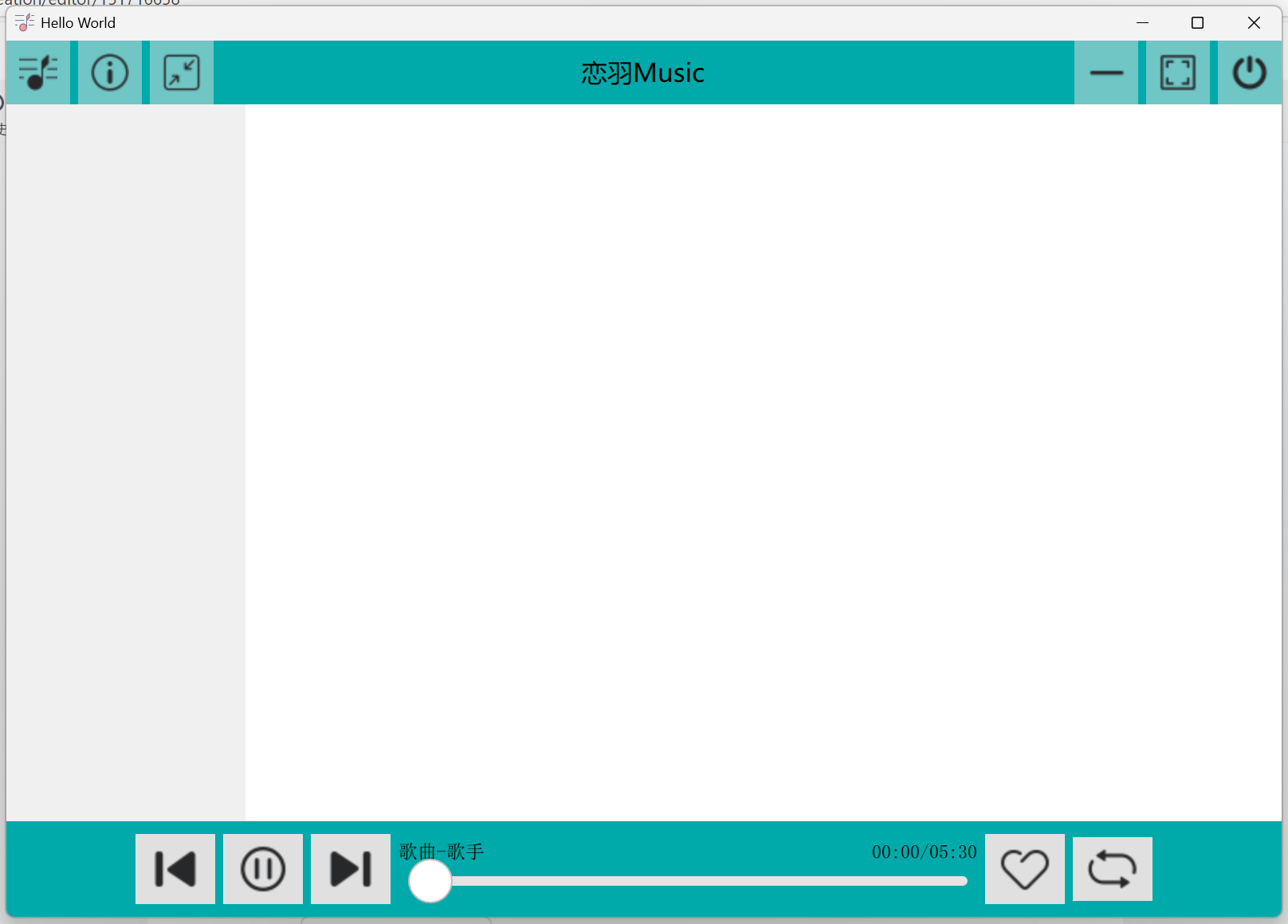
4.在进度条上方添加文本
在Item{}(进度条代码之前)中添加代码行
Layout.bottomMargin: 10 //顶部往下偏移10(进度条代码之前)添加文本:
(1)文本:“歌曲-歌手”
(2)文本:“歌曲已播时间 / 歌曲总时长”
/* 文本:歌曲--歌手 */
Text
{
    id: nametext                 //文本id
    anchors.left: slider.left    //此文本左端与进度条左端对齐
    anchors.bottom: slider.top   //此文本底部与进度条顶端对齐
    Layout.bottomMargin: 15         //顶部往下偏移15
    text:"歌曲-歌手"
}

/* 文本:歌曲已播时间/歌曲总时长 */
Text
{
    id: timetext
    anchors.right: slider.right   //此文本右端与进度条右端对齐
    anchors.bottom: slider.top
    Layout.bottomMargin: 15
    text:"00:00/05:30"
}
Ctrl+R运行:
三、进度条美化设计
1.设计进度条背景属性
background: Rectangle  //设置背景属性
{
    x:slider.leftPadding                                        //x坐标定位
    y:slider.topPadding + (slider.availableHeight - height)/2   //y坐标定位,居中
    width: slider.availableWidth
    height: 4
    radius: 2           //圆角
    color: "#e9f4ff"    //蓝色
}
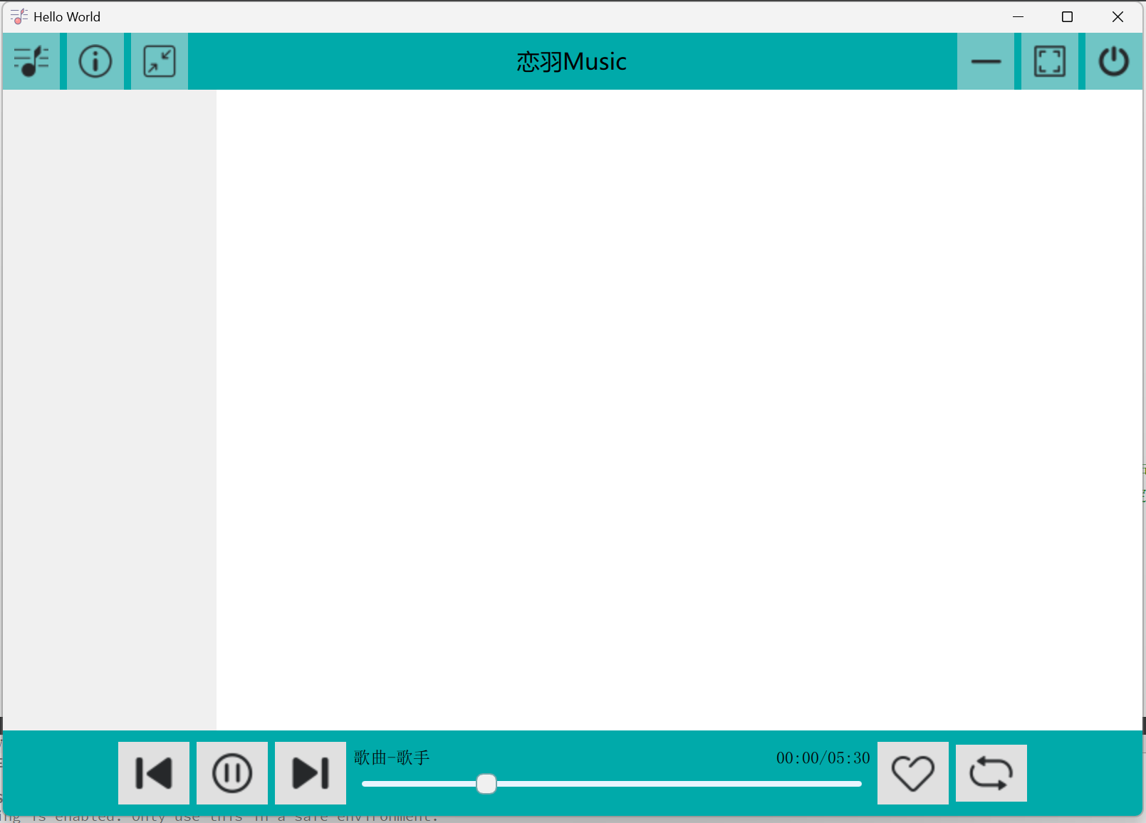
2.设计进度条上的拖动滑块
handle:Rectangle      //设置滑块属性
{
    x:slider.leftPadding +(slider.availableWidth - width) * slider.visualPosition   //设置成可拖动状态
    y:slider.topPadding + (slider.availableHeight - height)/2                       //y坐标定位,居中
    width: 15
    height: 15
    radius: 5                   //圆角
    color: "#f0f0f0"            //灰色
    border.color: "#73a7ab"     //边界颜色
    border.width: 0.5           //边界宽度
}
Ctrl+R运行:
3.添加进度条拖动后的颜色变化
在
background: Rectangle //设置背景属性
{
}
中添加代码:
Rectangle           //设置进度条上音乐已播部分属性
{
    width: slider.visualPosition * parent.width
    height: parent.height
    color: "#73a7ab"
    radius: 2
}
background: Rectangle{}整体代码:
background: Rectangle  //设置背景属性
{
    x:slider.leftPadding                                        //x坐标定位
    y:slider.topPadding + (slider.availableHeight - height)/2   //y坐标定位,居中
    width: slider.availableWidth
    height: 4
    radius: 2           //圆角
    color: "#e9f4ff"    //蓝色
    Rectangle           //设置进度条上音乐已播部分属性
    {
        width: slider.visualPosition * parent.width
        height: parent.height
        color: "#73a7ab"
        radius: 2
    }
}
Ctrl+R运行:
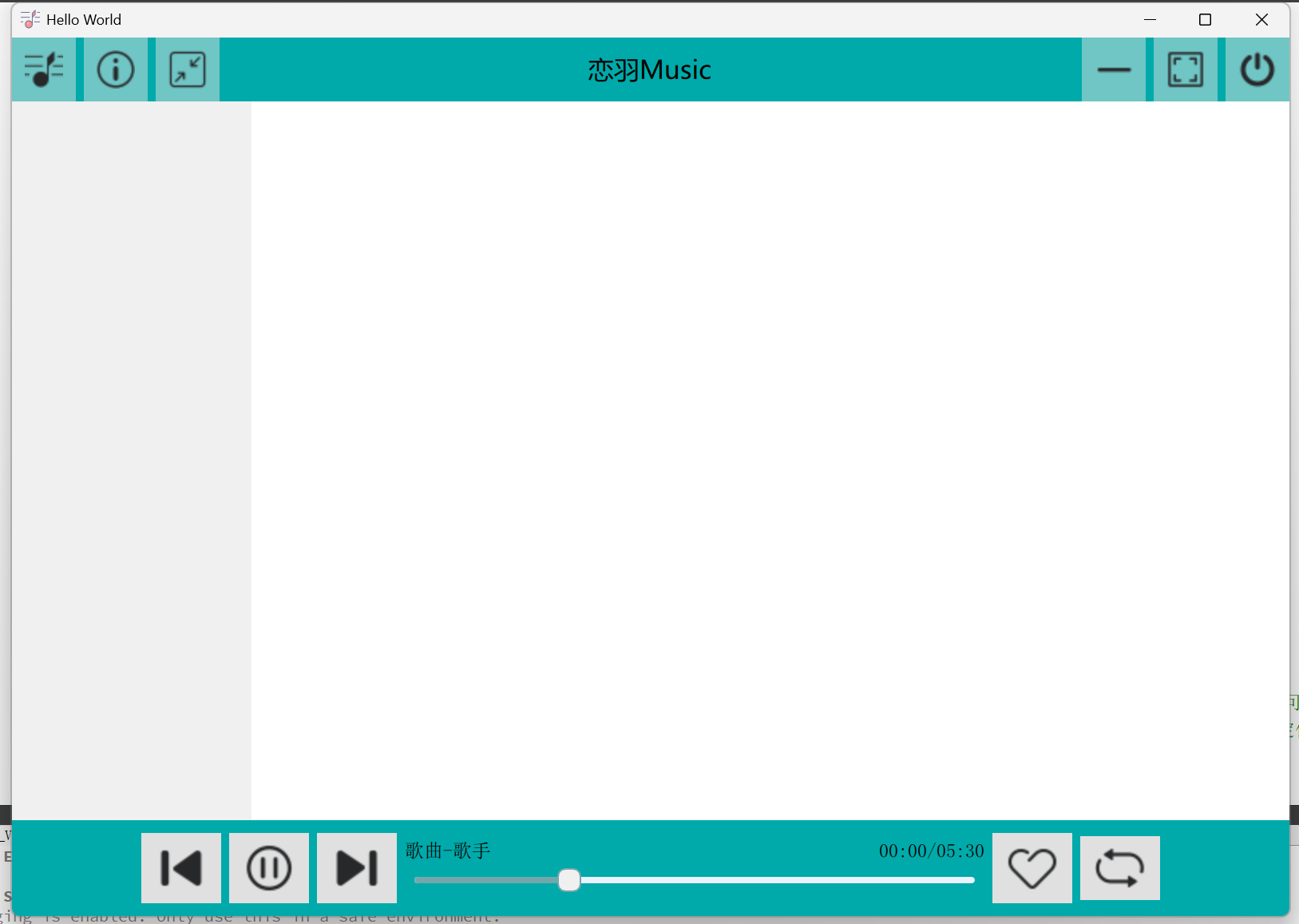
4.在上面运行界面中Text:“歌曲-歌手”比较偏左,下面对它进行修改,使其与进度条左端对齐
修改两个Text{}内的内容:
/* 文本:歌曲--歌手 */
Text
{
    id: nametext                 //文本id
    anchors.left: slider.left    //文本左端与进度条左端对齐
    anchors.bottom: slider.top   //文本底部与进度条顶端对齐
    anchors.leftMargin: 5        //左边缘往右偏移5
    text:"歌曲-歌手"
}

/* 文本:歌曲已播时间/歌曲总时长 */
Text
{
    id: timetext
    anchors.right: slider.right   //此文本右端与进度条右端对齐
    anchors.bottom: slider.top
    anchors.rightMargin: 5        //右边缘往左偏移5
    text:"00:00/05:30"
}
Ctrl+R运行:
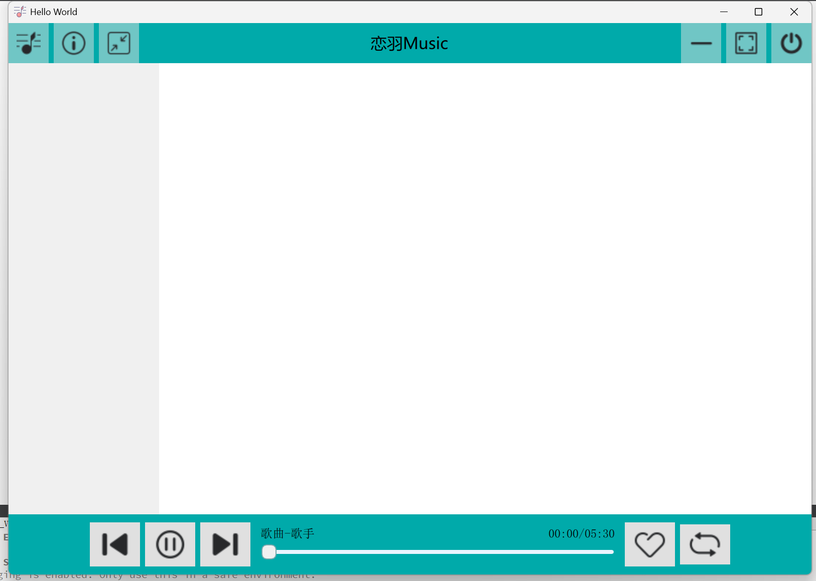
成功对齐
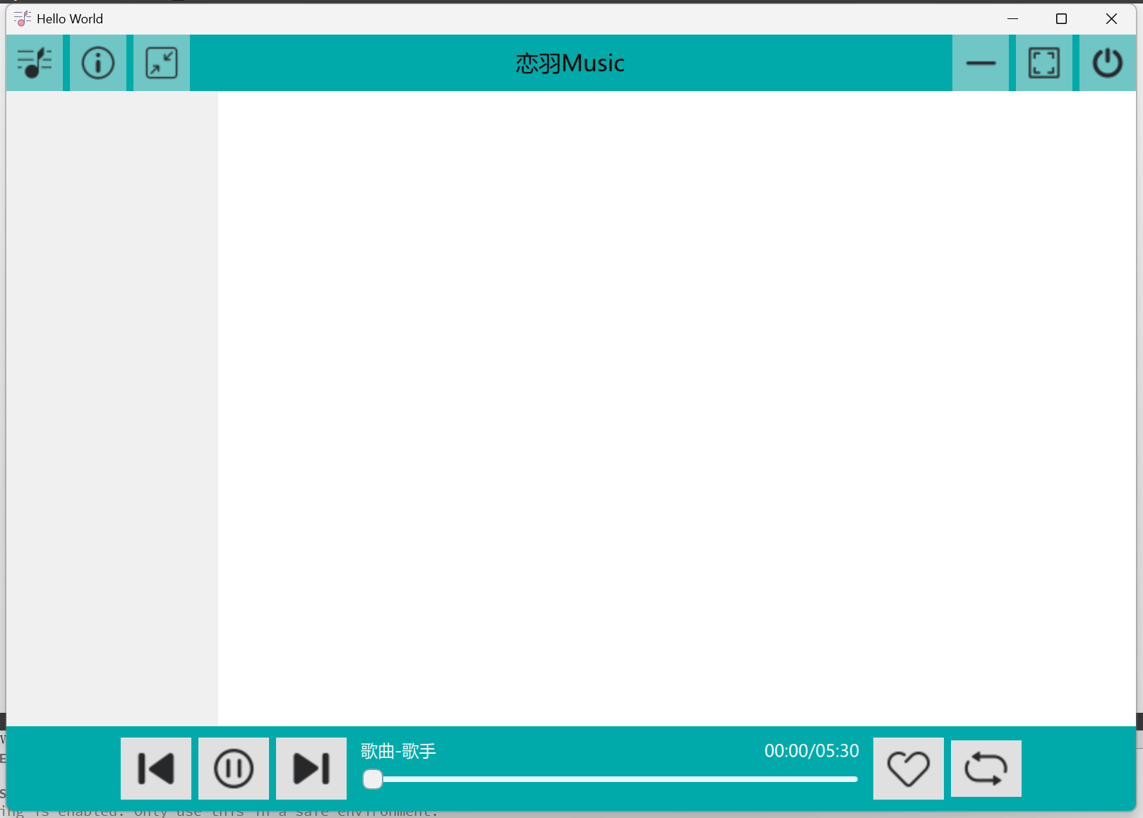
5.修改Text文本颜色、样式
在Text{}中添加代码行:
font.family: "微软雅黑"
color: "#ffffff"            //白色
Ctrl+R运行:
进度条整体代码:
/* 进度条 */
Item
{
    Layout.preferredWidth: parent.width/2      //长度为RowLayout的一半
    Layout.fillHeight: true
    Layout.fillWidth: true
    Layout.topMargin: 25                       //顶部往下偏移25

    /* 文本:歌曲--歌手 */
    Text
    {
        id: nametext                 //文本id
        anchors.left: slider.left    //文本左端与进度条左端对齐
        anchors.bottom: slider.top   //文本底部与进度条顶端对齐
        anchors.leftMargin: 5        //左边缘往右偏移5
        text:"歌曲-歌手"
        font.family: "微软雅黑"
        color: "#ffffff"            //白色
    }

    /* 文本:歌曲已播时间/歌曲总时长 */
    Text
    {
        id: timetext
        anchors.right: slider.right   //此文本右端与进度条右端对齐
        anchors.bottom: slider.top
        anchors.rightMargin: 5        //右边缘往左偏移5
        text:"00:00/05:30"
        font.family: "微软雅黑"
        color: "#ffffff"            //白色
    }

    /* 进度条 */
    Slider
    {
        id: slider
        width: parent.width      //宽度跟随Item宽度而变化
        Layout.fillWidth: true
        height: 25
        background: Rectangle  //设置背景属性
        {
            x:slider.leftPadding                                        //x坐标定位
            y:slider.topPadding + (slider.availableHeight - height)/2   //y坐标定位,居中
            width: slider.availableWidth
            height: 4
            radius: 2           //圆角
            color: "#e9f4ff"    //蓝色
            Rectangle           //设置进度条上音乐已播部分属性
            {
                width: slider.visualPosition * parent.width
                height: parent.height
                color: "#73a7ab"
                radius: 2
            }
        }
        handle:Rectangle      //设置滑块属性
        {
            x:slider.leftPadding +(slider.availableWidth - width) * slider.visualPosition   //设置成可拖动状态
            y:slider.topPadding + (slider.availableHeight - height)/2                       //y坐标定位,居中
            width: 15
            height: 15
            radius: 5                   //圆角
            color: "#f0f0f0"            //灰色
            border.color: "#73a7ab"     //边界颜色
            border.width: 0.5           //边界宽度
        }
    }
}
至此,音乐播放器第二部分----窗体布局与区域划分、底部工具栏设计、进度条设计制作完成。
感谢观看!
开源鸿蒙跨平台开发社区汇聚开发者与厂商,共建“一次开发,多端部署”的开源生态,致力于降低跨端开发门槛,推动万物智联创新。
更多推荐


 31
31 0
0- 0


 已为社区贡献7条内容

所有评论(0)