Qt笔记8
- 课程来源:QML快速入门
- 类型:个人笔记,没啥含金量,主要是熟悉个组件用法,看看就行了
概述
QML(Qt Meta-Object Language)是声明式语言,用的是JavaScript的语法,并通过 Qt 的 QML 引擎来解释和执行 QML 代码
现在企业都更青睐QML了,因为更方便。Qt Widget Application是最传统的方式(果然是不会有人用C++写前端的),而QML用的是Qt Quick Application(Compact)
创建一个Quick Application(Compact),以后用的都是这个模板
简单示例如下
import QtQuick
import QtQuick.Window

Window {
    width: 640
    height: 480
    visible: true
    title: qsTr("Hello World")
    //定义一矩形框
    Rectangle{
    	id:aaa//和HTML一样,唯一标识
        width: 100
        height: 100
        color:"red"
    }
}
运行就会在主窗口内显示一宽高100红色的矩形框
main.cpp逻辑
复习一下C++
创建一个Quick Application后也会生成一个cpp文件,里边的逻辑是这样的
头文件QGuiApplication用于管理GUI应用程序的控制流和主要设置(适用于无窗口控件或纯QML的应用程序)
头文件QQmlApplicationEngine用于加载和运行QML文件的引擎类
#if QT_VERSION < QT_VERSION_CHECK(6, 0, 0)
    QCoreApplication::setAttribute(Qt::AA_EnableHighDpiScaling);
#endif
这段是在支持高DPI缩放(兼容Qt5):若Qt版本低于6.0则启用高DPI缩放(Qt6默认启用),确保应用程序在高分辨率屏幕上正常显示
QGuiApplication app(argc, argv);//初始化GUI应用程序对象,管理事件循环和系统资源
QQmlApplicationEngine engine;//初始化QML引擎,用于加载并解释QML文件
引擎会帮我们解析QML文件,方便后续渲染窗口。至于底层怎么实现的,感兴趣的可以去看看官方文档,真要深入的话那能讲上好几天了
接下来是熟悉的信号与槽机制(错误处理)
const QUrl url(QStringLiteral("qrc:/main.qml"));//加载QML文件
QObject::connect(
    &engine,
    &QQmlApplicationEngine::objectCreated,
    &app,
    [url](QObject *obj, const QUrl &objUrl) {
        if (!obj && url == objUrl)
            QCoreApplication::exit(-1);
    },
    Qt::QueuedConnection);
- 监听引擎的
objectCreated信号,即当QML根对象(打开你的main.qml文件,里边的Window就是根对象)创建完成后触发 - lambda表达式:若加载失败(
obj为空指针)且Url匹配则退出应用并返回错误码-1 - 其实
connect有五个参数,因为最后一个参数连接方式默认AutoConnection,所以容易被忽略。这里的连接方式Qt::QueuedConnection是为了确保信号通过事件队列异步处理
最后这段
engine.load(url);//加载指定的QML文件(启动UI)
return app.exec();//启动应用程序的事件循环,等待用户交互(阻塞直到程序退出)
Item与Rectangle
QML属性
可以自定义类型,使用property然后自动补全就会像这样
property type name: value
类似C++的typedef
常见类型有real、double、list、int、color等
Window {
    width: 640
    height: 480
    visible: true
    title: qsTr("Hello World")

    Rectangle{
        id:aaa//唯一标识,注意不要加"",首字母也不能大写
        width: 100
        height: 100
        color:"red"
        border.color: "yellow"
        border.width: 5
        radius: 15
        default property color aaacolor: "pink"//默认
        readonly property color aaacolor2:"gray"//不能被修改
        required property int val//必须被赋值,不然程序就跑不了
        val:3

        //类似构造函数
        Component.onCompleted: {
            console.log("sad")//等于qDebug()
        }
    }
    Rectangle{
        id:bbb
        width: 100
        height: 100
        x:200
        color: aaa.aaacolor
    }
}
运行结果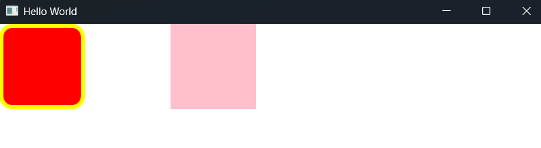
item常见属性
几乎所有可视化控件都继承自item,但其本身是不可视的
xyz坐标
原点坐标位于窗口左上角,x轴正方向朝下,y轴正方向朝右,z轴正向为屏幕内指向屏幕外
xy没啥好讲的,z轴表示的是layer层级,数字越大显示优先级越高
其他
visiblerotationscaleopacity:transparencyenabled:类似unity的enabledparent:父控件clip:剪切childrenRect
还有其他的看技术文档
锚布局
定义俩矩形id分别为a和b。如果想要b一直紧靠着a,这时就可以用锚布局
Rectangle{
        id:a
        width: 100
        height: 100
        color:"red"
    }
    Rectangle{
        id:b
        width: 100
        height: 100
        color: "blue"
        anchors.left: a.right//靠着a的右边
    }
效果如下,这时候设置b的x坐标是没用的。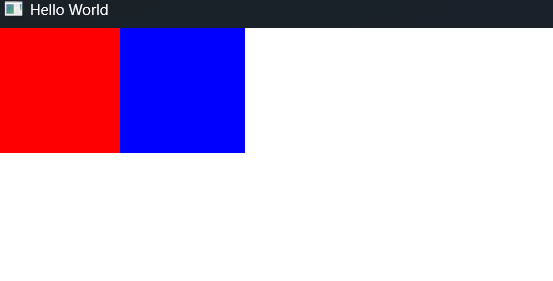
- 若想要b的上边也对齐a的话:
anchors.top: a.top
//其余同理
- 若想要b始终保持间距
anchors.leftMargin:3 //边距也可以是负的
//anchors.rightMargin: 1
anchors.topMargin: 2
//anchors.bottomMargin: 2
- 设置居中
anchors.centerIn: a//居中
anchors.horizontalCenter: a//水平居中
anchors.verticalCenter: a//竖直居中
- 填充
anchors.fill:a
rectangle
Qt6的rectangle多了这几个属性
topLeftRadiustopRightRadiusbottomLeftRadiusbottomRightRadius
如果在Qt5里想达到这种效果(例如仅留下右上角为圆角)
Item {
        width: 100
        height: 100
        clip: true//用裁剪来实现,当然也有别的方法来实现
        anchors.centerIn: parent//这样字矩形框也会居中
        Rectangle {
            width: 100
            height: 100
            color: "red"
            radius: 20
            x:-20
            y:20
        }
效果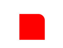
真有人会这么写嘛,很麻烦欸
文本控件与Image
Text
    Item {
        width: 400
        height: 400
        clip: true
        anchors.centerIn: parent
        Text{
            id:text
            width: 200//设置边界大小
            //内容
            text:"If I Can Stop One Heart From Breaking"
            //字体
            font.family: "黑体"
            //字号
            font.pixelSize: 20
            //颜色
            color:"red"
            //换行
            wrapMode: Text.WordWrap
            //省略号
            //elide: Text.ElideNone
            //elide: Text.ElideLeft
            //elide: Text.ElideMiddle
            //elide: Text.ElideRight
        }
    }
效果如下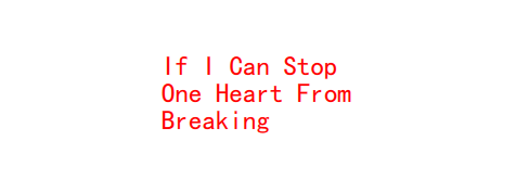
wrapMode有四种枚举
Text.NoWrap:即无换行Text.WordWrap:按词换行Text.WrapAnywhere:一句话若到了边界就换行Text.Wrap:自动寻界换行
其他的属性项目里边用到了再介绍
TextField
没啥好说的,看示例
 TextField{
            width:300
            height: 50
            font.family: "黑体"
            font.pixelSize: 30
            placeholderText:"请输入密码"//设置占位文本
            echoMode:TextInput.Password
            selectByMouse:true//能被鼠标选中
            maximumLength:5//设置文本最大长度
            horizontalAlignment:Text.AlignHCenter
            background:Rectangle{//背景用Rectangle填充
                anchors.fill: parent
                border.color: "red"
                color:"red"
                radius: 5
                border.width: 1
            }
        }
效果如下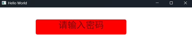
TextEdit
也没啥好说的
 TextArea{
        id:c
        anchors.fill: parent
        wrapMode:Text.WordWrap
        font.family: "黑体"
        selectByMouse:true
        color: "black"
        font.pixelSize: 30
        font.underline: true//设置下划线
        background: Rectangle{
            anchors.fill: parent
            color: "cyan"
            border.color: "red"
            border.width: 1
        }
    }
运行结果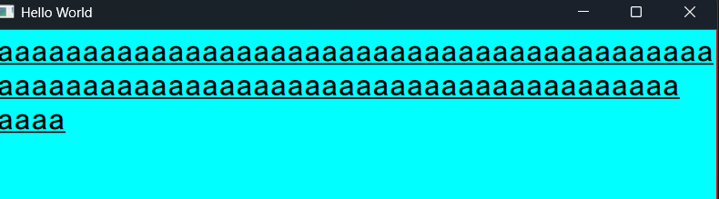
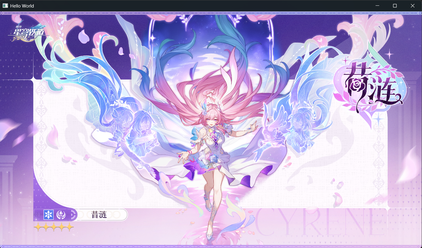
Image
也挺简单的
新建一个Qt资源文件,然后把要放的图片放到当前项目的目录下。因为这样可以保证在别的设备上也能正常显示图片
Image{
        anchors.fill: parent
        source: "qrc:/res/img/Cyrene.jpg"//复制的Url
    }
事件与按钮
事件系统
现在暂时只介绍鼠标事、键盘事件与拖拽事件
	//拖拽事件
    DropArea{
        width: 200
        height: 200
        x:200
        Rectangle{
            id:d
            anchors.fill: parent
        }
        onEntered: {
            d.color="pink"
        }
    }

    Rectangle{
        id:a
        width: 100
        height:100
        color: "cyan"
        focus: true//用键盘事件一定要设置为true
        Drag.active: area.drag.active//这样DropArea才能识别a
        Keys.onPressed: {
            if(event.key===Qt.Key_A)
                console.log("a")
        }
		//鼠标事件
        MouseArea{
            id:area
            anchors.fill: parent
            hoverEnabled: true//支持鼠标悬浮
            drag.target: a
            drag.axis:Drag.XAndYAxis
            onClicked:{
                a.color="red"
            }
            onEntered: {
                a.color="yellow"
            }

            onWheel:{
                if(wheel.angleDelta.y>0)
                    console.log("wheel moved forwards");
                else
                    console.log("wheel moved backwards")
            }

            onExited: {
                a.color="cyan"
            }
            onReleased: {
                d.color="white"
            }
        }

    }
实现功能:
- 使得矩形a可以被拖拽
- 鼠标进出a会使其会变色,在a内滑动鼠标滚轮在控制台输出相应信息
- 在a内按下a键控制台输出相应信息
- 将a拖入DropArea内,DropArea变成粉色,鼠标松开使其变回白色
注:官方推荐用===代替==,!==代替!=
按钮
基本所有Button都继承自AbstractButton。这里简要介绍下几种常用Button
Button
Button{
        height: 50
        width: 50
        text: "btn"
        anchors.centerIn: parent
        display: AbstractButton.TextUnderIcon//text展示在icon下方
        //几种槽函数
        onCanceled: {}
        onClicked: {}
        onPressAndHold: {}
        onPressed: {}
        onReleased: {}
        //icon.source: "xxx"
    }
press和release构成一次click
DelayButton
DelayButton{
        height: 50
        width: 100
        delay:1000
        onProgressChanged: {//onXXXChanged可以观察某属性的变化
            console.log("cur progress:",progress)
        }

        onActivated: {
            console.log("fin")
        }

    }
Switch
Switch{
        x:200
        onPositionChanged: {}//position为指示器的逻辑位置
        onVisualPositionChanged: {}//visualposition为指示器的视觉位置
        onCheckedChanged: {}//checked表示该开关是开还是关
    }
RadioButton和ButtonGroup
ButtonGroup{
        id:ga
        exclusive: false//默认为true
    }

    RadioButton{
        ButtonGroup.group:ga
        y:60
        onCheckableChanged: {
            checked ? console.log("selected"):console.log("not selected")
        }
    }

    RadioButton{
        ButtonGroup.group:ga
        y:80
        onCheckableChanged: {
            checked ? console.log("selected"):console.log("not selected")
        }
    }

    RadioButton{
        ButtonGroup.group:ga
        y:100
        onCheckableChanged: {
            checked ? console.log("selected"):console.log("not selected")
        }
    }
单选按钮,若创建了多个则只能选择一个。将三个单选按钮放入一组里,然后设置exclusive为false,这样按钮就可以多选了
各类窗口
Popup
Popup是所有类popup(popup-like)UI的基类下图展示了一Popup的基本布局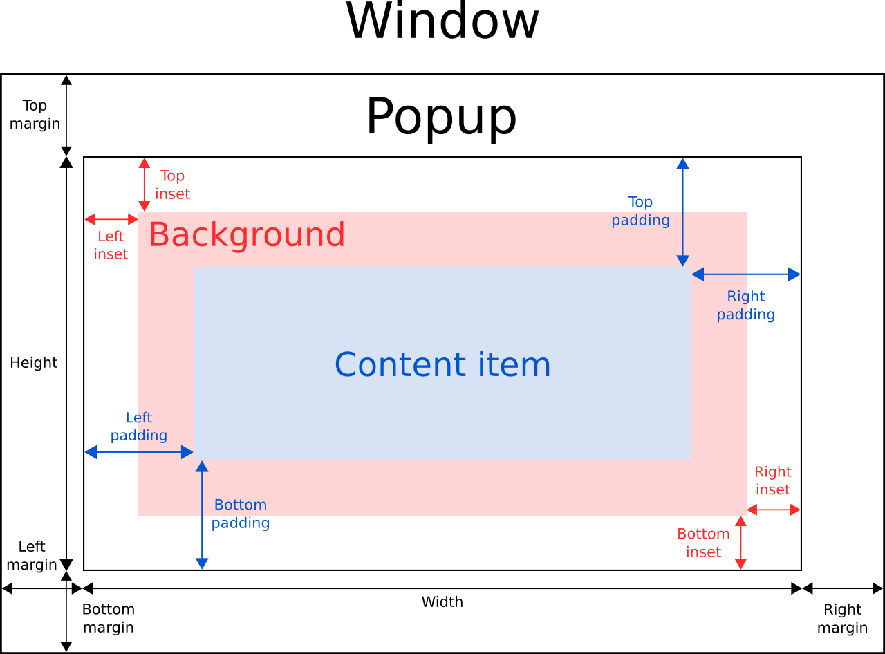
这是它的四种信号
void aboutToHide()void aboutToHide()void closeed()void opened()
三种方法
void close()void forceActiveFocus()void open()
几种常用属性
colormodal:是否为模态对话框closePolicy:常用Popup.NoAutoClose和Popup.CloseOnPressOutside,其余的枚举详见官方文档
##Dialog
最熟悉的一集,这里就只做些补充了
Button{
        onClicked: {a.open()}
    }

    Dialog{
        standardButtons: Dialog.Ok|Dialog.Cancel
        anchors.centerIn: parent
        title:"Dialog"
        id:a
        onAccepted: {console.log("a")}
        onRejected: {console.log("r")}
    }
点击按钮后弹出来长这样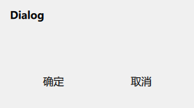
Qt6中的Dialog没有modality属性onAccepted():按钮对应AcceptedRole时触发,onRejected()同理
这是所有的flags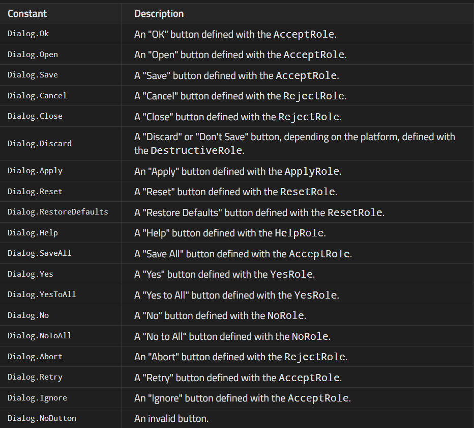
FileDialog和FolderDialog
这俩都继承自Dialog
  Button{
        width: 50
        onClicked: {a.open()}
    }

    FileDialog{
        id:a
        title: "File"
        acceptLabel: "Confirm"
        rejectLabel: "Cancel"
        onAccepted: {console.log(currentFile)}
    }
对话框长这样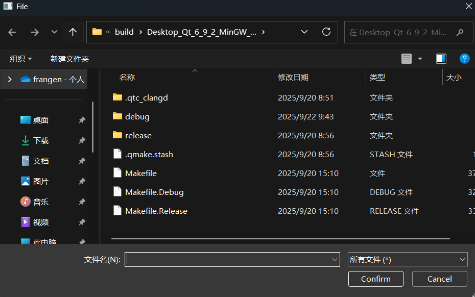
控制台输出文件所在路径
qml: file:///C:/Users/frang/Desktop/TEMP/Qt Temp/QMLStudy/QML_p1/build/Desktop_Qt_6_9_2_MinGW_64_bit-Debug/Makefile.Release
对于FolderDialog同理,打印路径时换成console.log(currentFolder)
重要属性modality,Qt5中Dialog有此属性
Qt.NonModalQt.WindowModal:该对话框对其所属的单个窗口层次结构是模态的,会阻止对其父窗口、所有祖父窗口以及父窗口和祖父窗口的所有同级窗口的输入Qt.ApplicationModal:对话框是该应用程序的模态窗口,会阻止所有其他窗口的输入
其他Dialog
ColorDialog长这样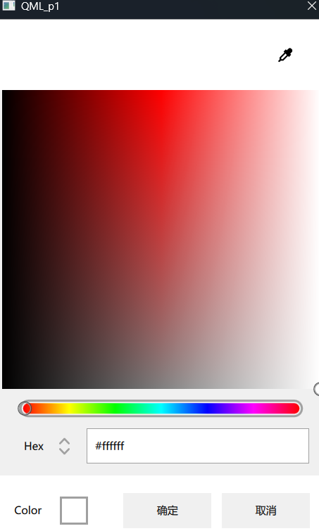
FontDialog长这样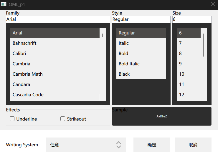
MessageDialog和MessageBox差不多,略
动画效果
State&Transition
之前的写法
Rectangle{
        width: 200
        height: 200
        Text {
            id: txt
            anchors.centerIn: parent
        }
        MouseArea{
            hoverEnabled: true
            anchors.fill: parent
            onEntered: {
                 parent.color="red"
                 txt.text="In"
            }
            onExited: {
                parent.color="yellow"
                txt.text="Out"
            }
        }

    }
不难看出如果逻辑越来越多的话这么写很麻烦,所以可以用state代替
//states是一个数组,这是它的默认模板
states:[
        State {
            name: "name"
            PropertyChanges {
                target: object

            }
        }
    ]
以上逻辑我们可以这么改写
    Rectangle{
        width: 200
        height: 200
        x:200
        id:rec
        color:"red"
        Text {
            id: txt
            anchors.fill: parent
        }
        anchors.centerIn: parent
        states:[
            State {
                name: "normal"
                PropertyChanges {
                    target: rec
                    color:"red"
                }
                PropertyChanges {
                    target: txt
                    text:"In"
                }
            },
            State{
                name:"hovered"
                PropertyChanges {
                    target: rec
                    color:"yellow"
                }
                PropertyChanges {
                    target: txt
                    text:"Out"
                }
            }
        ]
        MouseArea{
            hoverEnabled: true
            anchors.fill: parent
            onEntered: {
                rec.state="normal"
            }
            onExited: {
                rec.state="hovered"
            }
        }
    }
这样把改变逻辑放进states数组内,然后在外部调用接口就行了。有点像unity的状态机
想要加上过渡效果,可以使用transition
transitions: [
            Transition {
                from: "normal"
                to: "hovered"

                ColorAnimation {
                    target:rec
                    duration: 200
                }
            },
            Transition {
                from: "hovered"
                to: "normal"

                ColorAnimation {
                    target:rec
                    duration: 200
                }
            }
PropertyAnimation
将此代码放入transition数组
 PropertyAnimation{
                    target:rec
                    property: "width"
                    from: 100
                    to:400
                    easing.type: "Linear"
                }
easing.type有很多种枚举,详见文档
Behavior
简单实例
Rectangle{
        id:a
        width: 100
        height: 50
        color: "red"
        Behavior on width{
            NumberAnimation{duration: 1000}//数值动画
        }
        MouseArea{
            anchors.fill: parent
            onClicked: {parent.width=400}
            onDoubleClicked: {parent.width=700}
        }
    }
ParallelAnimation&SeqentialAnimation
即串行动画与并行动画
 ParallelAnimation{//并行执行动画
        id:a
        PropertyAnimation{
            id:a1
            target: r
            property:"width"
            to:400
            duration:2000
        }
        PropertyAnimation{
            id:a2
            target: r
            property:"height"
            to:400
            duration:2000
        }
        PropertyAnimation{
            id:a3
            target: r
            property:"color"
            to:"yellow"
            duration:2000
        }
    }
    SequentialAnimation{//按顺序执行动画
    		ScriptAction{
            script:
                console.log("fin")//执行完后输出"fin"
        }
    }
    Rectangle{
        id:r
        width: 100
        height: 50
        color: "red"
        MouseArea{
            anchors.fill: parent
            onClicked: {a.restart()}
        }
    }
图形与图片效果
Gradient
基本用法
gradient: Gradient{
            orientation: Gradient.Horizontal//默认是Vertical
            GradientStop{position: 0.1;color:"cyan"}
            GradientStop{position: 0.2;color:"red"}
            GradientStop{position: 0.3;color:"gray"}
            GradientStop{position: 1;color:"black"}
        }
效果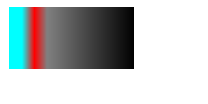
如果想要更复杂的效果如从左上角渐变至右下角,可用LinearGradient
但在使用之前,需要确保你安装了Qt 5 Compatibility Module(没安装去Maintainence Tool里添加该组件)
LinearRadient
import Qt5Compat.GraphicalEffects//必须import这玩意
Rectangle{
        id:btn
        width: 400
        height: 400
        anchors.centerIn: parent

    }

    LinearGradient{
        anchors.fill: btn
        start:Qt.point(0,0)
        end:Qt.point(400,400)
        gradient: Gradient{
            GradientStop{position: 0.2;color: "red"}
            GradientStop{position: 0.4;color: "cyan"}
            GradientStop{position: 0.6;color: "yellow"}
            GradientStop{position: 0.8;color: "gray"}
            GradientStop{position: 1;color: "black"}
        }
    }
效果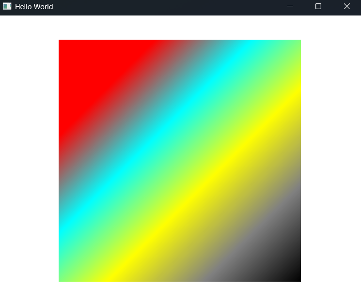
ConicalRadient
把上边的线性渐变换位锥形渐变
 ConicalGradient{
        anchors.fill: btn
        angle:45
        gradient: Gradient{
            GradientStop{position: 0.3;color: "white"}
            GradientStop{position: 0.6;color: "gray"}
            GradientStop{position: 0.9;color: "black"}
        }
    }
效果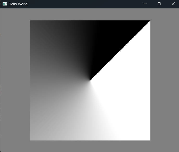
还可以加上旋转动画
 RotationAnimation on angle{
            from:0
            to:360
            duration: 1000
        }
RadicalRadient
 RadialGradient{
        anchors.fill: btn
        angle:45
        verticalRadius:100
        horizontalRadius:200
        gradient: Gradient{
            GradientStop{position: 0.3;color: "white"}
            GradientStop{position: 0.6;color: "gray"}
            GradientStop{position: 0.9;color: "black"}
        }
    }
效果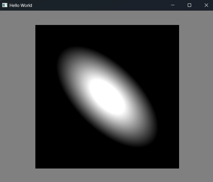
BrightnessContrast
即亮度与饱和度
一个小案例
Item{
        id:item
        width: 400
        height: 400
    }

    Image{
        id:img
        scale: 0.1
        source: "qrc:/res/img/cloudy.png"
        anchors.centerIn: item
    }

    Text{
        id:t1
        text: "亮度"
        anchors.right: s1.left
    }
    Slider{
        id:s1
        anchors.horizontalCenter: parent.horizontalCenter
        width:400
        height:30
        from:0
        to:1
        onValueChanged: {
            bc.brightness=value
        }
    }

    Text{
        id:t2
        text: "饱和度"
        anchors.right: s2.left
        anchors.verticalCenter: s2.verticalCenter
    }
    Slider{
        id:s2
        anchors.horizontalCenter: parent.horizontalCenter
        anchors.left: s1.left
        anchors.top: s1.bottom
        width:400
        height:30
        from:0
        to:1
        onValueChanged: {
            bc.contrast=value
        }
    }

    BrightnessContrast{
        id:bc
        source:img
        anchors.fill: img
        brightness: 0.5
        contrast:0.5
    }
}
滑动slider以改变图片的亮度与饱和度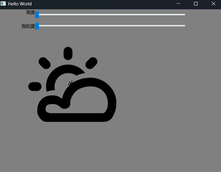
HSL着色
即色调、饱和度与亮度
常用
    Colorize{
        id:hsl1
        source:img
        anchors.fill: img
        hue:0//色调,范围0~1
        saturation: 0//饱和度,范围0~1
        lightness: 0//亮度,范围-1~1
    }
在onValueChanged里可以改成这样
hsl1.hue=value
也可以单独设置饱和度
    Desaturate{
    	//其余属性与Colorize差不多
        desaturation: 1//0~1
    }
其他
    GammaAdjust{//光照因子,用于模拟光照
        gamma:0
    }

    HueSaturation{
        //其他一样
        hue:0//-1~1
        saturation: 0//-1~1
        lightness: 0//-1~1
    }
HueSaturation与Colorize主要不同点在于对色相和饱和度属性值的处理方式不同。HueSaturation始终基于原始值进行色相、饱和度和明度偏移,而非直接设定这些数值
Blur
常见的几种模糊如下,懒得截图了,效果见官方文档
快速、高斯和递归模糊
Image{
	id:img
	source: "qrc:/res/img/Table.png"
}
 FastBlur{
        anchors.fill: img
        source:img
        radius:10
    }

    GaussianBlur{
        anchors.fill: img
        source:img
        radius:10
    }

    RecursiveBlur{
        anchors.fill: img
        source:img
        radius:10
        loops:10//递归次数
    }
遮罩模糊
//搭配LinearGradient使用
    LinearGradient{
        id:mask
        start:Qt.point(0,0)
        end:Qt.point(100,100)
        GradientStop{position: 0;color:"#00000000"}
        GradientStop{position: 1;color:"#ff000000"}
    }

    MaskedBlur{
        anchors.fill: img
        source:img
        radius:10
        maskSource: mask
    }
其他
DirectionalBlur{
//source那些略
		radius:11
		samples:11
		angle:45
}
RadialBlur{
		radius:11
		samples:11
		angle:45
}
ZoomBlur{
		radius:11
		samples:11
}
覆盖与混合
ColorOverlay
ColorOverlay{
        anchors.fill: item
        source:img
        color: "#50ff0000"//这是我随便填的
    }
官方的效果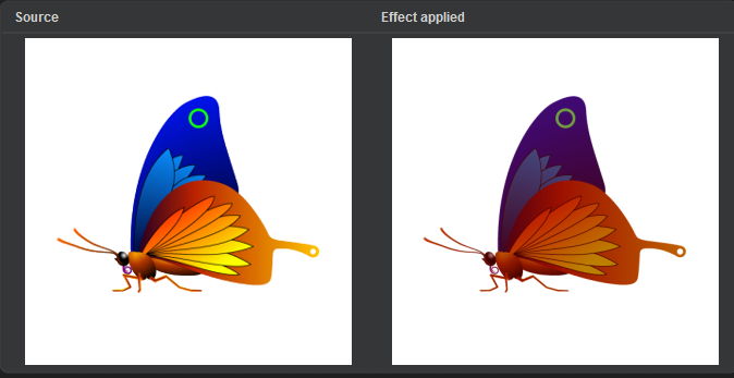
Blend
 Blend{
        anchors.fill: item
        source:img1
        foregroundSource: img2
        mode:"average"
    }
效果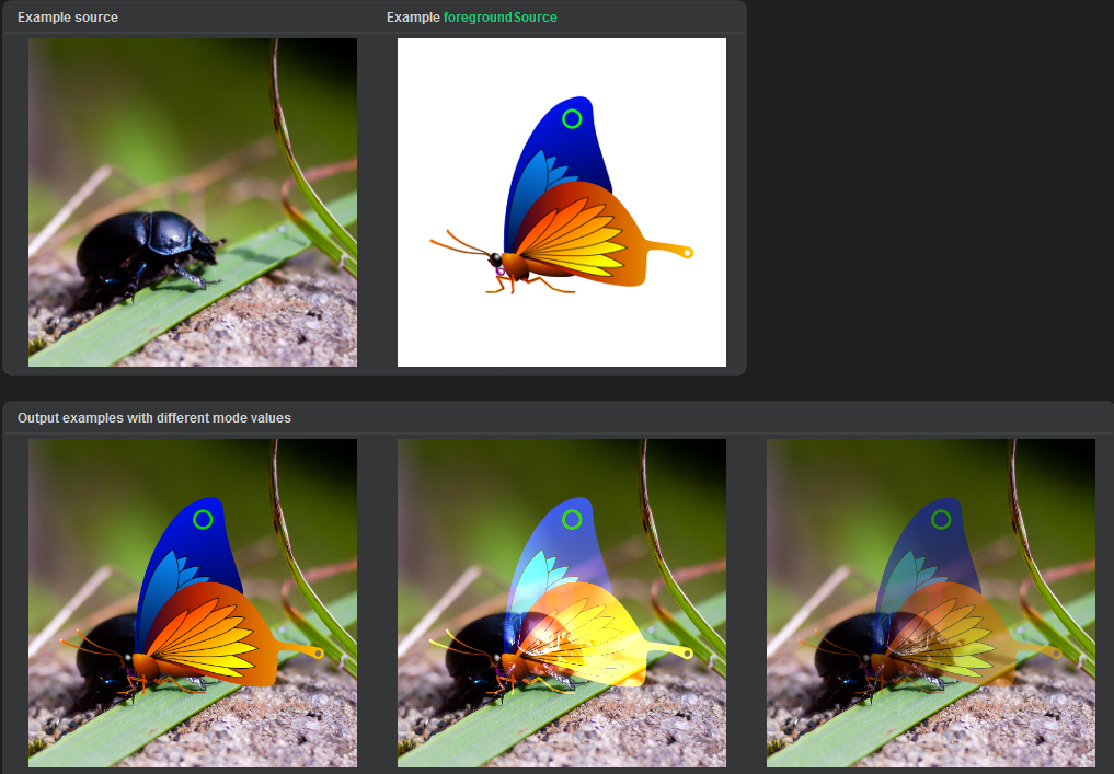
阴影与发光
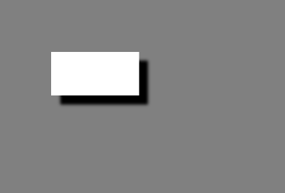
阴影
投影
DropShadow{
        anchors.fill: a
        source: a
        horizontalOffset: 10
        verticalOffset: 10
        radius:5
        samples:radius*2//一般这么设置。奈奎斯特定理?
        transparentBorder: true
    }
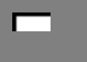
内阴影
InnerShadow{
        anchors.fill: a
        source: a
        horizontalOffset: 10
        verticalOffset: 10
        radius:5
        samples:radius*2
    }
发光
Glow
 Glow{
        anchors.fill: a
        source: a
        color: "cyan"
        radius:5
        samples:radius*2
    }
效果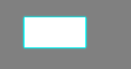
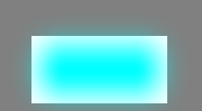
RectangularGlow
    RectangularGlow{
        anchors.fill: a
        color: "cyan"
        cornerRadius: Math.min(a.height,a.width)/2+glowRadius//这么设置会比较好看
    }
布局
ListView
本节为核心内容,涉及到三个重要板块代理、视图与模型
用一个小案例来学习这些模块(本节冗余代码很多,实际中不会这么写的。此案例仅用于学习)
要用到的包
import QtQuick
import QtQuick.Window
import QtQuick.Controls
import QtQuick.Dialogs
import Qt5Compat.GraphicalEffects
import QtQml.Models
import Qt.labs.platform as Platform
model用于携带数据,delegate用于绘制数据?
ListView{
        id:lv
        anchors.fill: parent
        model: ["A","B","C"]
        spacing:10
        delegate:Rectangle{
            width: lv.width
            height: 50
            color:"red"
            border.color: "yellow"
            border.width:1
            Text{
                anchors.centerIn: parent
                font.pixelSize: 30
                text:modelData//只有model是字符串数组这种形式时才会生效
            }
        }
    }
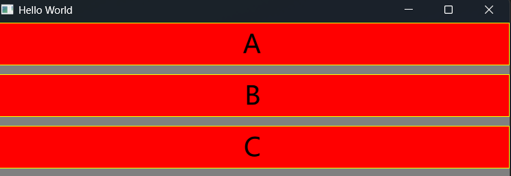
//往模型里添加数据
ListModel{
	ListElement{
			name:"张三"
			age:14
	}
	ListElement{
			name:"张三A"
			age:14
	}
	ListElement{
			name:"张三B"
			age:14
	}
	ListElement{
			name:"张三C"
			age:14
	}
	//后边还加了别的,但是和上边的代码一模一样,就不写了
}
麻了,我也不知道该从哪讲起了,直接看注释吧,反正也不难理解
Column{
        spacing: 10
        anchors.right: parent.right
        Button{
            width: 100
            text:"添加"
            onClicked: {
                lm.append({name:"王五"+lm.count,age:11})//尾插法
                //lm.insert(0,{name:"王五"+lm.count,age:11})//可以指定插入位置,此为头插法
                //lv.positionViewAtBeginning()//固定视角在头部
                lv.positionViewAtEnd()//同理
            }
        }
        Button{
            width: 100
            text:"删除"
            onClicked: {
                lm.remove(lm.count-1)
            }
        }
    }

    ListView{
        id:lv
        anchors.fill: parent
        anchors.rightMargin: 200
        spacing: 10
        model:lm

        highlight:Item{
            width: 800
            height: 50
            z:2//设置layer
            function setText(name,age){//设置一方法用于获取name和age
                nameHT.text=name
                ageHT.text=age
            }

            Rectangle{
                anchors.left: parent.left
                anchors.top: parent.top
                anchors.bottom:parent.bottom
                width: parent.width/2-5
                color: "cyan"
                Text{
                    id:nameHT
                    anchors.centerIn: parent
                    font.pixelSize: 30
                }
            }
            Rectangle{
                anchors.right: parent.right
                anchors.top: parent.top
                anchors.bottom:parent.bottom
                width: parent.width/2-5
                color: "cyan"
                Text{
                    id:ageHT
                    anchors.centerIn: parent
                    font.pixelSize: 30
                }
            }
        }

        header:Item{
            width: parent.width
            height: 50
            z:3
            Rectangle{
                anchors.left: parent.left
                anchors.top: parent.top
                anchors.bottom:parent.bottom
                width: parent.width/2-5
                color: "green"
                Text{
                    anchors.centerIn: parent
                    font.pixelSize: 30
                    text: "姓名"
                }
            }
            Rectangle{
                anchors.right: parent.right
                anchors.top: parent.top
                anchors.bottom:parent.bottom
                width: parent.width/2-5
                color: "green"
                Text{
                    anchors.centerIn: parent
                    font.pixelSize: 30
                    text: "年龄"
                }
            }
        }

        footer:Rectangle{
            width: parent.width
            height: 50
            z:3
            color: "pink"
            Text{
                anchors.centerIn: parent
                font.pixelSize: 30
                text: "表尾"
            }
        }

        //添加动画
        add:Transition{
            NumberAnimation {
                property: "y"//插入时数据会往下移,所以为y
                duration: 1000
            }
        }

        addDisplaced: Transition {
            NumberAnimation {
                property: "y"
                duration: 100
            }
        }

        //删除动画
        remove: Transition{
            NumberAnimation {
                property: "opacity"
                from: 1
                to:0
                duration: 200
            }
        }

        removeDisplaced: Transition{
            NumberAnimation {
                property: "opacity"
                from: 1
                to:0
                duration: 200
            }
        }

        //固定表头与表尾
        footerPositioning:ListView.OverlayFooter
        headerPositioning:ListView.OverlayHeader

        section{
            property: "name"
            labelPositioning: ViewSection.CurrentLabelAtStart//仅显示一个在开头
            criteria: ViewSection.FirstCharacter//一般都用这个
            delegate: Rectangle{
                width: 50
                height: 50
                radius: 25
                Text{
                    anchors.centerIn: parent
                    text:section//也是内置属性
                }
            }
        }

        //在代理中添加鼠标键盘事件
        delegate:Item{
            width: 800
            height: 50
            Rectangle{
                id:leftR
                anchors.left: parent.left
                anchors.top: parent.top
                anchors.bottom:parent.bottom
                width: parent.width/2-5
                color: "red"
                border.color: "yellow"
                Text{
                    anchors.centerIn: parent
                    font.pixelSize: 30
                    text: name
                }
            }
            Rectangle{
                id:leftL
                anchors.right: parent.right
                anchors.top: parent.top
                anchors.bottom:parent.bottom
                width: parent.width/2-5
                color: "red"
                border.color: "yellow"
                Text{
                    anchors.centerIn: parent
                    font.pixelSize: 30
                    text: age
                }
            }

            MouseArea{
                anchors.fill: parent
                hoverEnabled: true
                onEntered: {
                    lv.currentIndex=index//也是内置的属性,表示当前代理在数据中的索引
                    lv.highlightItem.setText(name,age)//通过highlightItem访问
                }
                onClicked: {
                    //console.log(lv.indexAt(200,200))//返回指定坐标索引
                    //console.log(lv.itemAtIndex(0).dy())
                    //获取指定item。若在index0内定义了dy函数,则可以这么调用
                }
            }
        }
    }
其他
实现对齐更简单,高复用的方法就是使用行布局和列布局
行与列布局
//列布局同理
 Row{
        spacing:10
        anchors.centerIn: parent
        layoutDirection: "RightToLeft"//从右到左展示
        topPadding: 300//往下移300px
        Rectangle{
            id:r1
            color:"pink"
            height: 100
            width: 100
        }

        Rectangle{
            id:r2
            color:"cyan"
            height: 100
            width: 100
        }

        Rectangle{
            id:r3
            color:"blue"
            height: 100
            width: 100
        }
    }
可以看出来这样减少了重复代码且能实现一样的效果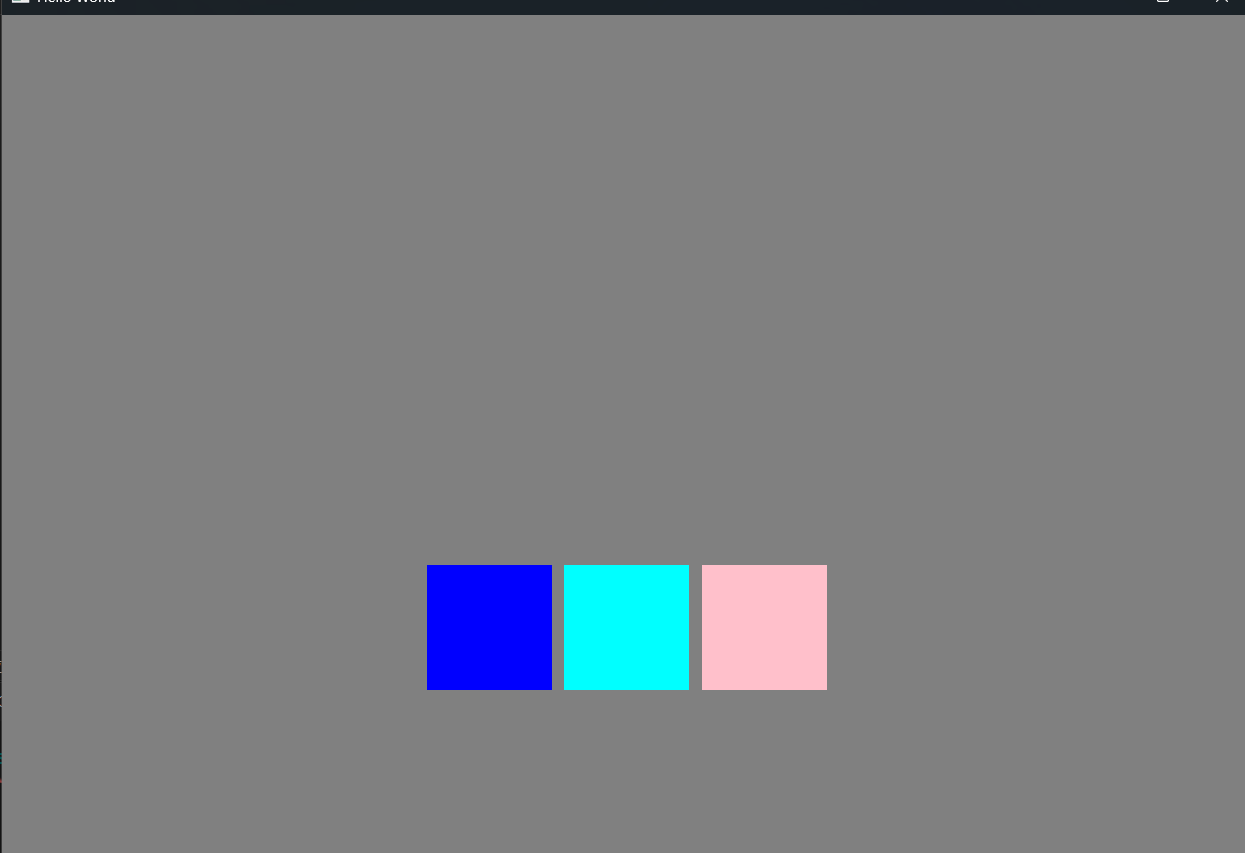
网格布局
 Grid{
        spacing:10
        anchors.centerIn: parent
        columns: 2
        rows: 2
        flow: Grid.TopToBottom
        Rectangle{
            id:r1
            color:"pink"
            height: 100
            width: 100
        }

        Rectangle{
            id:r2
            color:"cyan"
            height: 100
            width: 100
        }

        Rectangle{
            id:r3
            color:"blue"
            height: 100
            width: 100
        }
        Rectangle{
            id:r4
            color:"red"
            height: 100
            width: 100
        }
    }
flow: Grid.TopToBottom情况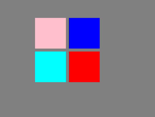
默认情况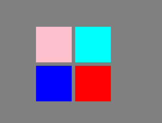
GridLayout/RowLayout/ColumnLayout
这些和Grid/Row/Column的区别是对其进行拉伸时里边的物体也会大小也会跟着拉伸
 RowLayout{
        anchors.centerIn: parent
        Rectangle{
            id:r1
            color:"pink"
            height: 100
            width: 100
        }

        Rectangle{
            id:r2
            color:"cyan"
            height: 100
            width: 100
            //设置对齐方式
            Layout.alignment: Qt.AlignCenter|Qt.AlignTop
            Layout.minimumHeight: 100
            Layout.maximumHeight: 100
            //填充
            Layout.fillHeight: true
            Layout.fillWidth: true
        }
补充:
- 实际开发中不会把全部逻辑都放在main.qml里的,就跟C++新建一个类一样
- 使用非当前目录下的组件时要import其路径
C++访问qml组件
首先在根节点下创建一矩形框
Window {
    width: 1000
    height: 680
    visible: true
    title: qsTr("Hello World")
    color:"gray"
    Rectangle{
        objectName:"rec"//注意这里不是用id
        height: 300
        width: 300
        anchors.centerIn: parent
        color: "red"
    }
}
在main.cpp内访问组件
#include<QQmlProperty>
int main()
{
	QObject* obj=engine.rootObjects().first();
    QQmlProperty(obj,"title").write("Window");//修改主窗口title
    auto rec=obj->findChild<QObject*>("rec");
    QQmlProperty(rec,"color").write("yellow");//修改子窗口颜色
}
访问信号与函数
在根节点内定义一信号与函数
signal sig()
    function test(arg){
        console.log("Testarg")
        return "recv"
    }
    onSig:{
        console.log("triggered")
    }
可以这么访问
	QMetaObject::invokeMethod(obj,"sig");
    QVariant ret;
    QMetaObject::invokeMethod(obj,"test",Q_RETURN_ARG(QVariant,ret),Q_ARG(QVariant,"sad"));
    qDebug()<<ret;
控制台输出
qml: triggered
qml: Testarg
QVariant(QString, "recv")
使用信号与槽(Qt5)
此方法仅限Qt5,Qt6需要别的方法
新建一个类继承QObject并添加宏Q_OBJECT
class TestSlots:public QObject
{
    Q_OBJECT
public:
    TestSlots();
public slots:
    void printH();
};
在main函数内连接
#include"testslots.h"
int main()
{
	auto testS=new TestSlots();
    QObject::connect(obj,SIGNAL(sig()),testS,SLOT(printH()));
}
开源鸿蒙跨平台开发社区汇聚开发者与厂商,共建“一次开发,多端部署”的开源生态,致力于降低跨端开发门槛,推动万物智联创新。
更多推荐


 8
8 0
0- 0


 已为社区贡献2条内容

所有评论(0)