Flutter三方库使用-屏幕适配(flutter_screenutil )
·
1. 添加依赖
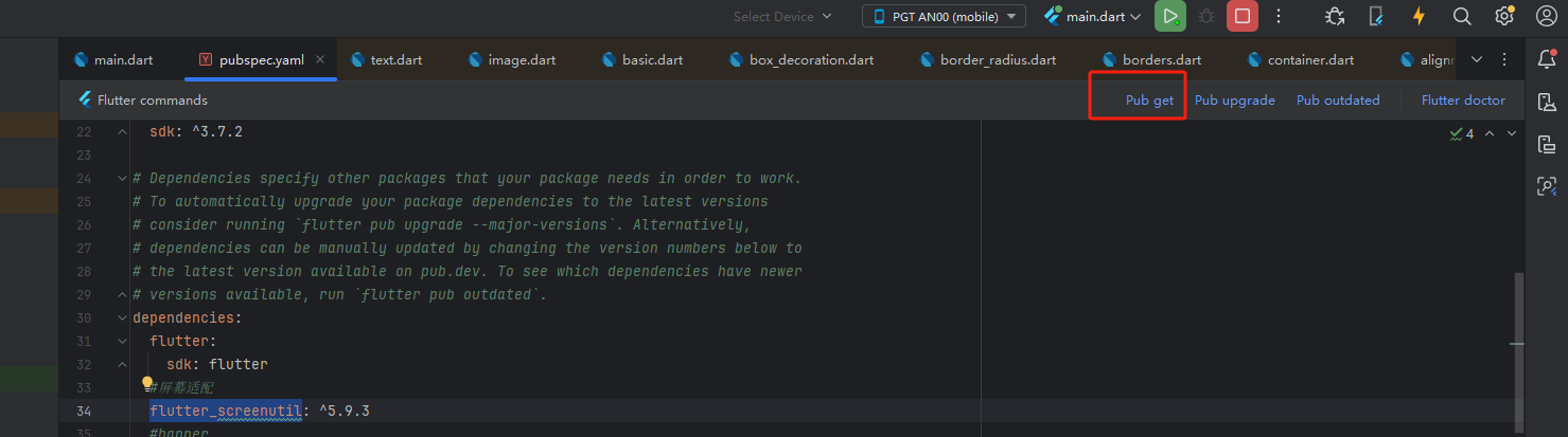
在 pubspec.yaml 中添加最新版本的 flutter_screenutil:
dependencies:
  flutter:
    sdk: flutter
  # add flutter_screenutil
  flutter_screenutil: ^{latest version}
实例图:

运行 flutter pub get 安装依赖。
实例图
2. 初始化适配
在根 Widget(如 MaterialApp)外包裹 ScreenUtilInit,并设置设计稿尺寸:
void main() => runApp(MyApp());

class MyApp extends StatelessWidget {
  @override
  Widget build(BuildContext context) {
    return ScreenUtilInit(
      designSize: const Size(360, 690), // 设计稿尺寸(单位:逻辑像素)
      minTextAdapt: true, // 是否根据宽度/高度自适应文本
      splitScreenMode: true, // 支持分屏尺寸
      builder: (context, child) {
        return MaterialApp(
          home: child,
        );
      },
      child: const HomePage(),
    );
  }
}
3. 在代码中使用适配单位
3.1 基本单位
-
.w: 根据屏幕宽度适配。 -
.h: 根据屏幕高度适配。 -
.r: 根据宽/高中较小者适配(常用于圆角)。
Container(
  width: 200.w,    // 相当于设计稿中 200 的宽度
  height: 100.h,   // 相当于设计稿中 100 的高度
  decoration: BoxDecoration(
    borderRadius: BorderRadius.circular(10.r), // 自适应圆角
  ),
);
3.2 字体适配
-
.sp: 根据屏幕宽度或高度自适应文本(推荐优先使用宽度)。
Text(
  'Hello ScreenUtil',
  style: TextStyle(fontSize: 24.sp),
);
3.3 获取屏幕信息
ScreenUtil().screenWidth;  // 屏幕宽度
ScreenUtil().screenHeight; // 屏幕高度
ScreenUtil().pixelRatio;   // 设备像素密度
4. 横竖屏切换处理
在 build 方法中动态响应屏幕方向变化:
@override
Widget build(BuildContext context) {
  ScreenUtil.init(context, designSize: Size(360, 690)); // 重新初始化适配
  return Scaffold(...);
}
示例代码:
class HomePage extends StatelessWidget {
  const HomePage({Key? key}) : super(key: key);

  @override
  Widget build(BuildContext context) {
    return Scaffold(
      appBar: AppBar(
        title: Text('ScreenUtil Demo', style: TextStyle(fontSize: 20.sp)),
      ),
      body: Center(
        child: Column(
          children: [
            Container(
              width: 300.w,
              height: 150.h,
              margin: EdgeInsets.all(10.r),
              decoration: BoxDecoration(
                color: Colors.blue,
                borderRadius: BorderRadius.circular(15.r),
              ),
              child: Text(
                '自适应容器',
                style: TextStyle(fontSize: 18.sp, color: Colors.white),
              ),
            ),
            SizedBox(height: 20.h),
            Text('屏幕宽度: ${ScreenUtil().screenWidth}px', style: TextStyle(fontSize: 16.sp)),
            Text('屏幕高度: ${ScreenUtil().screenHeight}px', style: TextStyle(fontSize: 16.sp)),
          ],
        ),
      ),
    );
  }
}
6. 注意事项
-
设计稿尺寸:
designSize必须与设计稿一致(通常由 UI 设计师提供)。 -
文本适配:若
minTextAdapt: true,文本会根据屏幕宽度或高度较小者适配。 -
热重载问题:修改设计稿尺寸后可能需要重启应用生效。
-
单元测试:在测试环境中需手动初始化
ScreenUtil。

开源鸿蒙跨平台开发社区汇聚开发者与厂商,共建“一次开发,多端部署”的开源生态,致力于降低跨端开发门槛,推动万物智联创新。
更多推荐


 4
4 0
0- 0


 已为社区贡献10条内容

所有评论(0)