Flutter App 底部导航栏页面框架
Flutter App 底部导航栏页面框架一、使用BottomNavigationBar 底部导航栏在 Scaffold 的 bottomNavigationBar 属性设置底部导航栏 ;设置当前索引 : BottomNavigationBar的 currentIndex 属性设置当前底部导航栏的选中索引 , 为其设置一个变量 , 改变该变量值后 , 通过 setState 方法更新 UI 显示
一、使用BottomNavigationBar 底部导航栏
在 Scaffold 的 bottomNavigationBar 属性设置底部导航栏 ;
设置当前索引 : BottomNavigationBar的 currentIndex 属性设置当前底部导航栏的选中索引 , 为其设置一个变量 , 改变该变量值后 , 通过 setState 方法更新 UI 显示 ;
设置点击方法 : BottomNavigationBar 的 onTap 属性设置点击方法 , 传入 index 索引 , 该索引值是被点击的按钮索引 , 在该方法中主要操作当前的 currentIndex 属性变量 , 以及 PageView 页面跳转 ;
底部按钮设置 : BottomNavigationBar 的 item 属性设置若干 BottomNavigationBarItem 类型的点击按钮 ;
Scaffold(
      body: IndexedStack(
        index: _currentIndex,
        children: _pages,
      ),
      bottomNavigationBar: NavigationBar(
        selectedIndex: _currentIndex,
        onDestinationSelected: (int index) {
          setState(() {
            _currentIndex = index;
          });
        },
        destinations: const [
          NavigationDestination(
            icon: Icon(Icons.home_outlined),
            selectedIcon: Icon(Icons.home),
            label: '首页',
          ),
          NavigationDestination(
            icon: Icon(Icons.search_outlined),
            selectedIcon: Icon(Icons.search),
            label: '搜索',
          ),
          NavigationDestination(
            icon: Icon(Icons.rule_rounded),
            selectedIcon: Icon(Icons.rule_outlined),
            label: '关于',
          ),
          NavigationDestination(
            icon: Icon(Icons.person_outline),
            selectedIcon: Icon(Icons.person),
            label: '我的',
          ),
        ],
      ),
    );
二、首页
待完善
Scaffold(
      appBar: AppBar(
        title: const Text('首页'),
        elevation: 0,
      ),
      body: SingleChildScrollView(
        padding: const EdgeInsets.all(24),
        child: Column(
          crossAxisAlignment: CrossAxisAlignment.start,
          children: [
            // 标题和图标
            Center(
              child: Column(
                children: [
                  Icon(
                    Icons.code_rounded,
                    size: 80,
                    color: theme.colorScheme.primary,
                  ),
                  const SizedBox(height: 16),
                  Text(
                    '待完善',
                    style: theme.textTheme.headlineMedium?.copyWith(
                      fontWeight: FontWeight.bold,
                      color: theme.colorScheme.primary,
                    ),
                  ),
                ],
              ),
            ),
          ],
        ),
      ),
    );
三、搜索页
搜索其他库或作者页面,待完善
四、关于页
项目介绍页面
使用SingleChildScrollView组件,这是一个可滚动的组件,用于包裹单个子组件并实现滚动功能,类似于Android中的ScrollView。以下是核心特性与使用方法:
1)核心属性
scrollDirection:滚动方向(默认垂直,可设为水平)
reverse:控制滚动初始位置(false在顶部,true在底部)
padding:内边距
physics:定义滚动行为(如弹性或微光效果)
controller:用于监听或控制滚动位置
2)使用场景
适用于内容较少的滚动需求(如单个Column/Row)
不支持Sliver延迟加载,大量内容时性能较差,建议改用ListView
singleChildScrollView(
        padding: const EdgeInsets.all(24),
        child: Column(
          crossAxisAlignment: CrossAxisAlignment.start,
          children: [
            // 标题和图标
            Center(
              child: Column(
                children: [
                  Icon(
                    Icons.code_rounded,
                    size: 80,
                    color: theme.colorScheme.primary,
                  ),
                  const SizedBox(height: 16),
                  Text(
                    'GitCode 口袋工具',
                    style: theme.textTheme.headlineMedium?.copyWith(
                      fontWeight: FontWeight.bold,
                      color: theme.colorScheme.primary,
                    ),
                  ),
                  ......
                  ......
五、我的
显示我的一些基本信息页面
SingleChildScrollView(
        padding: const EdgeInsets.all(24),
        child: Column(
          children: [
            const SizedBox(height: 20),

            // 头像和姓名
            _buildAvatarSection(context, theme),
            const SizedBox(height: 32),

            // 个人信息卡片
            _buildInfoCard(
              context,
              theme,
              title: '个人信息',
              icon: Icons.person_outline,
              children: [
                _buildInfoItem(
                  context,
                  icon: Icons.person,
                  label: '姓名',
                  value: name,
                ),
                const Divider(),
                _buildInfoItem(
                  context,
                  icon: Icons.account_circle,
                  label: 'GitCode账号',
                  value: gitcodeUsername,
                ),
              ],
            ),
            const SizedBox(height: 16),
            .......
            ......
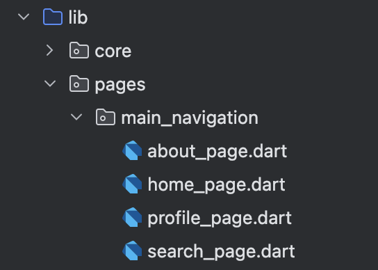
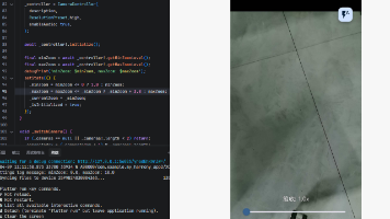
六、代码结构
在鸿蒙手机上运行,底部的效果: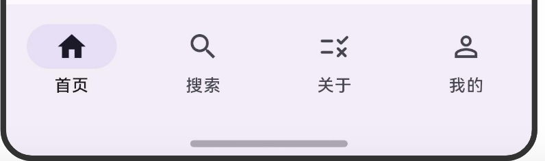
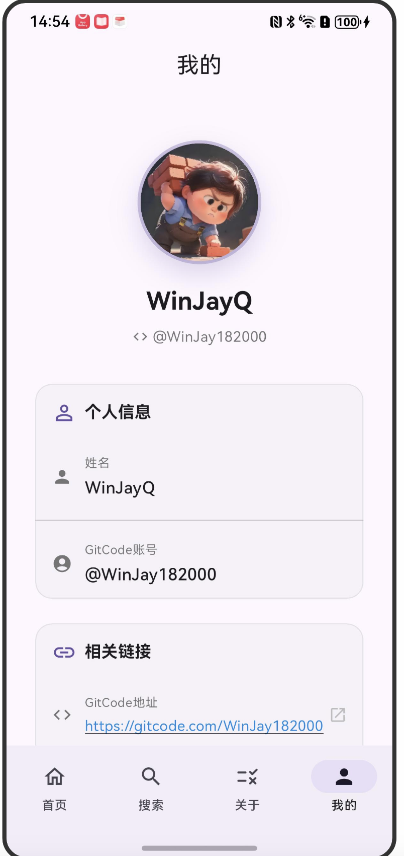
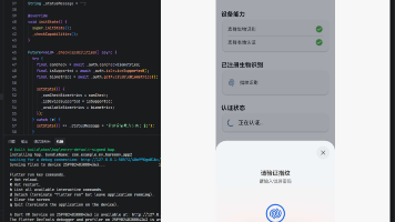
我的页面效果:

开源鸿蒙跨平台开发社区汇聚开发者与厂商,共建“一次开发,多端部署”的开源生态,致力于降低跨端开发门槛,推动万物智联创新。
更多推荐
 3
3 0
0- 0


 已为社区贡献3条内容

所有评论(0)