不练不熟,不写就忘 之 compose 之 动画之 animateColorAsState动画练习
·
使用场景
- 控件状态切换(选中 / 未选中、启用 / 禁用)
- 主题切换(浅色 / 深色模式)
- 交互反馈(按钮按压、列表 item 滑动)
- 数据状态可视化(进度、等级、状态提示)
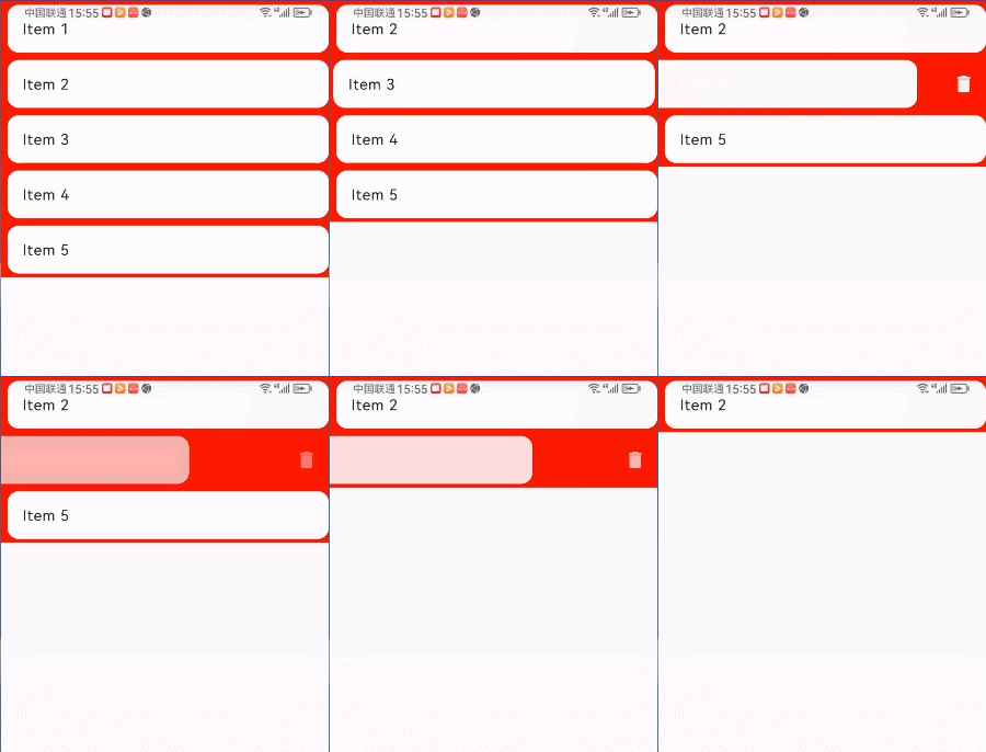
- 列表 Item 滑动删除(背景色渐变)
控件状态切换(选中 / 未选中、启用 / 禁用)
@Composable
fun AnimatedTab() {
    // 控制选中状态
    var isSelected by remember { mutableStateOf(false) }

    // 1. 背景色动画:选中→蓝色,未选中→灰色(默认动画时长 300ms)
    val bgColor by animateColorAsState(
        targetValue = if (isSelected) Color(0xFF2196F3) else Color(0xFFF5F5F5),
        label = "tab_bg_color" // 无障碍标签,必填
    )

    // 2. 文字色动画:选中→白色,未选中→黑色
    val textColor by animateColorAsState(
        targetValue = if (isSelected) Color.White else Color.Black,
        label = "tab_text_color"
    )

    Text(
        text = if (isSelected) "已选中" else "未选中",
        color = textColor,
        modifier = Modifier
            .padding(16.dp)
            .background(color = bgColor, shape = RoundedCornerShape(8.dp))
            .clickable { isSelected = !isSelected }
            .padding(12.dp)
    )
}
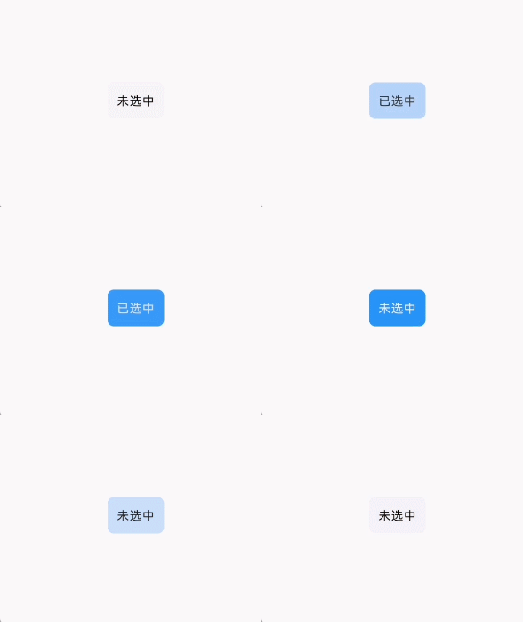
效果:
点击标签时,背景色从灰色渐变到蓝色,文字色从黑色渐变到白色,过渡自然无卡顿。
主题切换(浅色 / 深色模式)
@Composable
fun AnimatedThemeSwitch() {
    // 获取系统深色模式状态(也可替换为自定义主题开关)
//    val isDarkMode = LocalConfiguration.current.uiMode and android.content.res.Configuration.UI_MODE_NIGHT_MASK ==
//            android.content.res.Configuration.UI_MODE_NIGHT_YES
    var isDarkMode by remember { mutableStateOf(false) }

    // 主题色动画:深色模式→深灰背景+白色文字,浅色模式→白色背景+深灰文字
    val bgColor by animateColorAsState(
        targetValue = if (isDarkMode) Color(0xFF121212) else Color.White,
        label = "theme_bg_color"
    )
    val textColor by animateColorAsState(
        targetValue = if (isDarkMode) Color.White else Color(0xFF333333),
        label = "theme_text_color"
    )

    Box(
        modifier = Modifier
            .fillMaxSize()
            .background(bgColor)
    ) {
        Text(
            text = if (isDarkMode) "深色模式" else "浅色模式",
            color = textColor,
            fontSize = 24.sp,
            textAlign = TextAlign.Center,
            modifier = Modifier.fillMaxSize().padding(top = 100.dp).clickable{ isDarkMode = !isDarkMode}
        )
    }
}
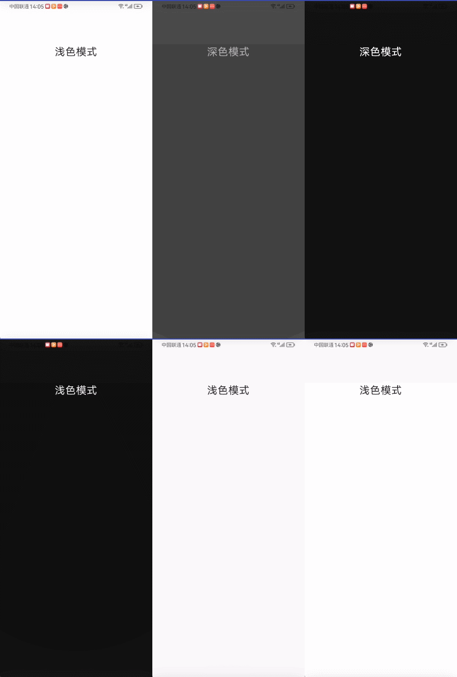
效果:系统切换深色 / 浅色模式时,页面背景色和文字色平滑渐变,避免生硬切换。
交互反馈(按钮按压、列表 item 滑动)
@Composable
fun AnimatedPressButton() {
    // 控制按压状态(通过 clickable 的 onPress 回调)
    var isPressed by remember { mutableStateOf(false) }
    val interactionSource = remember { MutableInteractionSource() }

    // 颜色动画:按压→深绿色,释放→浅绿色
    val buttonColor by animateColorAsState(
        targetValue = if (isPressed) Color(0xFF388E3C) else Color(0xFF4CAF50),
        label = "button_press_color"
    )

    Box(
        modifier = Modifier
            .size(120.dp)
            .background(color = buttonColor, shape = CircleShape)
            .clickable(
                interactionSource = interactionSource,
                indication = null,
                role = Role.Button,
                onClick = {}
            )
            .pointerInput(Unit){
                detectTapGestures(
                    onPress = {
                        isPressed = true
                        tryAwaitRelease()
                        isPressed = false
                    }
                )
            }
        ,
        contentAlignment = Alignment.Center
    ) {
        Text(text = "按压我", color = Color.White, fontSize = 18.sp)
    }
}
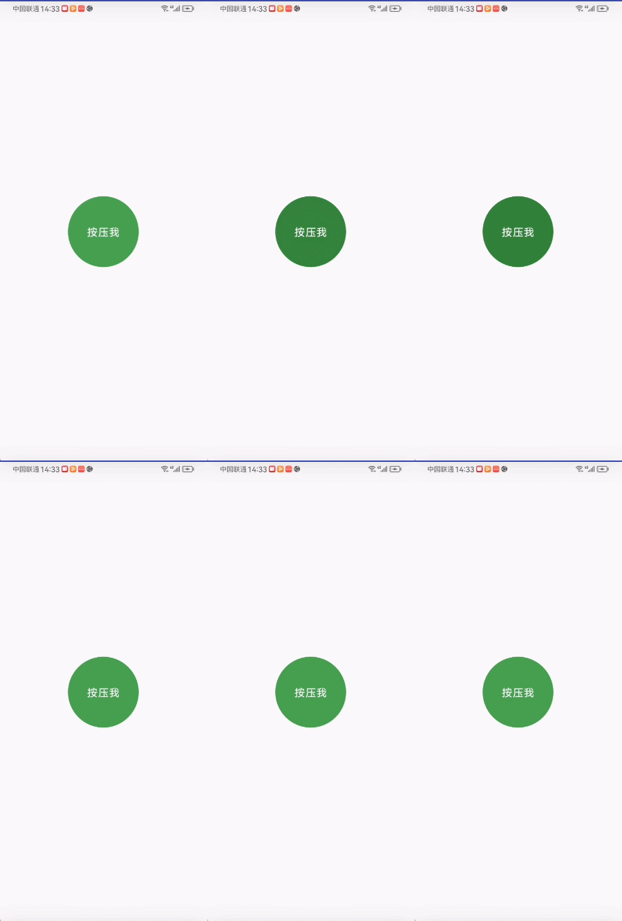
效果:按压按钮时,颜色从浅绿色渐变到深绿色;释放时反向渐变,模拟 “按压凹陷” 的视觉反馈。
数据状态可视化(进度、等级、状态提示)
@Composable
fun AnimatedProgressBar() {
    // 模拟进度变化(0~100)
    var progress by remember { mutableStateOf(0f) }
    val scope = rememberCoroutineScope()
    var job: Job? by remember { mutableStateOf(null) } // 用于手动取消协程的 Job

    // 颜色逻辑:0%→红色,50%→黄色,100%→绿色
    val targetColor = when {
        progress < 30f -> Color(0xFFF44336)
        progress < 70f -> Color(0xFFFFC107)
        else -> Color(0xFF4CAF50)
    }

    // 进度条颜色动画
    val progressColor by animateColorAsState(
        targetValue = targetColor,
        label = "progress_color"
    )
    Column(
        horizontalAlignment = Alignment.CenterHorizontally
    ) {
        Box(
            modifier = Modifier
                .fillMaxWidth()
                .padding(horizontal = 32.dp)
                .height(24.dp)
                .background(color = Color.LightGray, shape = RoundedCornerShape(12.dp))
        ) {
            Box(
                modifier = Modifier
                    .fillMaxWidth(fraction = progress / 100f)
                    .height(24.dp)
                    .background(color = progressColor, shape = RoundedCornerShape(12.dp))
            )
            Text(
                text = "${progress.toInt()}%",
                color = Color.Black,
                modifier = Modifier.padding(start = 16.dp, top = 2.dp)
            )
        }

        Spacer(modifier = Modifier.height(10.dp))

        AnimatedPressButton(onPress = {
            if (it) {
                job = scope.launch {
                    repeat(10) {
                        delay(500)
                        progress += 10f
                    }
                }
            } else {
                job?.cancel()
            }
        })
    }
}

@Composable
fun AnimatedPressButton(onPress: (Boolean) -> Unit) {
    // 控制按压状态(通过 clickable 的 onPress 回调)
    var isPressed by remember { mutableStateOf(false) }

    // 颜色动画:按压→深绿色,释放→浅绿色
    val buttonColor by animateColorAsState(
        targetValue = if (isPressed) Color(0xFF388E3C) else Color(0xFF4CAF50),
        label = "button_press_color"
    )

    Box(
        modifier = Modifier
            .size(120.dp)
            .background(color = buttonColor, shape = CircleShape)
            .pointerInput(Unit) {
                detectTapGestures(
                    onPress = {
                        isPressed = true
                        onPress(isPressed)
                        tryAwaitRelease()
                        isPressed = false
                        onPress(isPressed)
                    }
                )
            },
        contentAlignment = Alignment.Center
    ) {
        Text(text = "开始", color = Color.White, fontSize = 18.sp)
    }
}
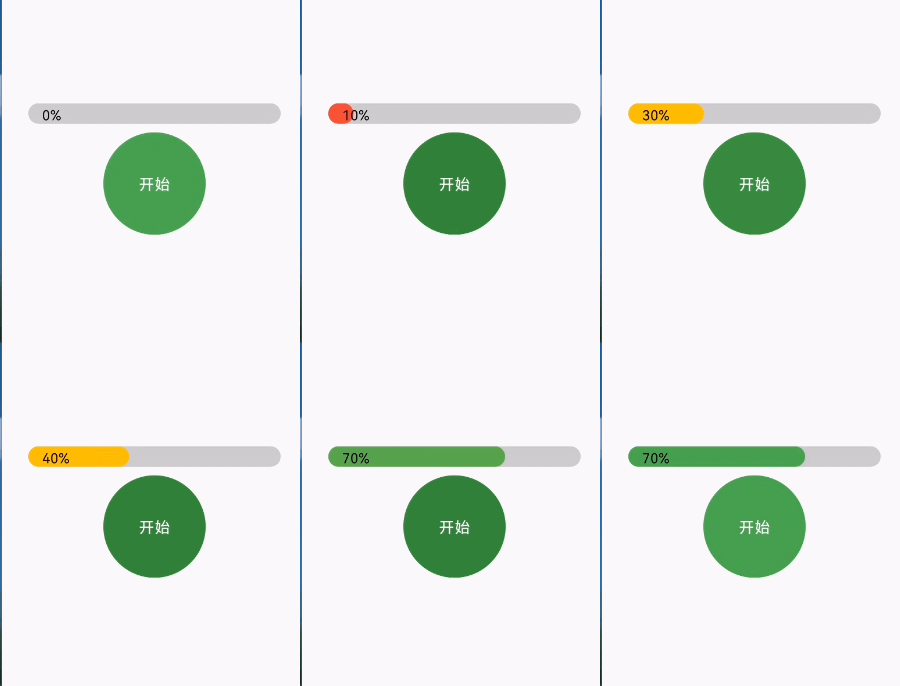
效果:进度从 0% 增长到 100% 时,进度条颜色平滑从红色→黄色→绿色过渡,直观反映进度状态。
列表 Item 滑动删除(背景色渐变)
@OptIn(ExperimentalMaterial3Api::class)
@Composable
fun SwipeToDismissWithColorAnimationDemo() {
    // 模拟列表数据(响应式更新)
    val items = remember { mutableStateListOf("Item 1", "Item 2", "Item 3", "Item 4", "Item 5") }

    LazyColumn(modifier = Modifier.fillMaxSize()) {
        items(items = items, key = { it }) { item ->
            // 1. 创建滑动状态
            val swipeState = rememberSwipeToDismissBoxState(
                confirmValueChange = { state ->
                    if (state == SwipeToDismissBoxValue.EndToStart) { // 右向左滑触发删除
                        items.remove(item)
                        true
                    } else {
                        false
                    }
                }
            )

            // 2. 核心:根据滑动进度动画过渡背景色
            // 滑动进度(0f = 未滑动,1f = 滑动到阈值)
            val swipeProgress = swipeState.progress
            // 动画目标色:未滑动(0f)→白色,滑动中(1f)→红色
            val backgroundColor by animateColorAsState(
                targetValue = if (swipeState.dismissDirection == SwipeToDismissBoxValue.EndToStart) {
                    // 仅当右向左滑时,根据进度渐变红色
                    Color.White.copy(alpha = 1f - swipeProgress * 0.8f) // 白色渐变到浅红(alpha 0.2f)
                    // 若想直接渐变到纯红色:Color.Red.copy(alpha = swipeProgress)
                } else {
                    Color.White // 其他状态(未滑动/左向右滑)保持白色
                },
                animationSpec = tween(durationMillis = 200), // 动画时长200ms,平滑过渡
                finishedListener = {
                    // 动画结束回调(可选)
                },
                label = "backgroundColorAnimation"
            )

            // 3. 滑动删除容器
            SwipeToDismissBox(
                state = swipeState,
                enableDismissFromStartToEnd = false, // 禁用左向右滑
                enableDismissFromEndToStart = true, // 启用右向左滑
                // 4. 背景组件(删除图标区域)
                backgroundContent = {
                    Box(
                        modifier = Modifier
                            .fillMaxSize()
                            .background(Color.Red) // 背景固定红色(与内容区动画区分)
                            .padding(horizontal = 20.dp),
                        contentAlignment = Alignment.CenterEnd
                    ) {
                        // 图标也可添加淡入动画(根据滑动进度)
                        val iconAlpha by animateColorAsState(
                            targetValue = Color.White.copy(alpha = swipeProgress),
                            animationSpec = tween(200),
                            label = "iconAlphaAnimation"
                        )
                        Icon(
                            imageVector = Icons.Default.Delete,
                            contentDescription = "删除",
                            tint = iconAlpha
                        )
                    }
                },
                // 5. 被滑动的内容组件(带背景色动画)
                content = {
                    Card(
                        modifier = Modifier
                            .fillMaxWidth()
                            .padding(vertical = 4.dp, horizontal = 8.dp),
                        elevation = CardDefaults.cardElevation(defaultElevation = 2.dp),
                        colors = CardDefaults.cardColors(
                            containerColor = backgroundColor // 绑定动画背景色
                        )
                    ) {
                        Text(
                            text = item,
                            modifier = Modifier.padding(16.dp),
                            style = MaterialTheme.typography.bodyLarge
                        )
                    }
                }
            )
        }
    }
}
效果:滑动列表项时,Item 背景色从白色渐变透明,逐渐透出红色删除背景,滑动体验更流畅
核心注意点
- 依赖 State 驱动:targetValue 必须是 State(如 remember { mutableStateOf() }),否则动画无法触发。
- label 必填:label 参数用于无障碍和调试,必须指定(Compose 1.2+ 强制要求)。
- 自定义动画参数:可通过 animationSpec 自定义动画时长、插值器(如 tween(1000) 延长到 1 秒,spring() 弹性动画
- 性能优化:避免在 animateColorAsState 中创建临时对象(如 Color(…) 可提前缓存),列表中使用时确保 key 稳定。
开源鸿蒙跨平台开发社区汇聚开发者与厂商,共建“一次开发,多端部署”的开源生态,致力于降低跨端开发门槛,推动万物智联创新。
更多推荐
 5
5 0
0- 0


 已为社区贡献15条内容

所有评论(0)