taro + react 如何自定义TabBar 不影响使用switchTab
对于一些具有独特业务逻辑和交互需求的小程序来说,原生 TabBar 可能无法满足复杂多变的场景。比如,某些应用需要在 TabBar 上实时展示动态信息或实现特定的动画效果,而这是原生 TabBar 难以实现的。从品牌塑造和用户体验的角度看,通过自定义 TabBar 可以更好地展现品牌特色,与整个应用的风格达到高度融合,给用户留下更深刻的印象,提升用户对应用的辨识度和黏性。但不可忽视的是,其原始问题
为什么需要自定义TabBar?
对于一些具有独特业务逻辑和交互需求的小程序来说,原生 TabBar 可能无法满足复杂多变的场景。比如,某些应用需要在 TabBar 上实时展示动态信息或实现特定的动画效果,而这是原生 TabBar 难以实现的。
从品牌塑造和用户体验的角度看,通过自定义 TabBar 可以更好地展现品牌特色,与整个应用的风格达到高度融合,给用户留下更深刻的印象,提升用户对应用的辨识度和黏性。
但不可忽视的是,其原始问题也很突出。原生 TabBar 的功能相对固定和简单,难以满足多样化的设计和功能诉求。
废话不多说直接上代码。
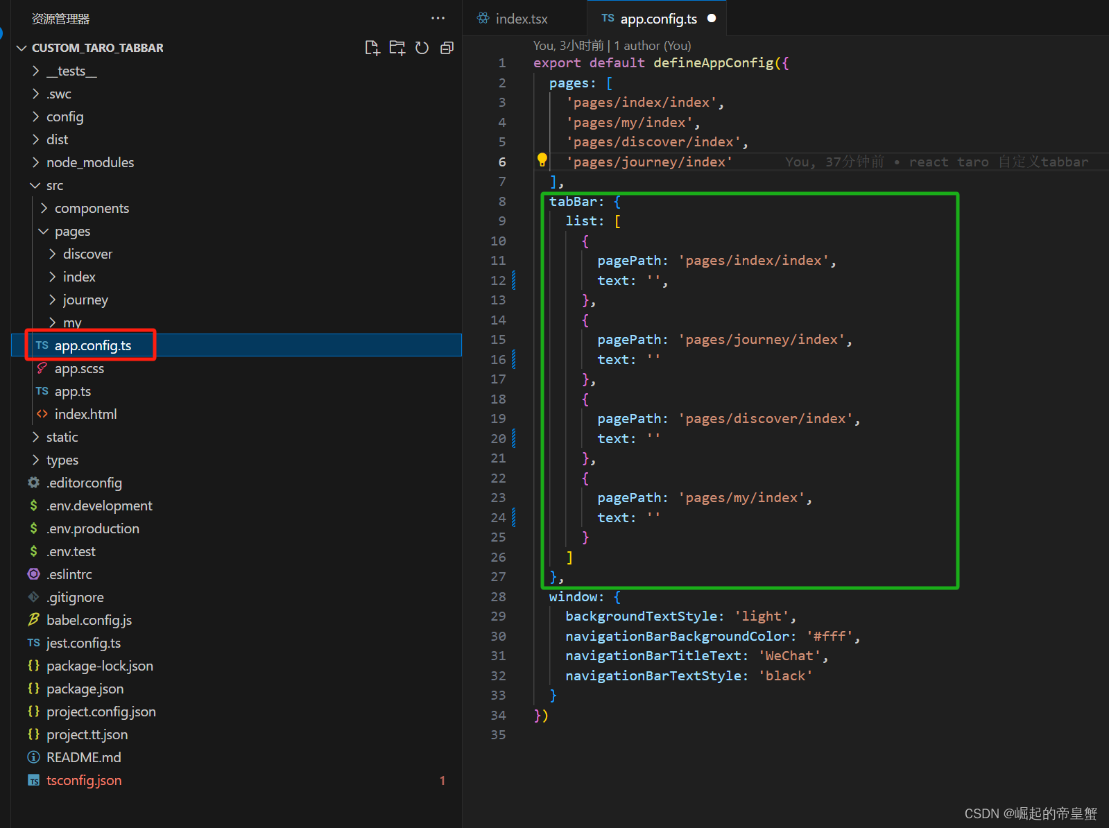
1.设置需要切换的tabBar 文件路径
这个里面还是需要提前定义好tabBar这个配置,我已经吧我需要的切换的tabBar文件页面提前创建好了
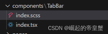
2.创建一个公用组件文件夹
个人习惯命名为components,然后再components下面再创建一个命名TabBar文件,文件组成有 index.tsx 和 index.scss 或者你可以写 index.less 样式文件可以随自己的喜好
index.scss 代码片段
.tabbar_main {
    position: fixed;
    bottom: 0;
    left: 0;
    right: 0;
    display: flex;
    justify-content: space-around;
    width: 100%;
    font-size: 28px;
    box-shadow: 0 0 3px 2px #e8e8e8;
    z-index: 1000;

    .tabbar_item {
        display: flex;
        flex-direction: column;
        align-items: center;
        padding-top: 18px;

        image {
            width: 56px;
            height: 56px;
        }
    }
}
index.tsx 代码片段
import { View, Image, Text } from "@tarojs/components"
import { hideTabBar, switchTab } from "@tarojs/taro"
import { useEffect } from "react";
import './index.scss';
interface Props {
currentPage: string; // 当前页面
color?: string | '#B7B7B7'; // 文字未选择颜色
checkedColor?: string | '#3C8DFF'; // 文字选择颜色
backgroundColor?: string | '#FFFFF'; // tabBar背景颜色
zIndex?: number | 1000; // 元素层级
}
interface TabBarItem {
pagePath: string
text: string
iconPath: string
selectedIconPath: string
}
export default ({ currentPage, color = '#B7B7B7', checkedColor = '#3C8DFF', backgroundColor = '#FFFFF', zIndex = 1000 }: Props) => {
const wordColor = color;
const selectColor = checkedColor;
const height = 150 / 2; // tabBar栏高度
const tabbarList: TabBarItem[] = [
{
pagePath: '/pages/index/index',
text: "首页",
iconPath: require(`../../../static/tabbar_img/home_icon.png`),
selectedIconPath: require('../../../static/tabbar_img/select_home_icon.png'),
},
{
pagePath: '/pages/journey/index',
text: '行程',
iconPath: require('../../../static/tabbar_img/journey_icon.png'),
selectedIconPath: require('../../../static/tabbar_img/select_journey_icon.png'),
},
{
pagePath: '/pages/discover/index',
text: '发现',
iconPath: require('../../../static/tabbar_img/discover_icon.png'),
selectedIconPath: require('../../../static/tabbar_img/select_discover_icon.png'),
},
{
pagePath: '/pages/my/index',
text: '我的',
iconPath: require('../../../static/tabbar_img/my_icon.png'),
selectedIconPath: require('../../../static/tabbar_img/select_my_icon.png'),
}
];
useEffect(() => {
hideTabBar(); // 隐藏tabBar栏
}, []);
function onNav(url: string) {
switchTab({ url });
}
return (
<View style={{ height }}>
<View className="tabbar_main" style={{ zIndex, backgroundColor, height }}>
{tabbarList.map((item, index) => {
return (
<View key={index} className="tabbar_item" onClick={() => onNav(item.pagePath)}>
{
currentPage === item.pagePath ?
<>
<Image src={item.selectedIconPath} />
<Text style={{ color: selectColor }}>{item.text}</Text>
</> :
<>
<Image src={item.iconPath} />
<Text style={{ color: wordColor }}>{item.text}</Text>
</>
}
</View>
)
})}
</View>
</View>
)
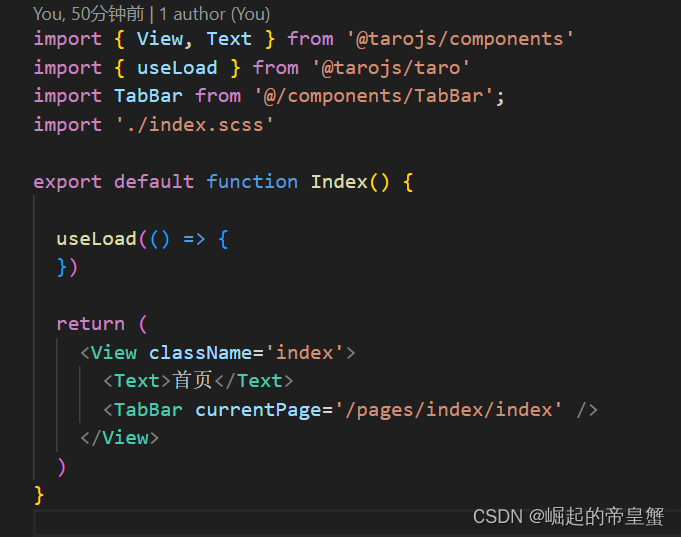
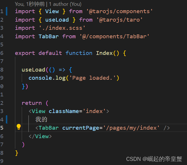
}3.使用组件
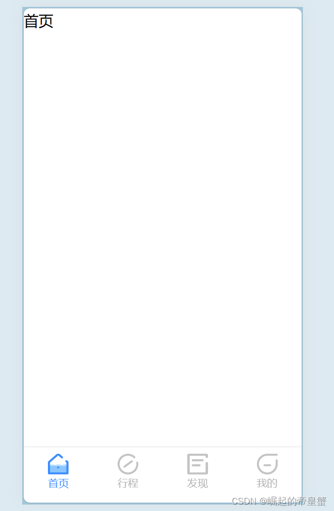
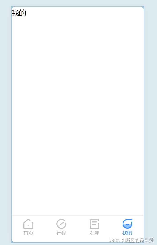
效果展示
这个是全部代码地址 yangjike123/custom_taro_tabbar: 如何自定义taro tabbar (github.com)
这里样式可能写的比较随意应为我这是随便再网上找到ui设计稿,样式自行修改

开源鸿蒙跨平台开发社区汇聚开发者与厂商,共建“一次开发,多端部署”的开源生态,致力于降低跨端开发门槛,推动万物智联创新。
更多推荐

 5
5 0
0- 0


 已为社区贡献1条内容

所有评论(0)