主页(二)-底部菜单布局——TabBar 标签栏 & 编程式导航实现顶部内容变化 & 首页重定向-exact & 引入图标文件替换antd-UI自带图标
主页(二)-底部菜单布局——TabBar 标签栏 & 编程式导航实现顶部内容变化 & 首页重定向-exact&引入图标文件替换antd-UI自带图标底部菜单布局antd菜单布局代码结构分析TabBar 标签栏:https://mobile.ant.design/components/tab-bar-cn/菜单布局需要把默认菜单内容隐藏,因为后续要使用路由的方式进行内容的显示
·
主页(二)-底部菜单布局——TabBar 标签栏 & 编程式导航实现顶部内容变化 & 首页重定向-exact & 引入图标文件替换antd-UI自带图标
底部菜单布局
-
antd菜单布局代码结构分析
-
菜单布局
-
需要把默认菜单内容隐藏,因为后续要使用路由的方式进行内容的显示
- noRenderContent: true
-
隐藏默认内容后的样式处理
.tabbar .am-tabs-tab-bar-wrap {
  position: fixed;
  width: 100%;
  bottom: 0;
}
.menu { /*position: fixed; height: 100%; width: 100%; top: 0;*/ }<div className="home"> <div className="tabbar menu"> <TabBar noRenderContent={true} unselectedTintColor="#949494" tintColor="#33A3F4" barTintColor="white" > {菜单条目} </TabBar> </div> </div> -
编程式导航实现顶部内容变化
- TabBar.Item组件的事件中触发路由导航
onPress={() => {
  this.props.history.push('/home/index')
}}
-
-
菜单布局重构
- title 表示菜单底部名称
- key 菜单唯一标识
- selected 控制当前菜单的选中
- onPress 控制菜单单击事件
- 切换选中状态
<TabBar.Item
  title={item.title}
  key={item.id}
  icon={<i className={`iconfont ${item.icon}`} />}
  selectedIcon={<i className={`iconfont ${item.icon}`} />}
  selected={this.state.selectedTab === item.path}
  onPress={() => {
    this.props.history.push(item.path)
    this.setState({
      selectedTab: item.path
    })
  }}
/>
- 调整样式和字体图标-界面文件
import '../../assets/fonts/iconfont.css'
<i className='iconfont icon-ind'></i>
//模板字符串写法进行拼接
icon={<i className={`iconfont ${item.icon}`}></i>}
selectedIcon={<i className={`iconfont ${item.icon}`}></i>}
//现用写法
icon={<i className={'iconfont ' + item.icon}></i>}
- 菜单路由配置
import Index from '../index/index'
import Find from '../find/index'
import Info from '../info/index'
import My from '../my/index'

{/*菜单相应显示内容的填充位*/}
<Route path='/home/index' component={Index}/>
<Route path='/home/find' component={Find}/>
<Route path='/home/info' component={Info}/>
<Route path='/home/my' component={My}/>
//push()——单独添加路径
<TabBar.Item
  onPress={() => {
    this.props.history.push(item.path)
    this.setState({
      selectedTab: item.path
    })
  }}
/>

//现用写法——push()-字符串拼接
	<TabBar.Item
          title={item.title}
          key={item.id}
          icon={<i className={'iconfont ' + item.icon}></i>}
          selectedIcon={<i className='iconfont icon-ind'></i>}
          selected={this.state.selectedTab === item.id}
          onPress={() => {
            this.setState({
              selectedTab: item.id
            });
            // 通过编程式导航控制路由跳转  拼接路径
            console.log(this.props)
            this.props.history.push('/home/' + item.id)
          }}
      />
首页重定向
- 主页面的默认路径是 /home
- 需要默认导航到 /home/index
<Switch>
  <Redirect exact from='/home' to='/home/index'/>
  <Route path='/home/index' component={Index}/>
  <Route path='/home/find' component={Find}/>
  <Route path='/home/info' component={Info}/>
  <Route path='/home/my' component={My}/>
</Switch>
实例
文件目录
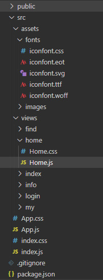
第一步:主页文件-src/views/home/Home.js
import React from 'react'
import { Route, Switch, Redirect } from 'react-router-dom'
import { TabBar } from 'antd-mobile'
import './Home.css'
import '../../assets/fonts/iconfont.css'
// import Index from '../index/Index.js'
// import Find from '../find/Find.js'
// import Info from '../info/Info.js'
// import My from '../my/My.js'

function Index () {
  return <div>Index</div>
}

function Find () {
  return <div>Find</div>
}
function Info () {
  return <div>Info</div>
}

function My () {
  return <div>My</div>
}

class Home extends React.Component {
  constructor (props) {
    super(props)
    this.state = {
      // 默认底部菜单栏-选中主页
      selectedTab: 'index',
      fullScreen: false
    }
  }

  renderMenuItem = () => {
    // 动态生成菜单条目
    let menuData = [{
      id: 'index',
      title: '主页',
      icon: 'icon-ind'
    }, {
      id: 'find',
      title: '找房',
      icon: 'icon-findHouse'
    }, {
      id: 'info',
      title: '资讯',
      icon: 'icon-myinfo'
    }, {
      id: 'my',
      title: '我的',
      icon: 'icon-my'
    }]
    return menuData.map(item => {
      return (
        // icon-图标;selectedIcon-选中图标
        <TabBar.Item
          title={item.title}
          key={item.id}
          icon={<i className={'iconfont ' + item.icon}></i>}
          selectedIcon={<i className='iconfont icon-ind'></i>}
          selected={this.state.selectedTab === item.id}
          onPress={() => {
            this.setState({
              selectedTab: item.id
            });
            // 通过编程式导航控制路由跳转  拼接路径
            console.log(this.props)
            this.props.history.push('/home/' + item.id)
          }}
        />
      )
    })
  }

  render () {
    return (
      <div className='menu'>
        {/*顶部的内容区*/}
        <Switch>
          {/*如果访问/home就重定向到/home/index*/}
          <Redirect exact from='/home' to='/home/index'/>
          <Route path='/home/index' component={Index}/>
          <Route path='/home/find' component={Find}/>
          <Route path='/home/info' component={Info}/>
          <Route path='/home/my' component={My}/>
        </Switch>
        {/*底部菜单区*/}
        {/*<Link to='/home/index'>主页</Link>
        <Link to='/home/find'>找房</Link>
        <Link to='/home/info'>资讯</Link>
        <Link to='/home/my'>我的</Link>*/}
        <TabBar
          unselectedTintColor="#949494"
          tintColor="#33A3F4"
          barTintColor="white"
          noRenderContent={true}>
          {this.renderMenuItem()}
        </TabBar>
      </div>
    )
  }
}

export default Home
第二步:新建主页样式文件-src/views/home/Home.css
.menu {
  /* position: fixed;
  height: 100%;
  width: 100%;
  top: 0 */
}

.menu .am-tabs-tab-bar-wrap {
  position: fixed;
  bottom: 0;
  width: 100%;
}
第三步:npm run start 或 yarn start,启动界面


开源鸿蒙跨平台开发社区汇聚开发者与厂商,共建“一次开发,多端部署”的开源生态,致力于降低跨端开发门槛,推动万物智联创新。
更多推荐


 0
0 0
0- 0


 已为社区贡献6条内容

所有评论(0)