Flutter学习记录——7.基础布局详解
文章目录1.Scaffold2.Container3.Center前面讲解了 Flutter 的几个基础组件,这节课将讲解跟布局相关的 Widget。每个平台的应用都有其自己的布局方式,例如 Android 有线性布局、相对布局、绝对布局、帧布局、表格布局等等,HTML 前端也有自己的布局方式。Flutter 当然也不例外。那么这节课就带领大家对 Flutter 的基础布局 Widget 中的..
前面讲解了 Flutter 的几个基础组件,这节课将讲解跟布局相关的 Widget。
每个平台的应用都有其自己的布局方式,例如 Android 有线性布局、相对布局、绝对布局、帧布局、表格布局等等,HTML 前端也有自己的布局方式。Flutter 当然也不例外。那么这节课就带领大家对 Flutter 的基础布局 Widget 中的几个典型的布局Widget进行详细分析,并结合案例进行详细的用法讲解。
1.基本布局
1.1 Scaffold
Flutter 布局系列的 Widget 一般分为两种,一种是只有单个子元素的布局 Widget,也就是SingleChildRenderObjectWidget;另一个种是具有多个子元素的布局 Widget,一般都有 children 参数,继承自MultiChildRenderObjectWidget。非布局系列 Widget 也有无子元素的 Widget,如 Text、Image 组件,这些无子元素的 Widget 属于 LeafRenderObjectWidget。Flutter 中不同的布局 Widget 对子 Widget 的排列渲染方式不同。接下来我们看下其中比较常用的一个布局 Widget——Scaffold。
Scaffold 是一个页面布局脚手架,实现了基本的 Material 布局,继承自 StatefulWidget,是有状态组件。我们知道大部分的应用页面都是含有标题栏,主体内容,底部导航菜单或者侧滑抽屉菜单等等构成,那么每次都重复写这些内容会大大降低开发效率,所以 Flutter 提供了 Material 风格的 Scaffold 页面布局脚手架,可以很快地搭建出这些元素部分:

Scaffold 有下面几个主要属性。
- appBar:显示在界面上的一个标题栏 AppBar。
- body: 当前页面的主体内容 Widget。
- floatingActionButton:页面的主要功能按钮,不配置就不会显示。
- persistentFooterButtons:固定显示在下方的按钮,比如对话框下方的确定、取消按钮。
- drawer:侧滑抽屉菜单控件。
- backgroundColor:body 内容的背景颜色。
- bottomNavigationBar:显示在页面底部的导航栏。
- resizeToAvoidBottomPadding:类似于 Android 中的 android:windowSoftInputMode=‘adjustResize’,避免类似弹出键盘这种操作遮挡布局使用的。
- bottomSheet:底部拉出菜单。
具体可配置的属性参数,我们看下看下 Scaffold 构造方法:
const Scaffold({
    Key key,
    // 标题栏
    this.appBar,
    // 中间主体内容部分
    this.body,
    // 悬浮按钮
    this.floatingActionButton,
    // 悬浮按钮位置
    this.floatingActionButtonLocation,
    // 悬浮按钮动画
    this.floatingActionButtonAnimator,
    // 固定在下方显示的按钮
    this.persistentFooterButtons,
    // 侧滑抽屉菜单
    this.drawer,
    this.endDrawer,
    // 底部菜单
    this.bottomNavigationBar,
    // 底部拉出菜单
    this.bottomSheet,
    // 背景色
    this.backgroundColor,
    this.resizeToAvoidBottomPadding,
    // 重新计算body布局空间大小,避免被遮挡
    this.resizeToAvoidBottomInset,
    // 是否显示到底部,默认为true将显示到顶部状态栏
    this.primary = true,
    this.drawerDragStartBehavior = DragStartBehavior.down,
  })
如果想显示 Snackbar 或 bottomSheet,可以这样调用:
Scaffold.of(context).showSnackBar(new SnackBar(
      content: Text('Hello!'),
    ));
Scaffold.of(context).showBottomSheet…
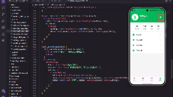
接下来看个实例的代码:
import 'package:flutter/material.dart';
import 'package:flutter/widgets.dart';

class ScaffoldSamples extends StatefulWidget {
  @override
  State<StatefulWidget> createState() {
    return ScaffoldSamplesState();
  }
}

class ScaffoldSamplesState extends State<ScaffoldSamples> {
  int _selectedIndex = 0;

  @override
  void initState() {
    super.initState();
  }

  @override
  Widget build(BuildContext context) {
    return scaffoldWidget(context);
  }

  Widget scaffoldWidget(BuildContext context) {
    return Scaffold(
      appBar: AppBar(
        title: Text("标题栏"),
        actions: <Widget>[
          //导航栏右侧菜单
          IconButton(icon: Icon(Icons.share), onPressed: () {}),
        ],
      ),
      body: Text("Body内容部分"),
      //抽屉
      drawer: Drawer(
        child: DrawerHeader(
          child: Text("DrawerHeader"),
        ),
      ),
      // 底部导航
      bottomNavigationBar: BottomNavigationBar(
        items: <BottomNavigationBarItem>[
          BottomNavigationBarItem(icon: Icon(Icons.home), title: Text('Home')),
          BottomNavigationBarItem(
              icon: Icon(Icons.category), title: Text('Cagergory')),
          BottomNavigationBarItem(
              icon: Icon(Icons.person), title: Text('Persion')),
        ],
        currentIndex: _selectedIndex,
        fixedColor: Colors.blue,
        onTap: _onItemTap,
      ),
      floatingActionButton: FloatingActionButton(
        child: Icon(Icons.add),
        onPressed: () {
          _onAdd();
        },
      ),
    );
  }

  void _onItemTap(int index) {
    setState(() {
      _selectedIndex = index;
    });
  }

  void _onAdd() {}
}
这个实例实现效果如前面两张图片所示效果。
1.2 Container
Container 是一个容器类布局 Widget,Container 可以说是多个小组件的一个组合容器,如可以设置 padding、margin、Align、Decoration、Matrix4 等等,可以说用起来很方便,很高效。
我们看下 Container 构造方法相关属性和作用:
Container({
    Key key,
    // 容器子Widget对齐方式
    this.alignment,
    // 容器内部padding
    this.padding,
    // 背景色
    Color color,
    // 背景装饰
    Decoration decoration,
    // 前景装饰
    this.foregroundDecoration,
    // 容器的宽度
    double width,
    // 容器的高度
    double height,
    // 容器大小的限制条件
    BoxConstraints constraints,
    // 容器外部margin
    this.margin,
    // 变换,如旋转
    this.transform,
    // 容器内子Widget
    this.child,
  })
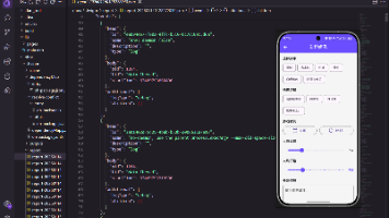
接下来看个实例的代码:
body: Container(
        constraints: BoxConstraints.expand(
          height: Theme.of(context).textTheme.display1.fontSize * 1.1 + 200.0,
        ),
        padding: const EdgeInsets.all(8.0),
        // 背景色
        color: Colors.teal.shade700,
        // 子Widget居中
        alignment: Alignment.center,
        // 子Widget元素
        child: Text('Hello World',
            style: Theme.of(context)
                .textTheme
                .display1
                .copyWith(color: Colors.white)),
        // 前景装饰
        foregroundDecoration: BoxDecoration(
          image: DecorationImage(
            image: NetworkImage('https://www.example.com/images/frame.png'),
            centerSlice: Rect.fromLTRB(270.0, 180.0, 1360.0, 730.0),
          ),
        ),
        // Container旋转
        transform: Matrix4.rotationZ(0.1),
      ),
运行效果如下图所示:

1.3 Center
Center 主要用于对齐,将内部子 Widget 与自身进行居中对齐,并根据子 Widget 的大小自动调整自身大小。
Center Widget 是继承自 Align,Align 继承自 SingleChildRenderObjectWidget,也是单子元素 Widget。
看下 Center 的构造方法:
 Center({
    Key key,
    // 宽度因子
    double widthFactor,
    // 高度因子
    double heightFactor,
    // 子元素
    Widget child
   })
大家可能对这个宽度和高度因子的作用不太明白,其实就是设置 Center 的宽度和高度是子元素宽度和高度的倍数的,widthFactor 和 heightFactor 可以不设置,默认 Center 容器宽度横向充满,高度包裹子元素。如将widthFactor 和 heightFactor 设置为 2.0 的话,则 Center 容器的占用宽度和高度是子元素宽度和高度的 2 倍,但是最大不超过屏幕的宽高。
接下来看个实例演示用法:
body: Column(
        children: <Widget>[
          Container(
            color: Colors.blueGrey,
            child: Center(
              widthFactor: 2,
              heightFactor: 2,
              child: Container(
                width: 60,
                height: 30,
                color: Colors.red,
              ),
            ),
          ),
          SizedBox(
            height: 10,
          ),
          Center(
            child: Container(
              width: 60,
              height: 30,
              color: Colors.teal,
            ),
          ),
          SizedBox(
            height: 10,
          ),
          Center(
            child: Container(
              height: 100.0,
              width: 100.0,
              color: Colors.yellow,
              child: Align(
                // 设置对齐位置约束
                alignment: FractionalOffset(0.2, 0.6),
                child: Container(
                  height: 40.0,
                  width: 40.0,
                  color: Colors.red,
                ),
              ),
            ),
          ),
        ],
      ),
运行效果如下图所示:
2.线性布局
2.1 Row
Row 布局组件类似于 Android 中的 LinearLayout 线性布局,它用来做水平横向布局使用,里面的 children 子元素按照水平方向进行排列。
Row 的继承关系如下:
Row -> Flex -> MultiChildRenderObjectWidget -> RenderObjectWidget …
可以看出 Row 是 Flex 的拓展子类,也是多子元素的一个组件之一(内部可以包含多个子元素)。
我们看下 Row 布局组件的大致效果图:

所有元素水平排成一行。
那么接下来我们看下 Row 的构造方法:
Row({
    Key key,
    // 主轴方向上的对齐方式(Row的主轴是横向轴)
    MainAxisAlignment mainAxisAlignment = MainAxisAlignment.start,
    // 在主轴方向(Row的主轴是横向轴)占有空间的值,默认是max
    MainAxisSize mainAxisSize = MainAxisSize.max,
    // 在交叉轴方向(Row是纵向轴)的对齐方式,Row的高度等于子元素中最高的子元素高度
    CrossAxisAlignment crossAxisAlignment = CrossAxisAlignment.center,
    // 水平方向子元素的排列方向:从左到右排列还是反向
    TextDirection textDirection,
    // 表示纵轴(垂直)的对齐排列方向,默认是VerticalDirection.down,表示从上到下。这个参数一般用于Column组件里
    VerticalDirection verticalDirection = VerticalDirection.down,
    // 字符对齐基线方式
    TextBaseline textBaseline,
    // 子元素集合
    List<Widget> children = const <Widget>[],
  })
接下来详细看下 Row 的主轴和交叉轴属性。
MainAxisAlignment(主轴属性:主轴方向上的对齐方式,Row 是横向轴为主轴)
enum MainAxisAlignment {
  // 按照主轴起点对齐,例如:按照靠近最左侧子元素对齐
  start,

  // 将子元素放置在主轴的末尾,按照末尾对齐
  end,

  // 子元素放置在主轴中心对齐
  center,

  // 将主轴方向上的空白区域均分,使得子元素之间的空白区域相等,首尾子元素都靠近首尾,没有间隙。有点类似于两端对齐
  spaceBetween,

  // 将主轴方向上的空白区域均分,使得子元素之间的空白区域相等,但是首尾子元素的空白区域为1/2
  spaceAround,

  // 将主轴方向上的空白区域均分,使得子元素之间的空白区域相等,包括首尾子元素
  spaceEvenly,
}
再看下 Row 的交叉属性。
CrossAxisAlignment(交叉属性:在交叉轴方向的对齐方式,Row 是纵向轴。Row 的高度等于子元素中最高的子元素高度)
enum CrossAxisAlignment {
  // 子元素在交叉轴上起点处展示
  start,

  // 子元素在交叉轴上末尾处展示
  end,

  // 子元素在交叉轴上居中展示
  center,

  // 让子元素填满交叉轴方向
  stretch,

  // 在交叉轴方向,使得子元素按照baseline对齐
  baseline,
}
再看下 MainAxisSize 属性。
MainAxisSize(在主轴方向子元素占有空间的方式,Row 的主轴是横向轴。默认是 max)
enum MainAxisSize {
  // 根据传入的布局约束条件,最大化主轴方向占用可用空间,也就是尽可能充满可用宽度
  max,

  // 与max相反,是最小化占用主轴方向的可用空间
  min,
}
接下来我们通过一个实例来学习下 Row 的布局特点。
Column(
        children: <Widget>[
          // 默认横向排列元素
          Row(
            verticalDirection: VerticalDirection.up,
            textBaseline: TextBaseline.ideographic,
            children: <Widget>[
              RaisedButton(
                color: Colors.blue,
                child: Text(
                  '我是按钮一\n 按钮',
                  style: TextStyle(color: Colors.white),
                ),
                onPressed: () {},
              ),
              RaisedButton(
                color: Colors.grey,
                child: Text(
                  '   我是按钮二  ',
                  style: TextStyle(color: Colors.black),
                ),
                onPressed: () {},
              ),
              RaisedButton(
                color: Colors.orange,
                child: Text(
                  '      我是按钮三    ',
                  style: TextStyle(color: Colors.white),
                ),
                onPressed: () {},
              ),
            ],
          ),
          SizedBox(
            height: 10,
          ),
          // 默认横向排列元素
          Row(
            children: <Widget>[
              const FlutterLogo(),
              const Expanded(
                child: Text(
                    'Flutter\'s hot reload helps you quickly and easily experiment, build UIs, add features, and fix bug faster. Experience sub-second reload times, without losing state, on emulators, simulators, and hardware for iOS and Android.'),
              ),
              const Icon(Icons.sentiment_very_satisfied),
            ],
          ),
          SizedBox(
            height: 10,
          ),
          // 居中排列元素
          Row(
            mainAxisAlignment: MainAxisAlignment.center,
            children: <Widget>[
              Text(
                " 我们居中显示 |",
                style: TextStyle(color: Colors.teal),
              ),
              Text(" Flutter的Row布局组件 "),
            ],
          ),
        ],
    ),
运行效果如下图所示:

2.2 Column
在学习完了 Row 布局组件后,再学习 Column 很容易,Row 是横向排列元素,Column 是纵向排列子元素,可以对比着学习。
Column 的继承关系如下:
Column -> Flex -> MultiChildRenderObjectWidget -> RenderObjectWidget …
Column 也是 Flex 的拓展子类,也是多子元素的一个组件之一(内部可以包含多个子元素)。
我们看下 Column 布局组件的大致效果图:

所有元素纵向排成一列。
构造方法是一致的,只不过主轴和交叉轴和 Row 是相反的。这里就不再重复讲解了。
接下来看一个实例:
Column(
        // 纵向排列子元素
        children: <Widget>[
          RaisedButton(
            color: Colors.blue,
            child: Text(
              '我是按钮一',
              style: TextStyle(color: Colors.white),
            ),
            onPressed: () {},
          ),
          RaisedButton(
            color: Colors.grey,
            child: Text(
              '   我是按钮二  ',
              style: TextStyle(color: Colors.black),
            ),
            onPressed: () {},
          ),
          RaisedButton(
            color: Colors.orange,
            child: Text(
              '      我是按钮三    ',
              style: TextStyle(color: Colors.white),
            ),
            onPressed: () {},
          ),
          SizedBox(
            height: 10,
          ),
          const FlutterLogo(),
          Text(
              'Flutter\'s hot reload helps you quickly and easily experiment, build UIs, add features, and fix bug faster. Experience sub-second reload times, without losing state, on emulators, simulators, and hardware for iOS and Android.'),
          const Icon(Icons.sentiment_very_satisfied),
        ],
      ),
运行效果如下图所示:

3.弹性布局
Flex 组件是 Row 和 Column 的父类,主要用于弹性布局,类似于HTML 中的 Flex 弹性盒子布局,可以按照一定比例进行分类布局空间。
Flex 继承自 MultiChildRenderObjectWidget,Flex 也是多子元素的一个组件之一(内部可以包含多个子元素)。
Flex 一般和 Expanded 搭配使用,Expanded 组件从名字就可以看出它的特点,就是让子元素扩展占用 Flex 的剩余空间。
我们看下 Flex 布局组件的大致效果图:

按钮一占用 2/3 的横向空间,按钮二占用剩余 1/3 空间。
我们看下 Flex 构造方法:
Flex({
    Key key,
    // 子元素排列方向:横向还是纵向
    @required this.direction,
    this.mainAxisAlignment = MainAxisAlignment.start,
    this.mainAxisSize = MainAxisSize.max,
    this.crossAxisAlignment = CrossAxisAlignment.center,
    this.textDirection,
    this.verticalDirection = VerticalDirection.down,
    this.textBaseline,
    List<Widget> children = const <Widget>[],
  })
单独看 Flex 组件没有意义,因为一般直接用它的子类 Row 和 Column 来使用。而 Flex 主要是和 Expanded 搭配使用。我们再看下 Expanded 组件构造方法:
const Expanded({
    Key key,
    // 占用空间比重、权重
    int flex = 1,
    // 子元素
    @required Widget child,
  })
我们通过一个实例看下 Flex 和 Expanded 搭配用法:
body: Row(
          children: <Widget>[
            Expanded(
              // flex设置权重,这里是占2/5空间
              flex: 2,
              child: RaisedButton(
                color: Colors.blue,
                child: Text(
                  '我是按钮一',
                  style: TextStyle(color: Colors.white),
                ),
                onPressed: () {},
              ),
            ),
            // flex设置权重,这里是占1/5空间
            Expanded(
              flex: 1,
              child: Column(
                children: <Widget>[
                  Expanded(
                    flex: 2,
                    child: RaisedButton(
                      color: Colors.grey,
                      child: Text(
                        '   我是按钮一  ',
                        style: TextStyle(color: Colors.black),
                      ),
                      onPressed: () {},
                    ),
                  ),
                  Expanded(
                    flex: 1,
                    child: RaisedButton(
                      color: Colors.teal,
                      child: Text(
                        '   我是按钮二  ',
                        style: TextStyle(color: Colors.white),
                      ),
                      onPressed: () {},
                    ),
                  )
                ],
              ),
            ),
            // flex设置权重,这里是占2/5空间
            Expanded(
              flex: 2,
              child: RaisedButton(
                color: Colors.grey,
                child: Text(
                  '   我是按钮二  ',
                  style: TextStyle(color: Colors.black),
                ),
                onPressed: () {},
              ),
            )
          ],
        )
运行效果图如下:

4.层叠布局
Stack 和 IndexStack 都是层叠布局方式,类似于 Android 里的 FrameLayout 帧布局,内部子元素是有层级堆起来的。
Stack 继承自 MultiChildRenderObjectWidget,Stack 也是多子元素的一个组件之一(内部可以包含多个子元素)。
而 IndexedStack 继承自 Stack,扩展了 Stack的一些特性。它的作用是显示第 index 个子元素,其他子元素都是不可见的。所以 IndexedStack 的尺寸永远是跟最大的子元素尺寸一致。
Stack 的布局行为,是根据子元素是 positioned 还是 non-positioned 来区分的:
- 对于 positioned 的子元素,它们的位置会根据所设置的 top、bottom、right 或 left 属性来确定,这几个值都是相对于 Stack 的左上角;
- 对于 non-positioned 的子元素,它们会根据 Stack 的 aligment 来设置位置。
Stack 布局的子元素层级堆叠顺序:最先布局绘制的子元素在最底层,越后绘制的越在顶层。类似于 Web 中的 z-index。
看下 Stack 布局组件的效果图:

默认按照左上角,有层级的绘制排列。
看下 Stack 的构造方法:
Stack({
    Key key,
    // 对齐方式,默认是左上角(topStart)
    this.alignment = AlignmentDirectional.topStart,
    // 对齐方向
    this.textDirection,
    // 定义如何设置无定位子元素尺寸,默认为loose
    this.fit = StackFit.loose,
    // 超过的部分子元素处理方式
    this.overflow = Overflow.clip,
    // 子元素
    List<Widget> children = const <Widget>[],
  })
我们看下 alignment:
  // 左上角
  static const Alignment topLeft = Alignment(-1.0, -1.0);

  // 主轴顶部对齐,交叉轴居中
  static const Alignment topCenter = Alignment(0.0, -1.0);

  // 主轴顶部对齐,交叉轴偏右
  static const Alignment topRight = Alignment(1.0, -1.0);

  // 主轴居中,交叉轴偏左
  static const Alignment centerLeft = Alignment(-1.0, 0.0);

  // 居中
  static const Alignment center = Alignment(0.0, 0.0);

  // 主轴居中,交叉轴偏右
  static const Alignment centerRight = Alignment(1.0, 0.0);

  // 主轴底部对齐,交叉轴偏左
  static const Alignment bottomLeft = Alignment(-1.0, 1.0);

  // 主轴底部对齐,交叉轴居中
  static const Alignment bottomCenter = Alignment(0.0, 1.0);

  // 主轴底部对齐,交叉轴偏右
  static const Alignment bottomRight = Alignment(1.0, 1.0);
看下 fit 属性:
enum StackFit {
  // 子元素宽松的取值,可以从min到max的尺寸
  loose,

  // 子元素尽可能的占用剩余空间,取max尺寸
  expand,

  // 不改变子元素的约束条件
  passthrough,
}
最后看下 overflow 属性:
enum Overflow {
  // 超出部分不会被裁剪,正常显示
  visible,

  // 超出部分会被裁剪
  clip,
}
我们看下 IndexedStack 构造方法:
IndexedStack({
    Key key,
    AlignmentGeometry alignment = AlignmentDirectional.topStart,
    TextDirection textDirection,
    StackFit sizing = StackFit.loose,
    // 多了一个索引,索引的这个元素显示,其他元素隐藏
    this.index = 0,
    // 子元素
    List<Widget> children = const <Widget>[],
  })
接下来通过一个实例来演示下 Stack 和 IndexedStack 的用法:
body: Column(
          children: <Widget>[
            // Stack层叠布局
            Stack(
              children: <Widget>[
                Container(
                  width: 300,
                  height: 300,
                  color: Colors.grey,
                ),
                Container(
                  width: 200,
                  height: 200,
                  color: Colors.teal,
                ),
                Container(
                  width: 100,
                  height: 100,
                  color: Colors.blue,
                ),
                Text(
                  "Stack",
                  style: TextStyle(color: Colors.white),
                ),
              ],
            ),
            SizedBox(
              height: 10,
            ),
            // IndexedStack层叠布局
            IndexedStack(
              // 指定显示的子元素序号,其余子元素隐藏
              index: 2,
              children: <Widget>[
                Container(
                  width: 300,
                  height: 300,
                  color: Colors.grey,
                ),
                Container(
                  width: 200,
                  height: 200,
                  color: Colors.teal,
                ),
                Container(
                  width: 100,
                  height: 100,
                  color: Colors.blue,
                ),
                Text(
                  "Stack",
                  style: TextStyle(color: Colors.white),
                ),
              ],
            )
          ],
        )
运行效果图如下:


开源鸿蒙跨平台开发社区汇聚开发者与厂商,共建“一次开发,多端部署”的开源生态,致力于降低跨端开发门槛,推动万物智联创新。
更多推荐

 1
1 0
0- 0


 已为社区贡献32条内容

所有评论(0)