Flutter - Image & Text & Icon
组件 - Image Text Icon内容来自教程《Flutter技术入门与实战》Image参考:Image classBoxFit enum其构造方法:new Image用于从ImageProvider获取图像new Image.asset加载资源图片new Image.file加载本地图片文件new Image.network加载网络图片new Image.mem...
Image & Text & Icon
内容来自教程《Flutter技术入门与实战》
无状态组件和有状态组件
参考:
Flutter中的
StatelessWidget是一个不需要状态更改的widget - 它没有要管理的内部状态。
当您描述的用户界面部分不依赖于对象本身中的配置信息以及widget的BuildContext 时,无状态widget非常有用。AboutDialog,CircleAvatar和Text都是StatelessWidget的子类。
StatefulWidget是可变状态的widget。 使用setState方法管理StatefulWidget的状态的改变。调用setState告诉Flutter框架,某个状态发生了变化,Flutter会重新运行build方法,以便应用程序可以应用最新状态。
状态是在构建widget时可以同步读取的信息可能会在widget的生命周期中发生变化。确保在状态改变时及时通知状态变化是widget实现者的责任。当widget可以动态更改时,需要使用StatefulWidget。 例如, 通过键入表单或移动滑块来更改widget的状态. 或者, 它可以随时间变化 - 或者数据推送更新UICheckbox,Radio,Slider,InkWell,Form, 和TextField都是有状态的widget,也是StatefulWidget的子类。
Image
参考:
其构造方法:
new Image用于从ImageProvider获取图像new Image.asset加载资源图片new Image.file加载本地图片文件new Image.network加载网络图片new Image.memory加载Uint8List资源图片
加载网路图片
如下,加载一个网络图片
class MyApp extends StatelessWidget {
  // This widget is the root of your application.
  @override
  Widget build(BuildContext context) {
    return MaterialApp(
      title: 'Image',
      home: Scaffold(
        appBar: AppBar(
          title: Text('Image'),
        ),
        body: ImageDemo(),
      ),
    );
  }
}

class ImageDemo extends StatelessWidget {
  @override
  Widget build(BuildContext context) {
    return new Center(
      child: Image.network(
        'https://flutter.github.io/assets-for-api-docs/assets/widgets/owl.jpg',
        fit: BoxFit.fitWidth,
      ),
    );
  }
}
BoxFit.fitWidth表示显示可能拉伸,可能裁剪,宽度充满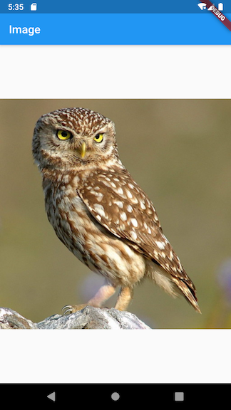
图片默认是居中显示的,如下的例子:
class HomeContent extends StatelessWidget {
  @override
  Widget build(BuildContext context) {
    return Center(
      child: Container(
        child: Image.network(
          "https://picsum.photos/id/10/200/200",
        ),
        width: 300,
        height: 300,
        decoration: BoxDecoration(
          color: Colors.yellow,
        ),
      ),
    );
  }
}

通过设置alignment为Alignment.topLeft为左上角来显示
alignment: Alignment.topLeft,

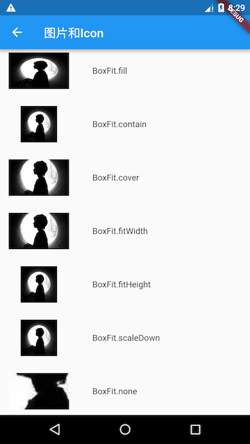
通过设置fit,来调整缩放模式,参考:
其中最常用的为cover
- 会按图片的长宽比放大后居中填满显示空间,图片不会变形,超出显示空间部分会被剪裁
圆角图片
原本以为,实现圆角图片,即把container的圆角设置为宽度的一般,然后将图片的fit设置为BoxFit.cover
但效果却不是这样的

所以,参考网络上的实现方式
1.通过decoration中的,BoxDecoration的image来实现
class HomeContentCircleImage1 extends StatelessWidget {
  @override
  Widget build(BuildContext context) {
    return Center(
      child: Container(
        width: 300,
        height: 300,
        decoration: BoxDecoration(
          color: Colors.yellow,
          borderRadius: BorderRadius.circular(150),//圆角
          image: DecorationImage(
            image: NetworkImage("https://picsum.photos/id/1027/200/200"),
            fit: BoxFit.cover,
          )
        ),
      ),
    );
  }
}

2.通过使用ClipOval
class HomeContentCircleImage2 extends StatelessWidget {
  @override
  Widget build(BuildContext context) {
    return Center(
      child: Container(
        child: ClipOval(
          child: Image.network(
            "https://picsum.photos/id/1027/200/200",
          ),
        ),
      ),
    );
  }
}

也可以结合width和height使用
class HomeContentCircleImage2 extends StatelessWidget {
  @override
  Widget build(BuildContext context) {
    return Center(
      child: Container(
        child: ClipOval(
          child: Image.network(
            "https://picsum.photos/id/1027/200/200",
            width: 100,
            height: 100,
            fit: BoxFit.cover,
          ),
        ),
      ),
    );
  }
}

本地图片
参考:
创建images目录,添加图片
修改pubspec.yaml

加载本地图片
class HomeContentLocalImage extends StatelessWidget {
  @override
  Widget build(BuildContext context) {
    return Center(
      child: Container(
        child: Image.asset(
          "images/girl.jpg",
          width: 100,
        ),
      ),
    );
  }
}
效果如下:

Text
参考:
class MyApp extends StatelessWidget {
// This widget is the root of your application.
@override
Widget build(BuildContext context) {
return MaterialApp(
title: 'Flutter Demo',
theme: ThemeData(
primarySwatch: Colors.blue,
),
home: Scaffold(
appBar: AppBar(
title: Text('文本组件'),
),
body: Column(
children: <Widget>[
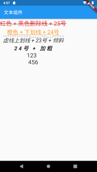
Text(
'红色 + 黑色删除线 + 25号',
style: TextStyle(
color: const Color(0xffff0000),
decoration: TextDecoration.lineThrough,
decorationColor: const Color(0xff000000),
fontSize: 25.0
),
),
Text(
'橙色 + 下划线 + 24号',
style: TextStyle(
color: Color(0xffff9900),
decoration: TextDecoration.underline,
fontSize: 24.0
),
),
Text(
'虚线上划线 + 23号 + 倾斜',
style: TextStyle(
decoration: TextDecoration.overline,
decorationStyle: TextDecorationStyle.dashed,
fontSize: 23.0,
fontStyle: FontStyle.italic
),
),
Text(
'24号 + 加粗',
style: TextStyle(
fontSize: 23.0,
fontStyle: FontStyle.italic,
fontWeight: FontWeight.bold,
letterSpacing: 6.0
),
),
Text(
'123 \n 456 \n 789 \n',
maxLines: 2,
style: TextStyle(
fontSize: 25.0
),
)
],
)
)
);
}
}
Icon
参考:
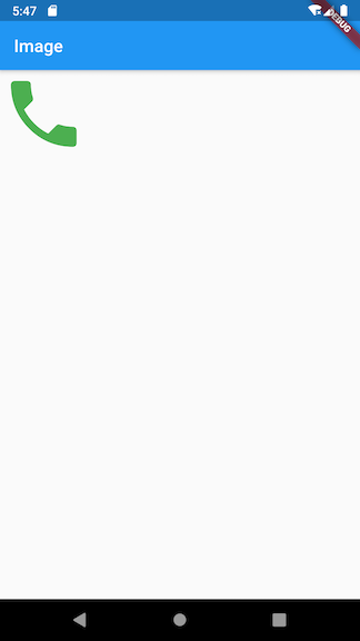
Icon表示的是图标组件,是不可交互的。如果要想交互,考虑使用IconButton
There must be an ambient
Directionalitywidget when usingIcon. Typically this is introduced automatically by theWidgetsApporMaterialApp.
This widget assumes that the rendered icon is squared. Non-squared icons may render incorrectly.
使用图标时,必须有一个环境方向性小部件。 通常,这是由WidgetsApp或MaterialApp自动引入的。
该小部件假定渲染的图标为正方形。 非正方形图标可能会错误显示。
class MyApp extends StatelessWidget {
  // This widget is the root of your application.
  @override
  Widget build(BuildContext context) {
    return MaterialApp(
      title: 'Image',
      home: Scaffold(
        appBar: AppBar(
          title: Text('Image'),
        ),
        body: LayoutDemo()
      ),
    );
  }
}

class LayoutDemo extends StatelessWidget {
  @override
  Widget build(BuildContext context) {
    return new Icon(Icons.phone, color: Colors.green[500], size: 100);
  }
}

开源鸿蒙跨平台开发社区汇聚开发者与厂商,共建“一次开发,多端部署”的开源生态,致力于降低跨端开发门槛,推动万物智联创新。
更多推荐

 0
0 0
0- 0


 已为社区贡献9条内容

所有评论(0)