Flutter-Container组件
Container参考:Container classFlutter — Container Cheat Sheet
Container组件
参考:
Container相当于前端中的div的角色
Container({
  this.alignment,
  this.padding, //容器内补白,属于decoration的装饰范围
  Color color, // 背景色
  Decoration decoration, // 背景装饰
  Decoration foregroundDecoration, //前景装饰
  double width,//容器的宽度
  double height, //容器的高度
  BoxConstraints constraints, //容器大小的限制条件
  this.margin,//容器外补白,不属于decoration的装饰范围
  this.transform, //变换
  this.child,
})
可设置宽、高,通过decoration设置背景颜色等
如下简单的例子:
设置背景颜色、边框
import 'package:flutter/material.dart';

void main() {
  runApp(MyApp());
}

class MyApp extends StatelessWidget {
  // This widget is the root of your application.
  @override
  Widget build(BuildContext context) {
    return MaterialApp(
      home: Scaffold(
        appBar: AppBar(
          title: Text('flutter demo'),
        ),
        body: HomeContent()
      ),
    );
  }
}

class HomeContent extends StatelessWidget {
  @override
  Widget build(BuildContext context) {
    return Center(
      child: Container(
        child: Text('一个文本'),
        height: 300.0,
        width: 300.0,
        decoration: BoxDecoration(
          color: Colors.yellow,
          border: Border.all(
            color: Colors.blue,
            width: 2.0
          )
        ),
      ),
    );
  }
}
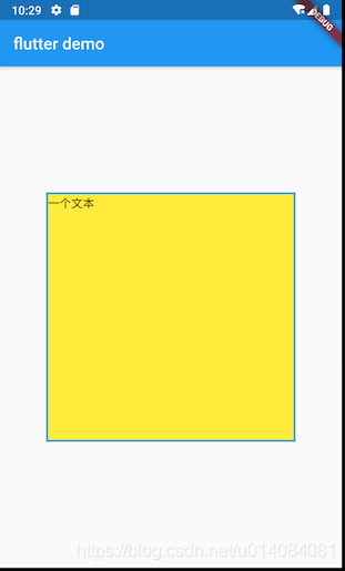
这里使用BoxDecoration来设置边框等,参考:
BoxDecoration({
  Color color, //颜色
  DecorationImage image,//图片
  BoxBorder border, //边框
  BorderRadiusGeometry borderRadius, //圆角
  List<BoxShadow> boxShadow, //阴影,可以指定多个
  Gradient gradient, //渐变
  BlendMode backgroundBlendMode, //背景混合模式
  BoxShape shape = BoxShape.rectangle, //形状
})
这里通过Border.all来设置边框,其方法如下:
Border.all({Color color: const Color(0xFF000000), double width: 1.0, BorderStyle style: BorderStyle.solid})
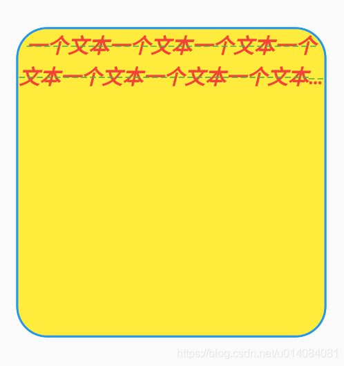
设置圆角
        decoration: BoxDecoration(
          color: Colors.yellow,
          border: Border.all(
            color: Colors.blue,
            width: 2.0
          ),
          borderRadius: BorderRadius.circular(30),

        ),
布局行为
总的来说:Container tries, in order: to honor alignment, to size itself to the child, to honor the width, height, and constraints, to expand to fit the parent, to be as small as possible.
详细来说:
1.如果widget没有child,没有height,没有width,没有约束constraint,并且parent提供了无限制的约束,Container将尺寸设置的尽可能小
2.如果widget小部件没有child且没有对齐方式alignment,但是提供了高度,宽度或约束,则在给定那些约束和父级约束的组合的情况下,容器将尝试尽可能小
3.如果widget小部件没有child,没有高度,没有宽度,没有约束并且没有对齐方式,但是父级提供了有限的约束,那么Container将扩展以适合父级提供的约束
4.如果widget小部件具有对齐方式,并且父级提供有界的约束,则容器会尝试扩展以适合父级,然后按照对齐方式将子级放置在自身内
5.如果有child,但没有高度,宽度,约束和对齐方式,并且Container将约束从parent传递给child,并自行调整大小以匹配该child
通过例子来说明
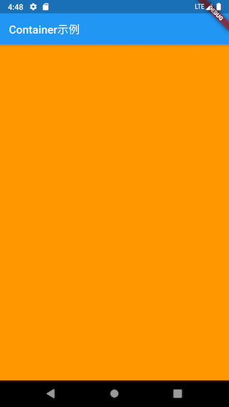
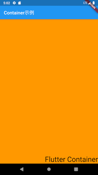
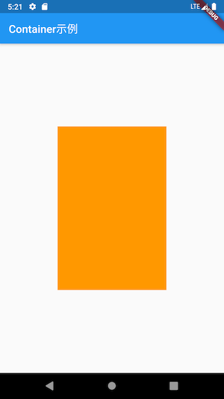
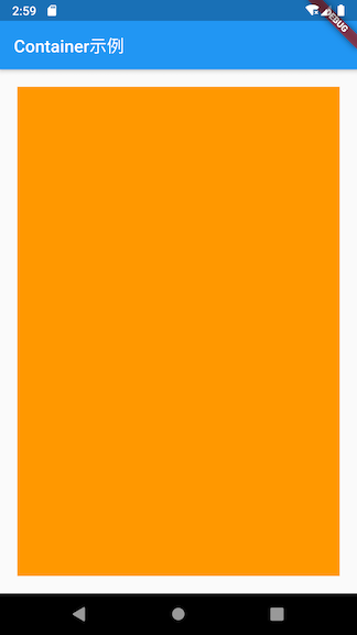
1.如下的空container,仅仅添加一个颜色,这个container将填充整个屏幕
class MyApp extends StatelessWidget {
  // This widget is the root of your application.
  @override
  Widget build(BuildContext context) {
    return MaterialApp(
        title: 'Flutter Demo',
        theme: ThemeData(
          primarySwatch: Colors.blue,
        ),
        home: Scaffold(
            appBar: AppBar(
              title: Text('Container示例'),
            ),
            body: Center(
                child: Container(
                  color: Colors.orange,
                )
            )
        )
    );
  }
}
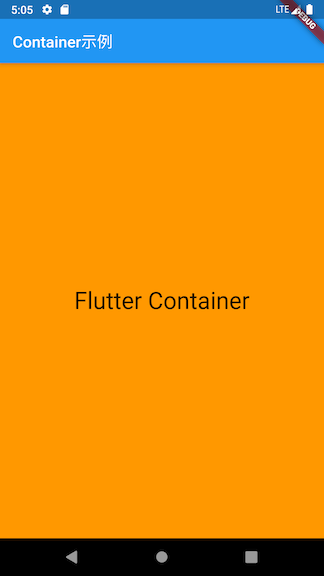
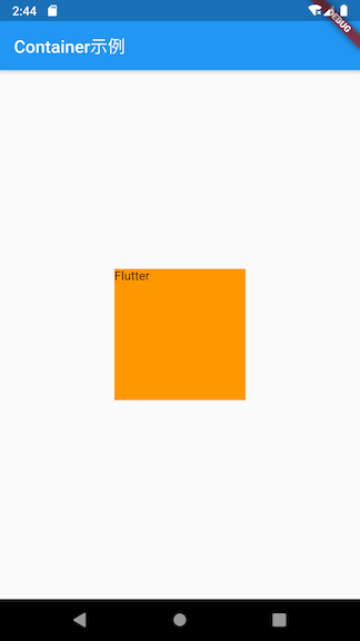
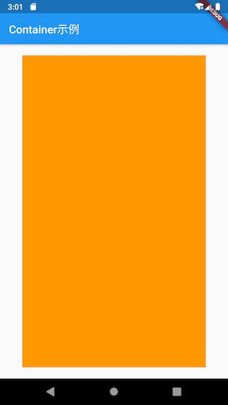
2.添加一个child
            body: Center(
                child: Container(
                  color: Colors.orange,
                  child: Text("Flutter Container"),
                )
            )
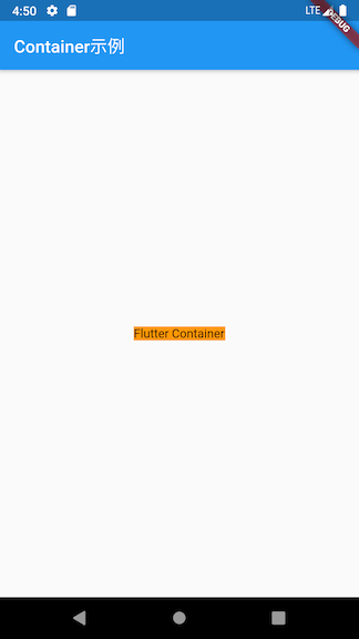
可见,container的大小为child的大小
属性
Alignment
alignment用来控制child的对齐方式,使用Alignment classAlignment(0.0, 0.0)表示的是矩形的中心,含义如下所示: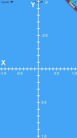
如下,将其设置为Alignment(1.0, 1.0)时,效果如下:
            body: Center(
                child: Container(
                  color: Colors.orange,
                  child: Text("Flutter Container", style: TextStyle(fontSize: 30.0),),
                  alignment: Alignment(1.0, 1.0),
                )
            )
还可以使用FractionalOffset,它与在于其原点位于矩形左上角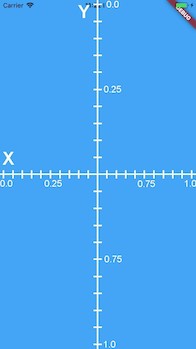
            body: Center(
                child: Container(
                  color: Colors.orange,
                  child: Text("Flutter Container", style: TextStyle(fontSize: 30.0),),
                  alignment: FractionalOffset(0.5, 0.5),
                )
            )
Constraints
constraints用来设置约束,可使用BoxConstraint
            body: Center(
                child: Container(
                  color: Colors.orange,
                  constraints: BoxConstraints(
                    maxHeight: 300.0,
                    maxWidth: 200.0,
                    minWidth: 150.0,
                    minHeight: 150.0
                  ),
                )
            )
此时,由于没有child,container会自动的填充给定的screen,但由于提供max-width和max-height ,container会填充max-width和max-height 定义的区域
然后再添加一个Text控件,如下:
            body: Center(
                child: Container(
                  color: Colors.orange,
                  constraints: BoxConstraints(
                    maxHeight: 300.0,
                    maxWidth: 200.0,
                    minWidth: 150.0,
                    minHeight: 150.0
                  ),
                  child: Text("Flutter"),
                )
由于有个child,container会包裹给定element,由于其有min-width和min-height,其将会使用这个size
如果将Text的字体设置大一点,效果如下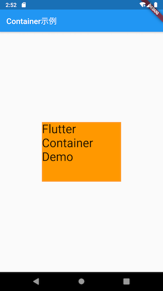
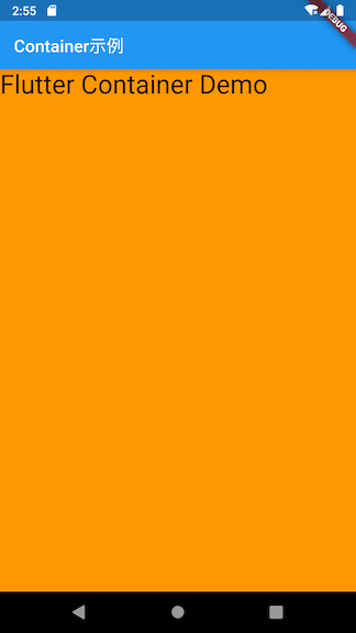
在container中有child的时候,如果想将container的size扩展到最大,可使用BoxConstraints.expand()
            body: Center(
                child: Container(
                  color: Colors.orange,
                  child: Text("Flutter Container Demo", style: TextStyle(fontSize: 30),),
                  constraints: BoxConstraints.expand(),
                )
            )
Margin
EdgeInsets.all()表示所有的边都有边距
            body: Center(
                child: Container(
                  color: Colors.orange,
                  margin: EdgeInsets.all(20.0),
                )
            )
EdgeInsets.symmetric()表示水平或者垂直对称的边距
            body: Center(
                child: Container(
                  color: Colors.orange,
                  margin: EdgeInsets.symmetric(vertical: 20.0, horizontal: 40.0)
                )
            )
EdgeInsets.fromLTRB()表示添加left, top, right, 和 bottom的间距
            body: Center(
                child: Container(
                  color: Colors.orange,
                  margin: EdgeInsets.fromLTRB(10, 20, 30, 40),
                )
            )
EdgeInsets.only()表示add margin with only the given values non-zero,大概就是,不用每个边都列出来给值
            body: Center(
                child: Container(
                  color: Colors.orange,
                  margin: EdgeInsets.only(left: 20, top: 30, bottom: 40)
                )
            )
transform
transform用来进行变换,可参考:
例子
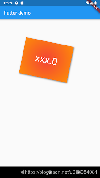
参考上面的教程,如下的例子:
class ContainerContent extends StatelessWidget {
  @override
  Widget build(BuildContext context) {
    return Container(
      margin: EdgeInsets.only(top: 50.0, left: 120.0),
      constraints: BoxConstraints.tightFor( //卡片大小
        width: 200.0,
        height: 150.0
      ),
      decoration: BoxDecoration(
        gradient: RadialGradient(//径向渐变
          colors: [Colors.red, Colors.orange],
          center: Alignment.center,
          radius: 0.98
        ),
        boxShadow: [
          BoxShadow(
              color: Colors.black54,
              offset: Offset(2.0, 2.0),
              blurRadius: 4.0
          )
        ],

      ),
      child: Text(
        "xxx.0",
        style: TextStyle(
          color: Colors.white,
          fontSize: 40.0
        ),
      ),
      alignment: Alignment.center,
      transform: Matrix4.rotationZ(.2), //卡片倾斜变换

    );
  }
}

开源鸿蒙跨平台开发社区汇聚开发者与厂商,共建“一次开发,多端部署”的开源生态,致力于降低跨端开发门槛,推动万物智联创新。
更多推荐

 0
0 0
0- 0


 已为社区贡献9条内容

所有评论(0)