Flutter-Buttons
Flutter-ButtonsFloatingActionButton参考:FloatingActionButton classFloatingActionButtonLocation classFloatingActionButton是个类Android风格的按钮,通常在Scaffold.floatingActionButton 中使用。使用floatingActionButton...
·
Flutter-Buttons
FloatingActionButton
参考:
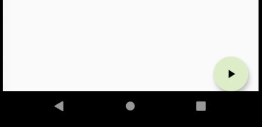
FloatingActionButton是个类Android风格的按钮,通常在Scaffold.floatingActionButton 中使用。使用floatingActionButtonLocation来设置位置
      floatingActionButtonLocation: FloatingActionButtonLocation.endDocked,
      floatingActionButton: FloatingActionButton(
        onPressed: (){},
        child: Icon(Icons.play_arrow),
        backgroundColor: Colors.lightGreen.shade100,
      ),
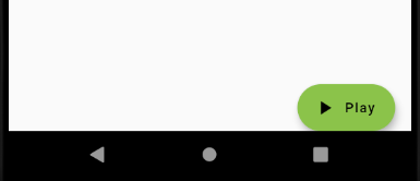
可以使用FloatingActionButton.extended方法创建带有圆角的button
    floatingActionButton: FloatingActionButton.extended(
        onPressed: (){},
        icon: Icon(Icons.play_arrow),
        label: Text('Play')
    ),
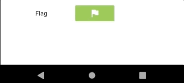
FlatButton
参考:
扁平化的按钮,点击的时候有阴影的效果
        Row(
          children: <Widget>[
            Padding(padding: EdgeInsets.all(16.0)),
            FlatButton(
              onPressed: (){},
              child: Text('Flag'),
            ),
            Padding(padding: EdgeInsets.all(16.0)),
            FlatButton(
              onPressed: (){},
              child: Icon(Icons.flag),
              color: Colors.lightGreen,
              textColor: Colors.white,
            )
          ],
        )
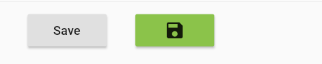
RaisedButton
参考:
RaisedButton是个具有凸起效果的按钮
        Row(
          children: <Widget>[
            Padding(padding: EdgeInsets.all(16.0)),
            RaisedButton(
              onPressed: () {},
              child: Text('Save'),
            ),
            Padding(padding: EdgeInsets.all(16.0)),
            RaisedButton(
              onPressed: () {},
              child: Icon(Icons.save),
              color: Colors.lightGreen,
            ), ],
        ),
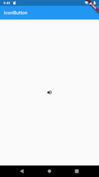
IconButton
参考:
IconButton可以响应按下的事件,并且按下时有一个水波纹的效果。如果它的onPressed回调函数为null,那么这个按钮处于禁用状态,并且不可以按下
属性:
- icon - 展示的图标
- onPressed - 按下时的回到事件
- tooltip - 按下时的提示语句
如下的例子:
class MyApp extends StatelessWidget {
  // This widget is the root of your application.
  @override
  Widget build(BuildContext context) {
    return MaterialApp(
      title: 'Image',
      home: Scaffold(
        appBar: AppBar(
          title: Text('Image'),
        ),
        body: Center(
          child: IconButton(
            icon: Icon(Icons.volume_up),
            tooltip: 'Increase volume by 10',
            onPressed: (){
              print("按下操作");
            },
          ),
        )
      ),
    );
  }
}
PopupMenuButton
参考:
PopupMenuButton为弹出菜单按钮,一般放在页面的右上角,表示有更多的操作
- icon - 图标
- itemBuilder - 菜单构造器
- onSelected - 当某项菜单被选中时回调的方法
class TodoMenuItem {
  final String title;
  final Icon icon;

  TodoMenuItem({this.title, this.icon});
}

List<TodoMenuItem> foodMenuList = [
  TodoMenuItem(title: 'Fast Food', icon: Icon(Icons.fastfood)),
  TodoMenuItem(title: 'Remind Me', icon: Icon(Icons.add_alarm)),
  TodoMenuItem(title: 'Flight', icon: Icon(Icons.flight)),
  TodoMenuItem(title: 'Music', icon: Icon(Icons.audiotrack)),
];

class PopupMenuButtonWidget extends StatelessWidget
    implements PreferredSizeWidget {
  const PopupMenuButtonWidget({
    Key key,
  }) : super(key: key);

  @override
  Widget build(BuildContext context) {
    return Container(
      color: Colors.lightGreen.shade100,
      height: preferredSize.height,
      width: double.infinity,
      child: Center(
        child: PopupMenuButton<TodoMenuItem>(
          icon: Icon(Icons.view_list),
          onSelected: ((valueSelected) {
            print('valueSelected: ${valueSelected.title}');
          }),
          itemBuilder: (BuildContext context) {
            return foodMenuList.map((TodoMenuItem todoMenuItem) {
              return PopupMenuItem<TodoMenuItem>(
                value: todoMenuItem,
                child: Row(
                  children: <Widget>[
                    Icon(todoMenuItem.icon.icon),
                    Padding(
                      padding: EdgeInsets.all(8.0),
                    ),
                    Text(todoMenuItem.title),
                  ],
                ),
              );
            }).toList();
          },
        ),
      ),
    );
  }

  @override
// implement preferredSize
  Size get preferredSize => Size.fromHeight(75.0);
}

开源鸿蒙跨平台开发社区汇聚开发者与厂商,共建“一次开发,多端部署”的开源生态,致力于降低跨端开发门槛,推动万物智联创新。
更多推荐

 0
0 0
0- 0


 已为社区贡献9条内容

所有评论(0)