【Flutter】入门12-按钮
FloatingActionButtonWidget build(BuildContext context) {return Scaffold(appBar: AppBar(title: Text('Gecer'),),body: null,floatingActionButton: FloatingAc...
·
FloatingActionButton
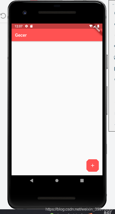
Widget build(BuildContext context) {
    return Scaffold(
      appBar: AppBar(
        title: Text('Gecer'),
      ),
      body: null,
      floatingActionButton: FloatingActionButton(
        onPressed: () {},
        child: Icon(Icons.add),
        elevation: 0.0,
        backgroundColor: Theme.of(context).primaryColor,
        //形状,默认是圆形
        shape: BeveledRectangleBorder(
          borderRadius: BorderRadius.circular(10)
        ),
      ),
    );
  }
FloatingActionButton.extended
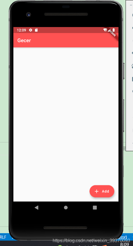
Widget build(BuildContext context) {
    return Scaffold(
      appBar: AppBar(
        title: Text('Gecer'),
      ),
      body: null,
      floatingActionButton: FloatingActionButton.extended(
        onPressed: () {},
        icon: Icon(Icons.add),
        label: Text('Add'),
        backgroundColor: Theme.of(context).primaryColor,
      ),
    );
  }
控制FloatingActionButton的位置
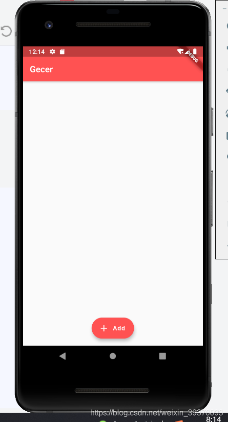
Widget build(BuildContext context) {
    return Scaffold(
      appBar: AppBar(
        title: Text('Gecer'),
      ),
      body: null,
      //控制位置
      floatingActionButtonLocation: FloatingActionButtonLocation.centerFloat,
      floatingActionButton: FloatingActionButton.extended(
        onPressed: () {},
        icon: Icon(Icons.add),
        label: Text('Add'),
        backgroundColor: Theme.of(context).primaryColor,
      ),
    );
  }
FlatButton
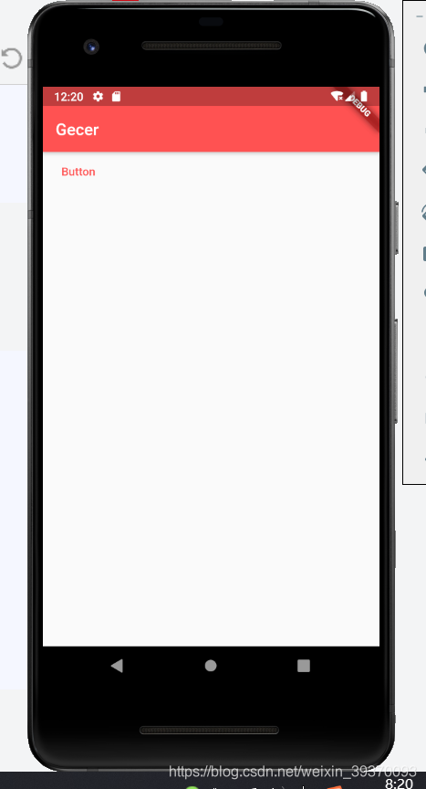
Widget build(BuildContext context) {
return Scaffold(
appBar: AppBar(
title: Text('Gecer'),
),
body: FlatButton(
child: Text('Button'),
onPressed: () {},
splashColor: Colors.redAccent, //渐墨效果颜色
textColor: Theme.of(context).primaryColor,
),
);
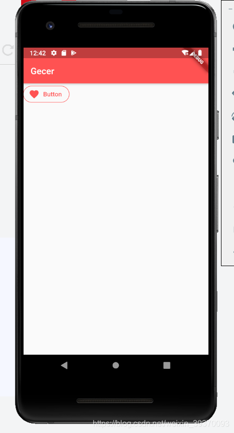
}FlatButton.icon
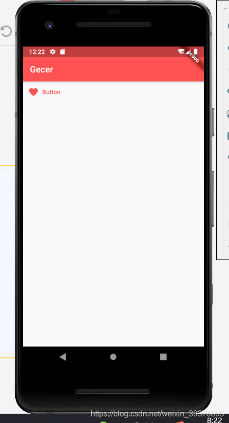
  Widget build(BuildContext context) {
    return Scaffold(
      appBar: AppBar(
        title: Text('Gecer'),
      ),
      body: FlatButton.icon(
        icon: Icon(Icons.favorite),
        label: Text('Button'),
        onPressed: () {},
        splashColor: Colors.redAccent, //渐墨效果颜色
        textColor: Theme.of(context).primaryColor,
      ),
    );
  }
RaisedButton
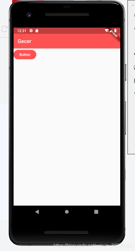
RaisedButton(
        child: Text('Button'),
        onPressed: () {},
        splashColor: Colors.grey,
        elevation: 0.0, //阴影大小
        color: Theme.of(context).primaryColor, //背景颜色
        textColor: Colors.white,
        shape: StadiumBorder(), //圆角按钮 默认是方的
      )
RaisedButton.icon
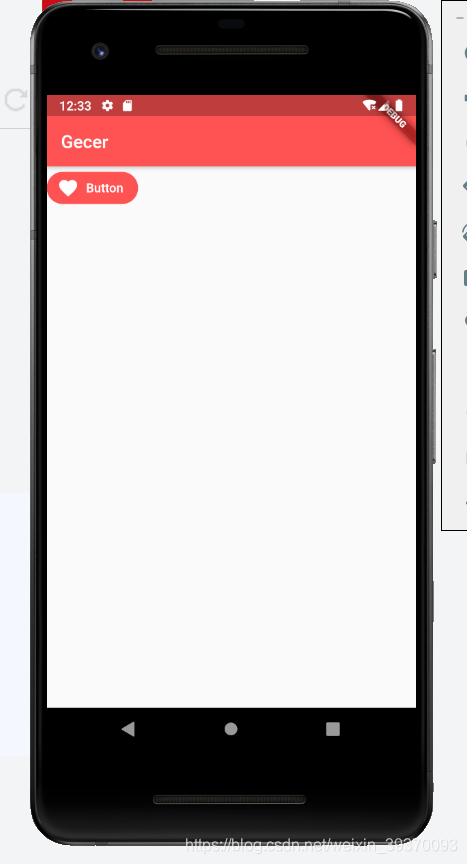
RaisedButton.icon(
        icon: Icon(Icons.favorite),
        label: Text('Button'),
        onPressed: () {},
        splashColor: Colors.grey,
        elevation: 0.0, //阴影大小
        color: Theme.of(context).primaryColor, //背景颜色
        textColor: Colors.white,
        shape: StadiumBorder(), //圆角按钮 默认是方的
      )
OutlineButton
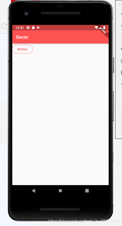
OutlineButton(
        child: Text('Button'),
        onPressed: () {},
        splashColor:Theme.of(context).primaryColor,//渐墨颜色
        highlightedBorderColor: Colors.blue,//点击时按钮的颜色
        borderSide:BorderSide(
          color: Theme.of(context).primaryColor//边框颜色颜色
        ),
        textColor: Theme.of(context).primaryColor,
        shape: StadiumBorder(), //圆角按钮 默认是方的
      )
OutlineButton.icon
 OutlineButton.icon(
        icon: Icon(Icons.favorite),
        label: Text('Button'),
        onPressed: () {},
        splashColor:Theme.of(context).primaryColor,//渐墨颜色
        highlightedBorderColor: Colors.blue,//点击时按钮的颜色
        borderSide:BorderSide(
          color: Theme.of(context).primaryColor//边框颜色颜色
        ),
        textColor: Theme.of(context).primaryColor,
        shape: StadiumBorder(), //圆角按钮 默认是方的
      ),
通过Container容器控制button的大小
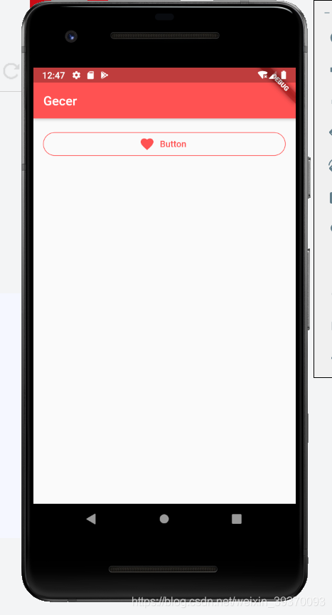
Container(
        padding: EdgeInsets.all(16),
        width: double.infinity,
          child: OutlineButton.icon(
        icon: Icon(Icons.favorite),
        label: Text('Button'),
        onPressed: () {},
        splashColor: Theme.of(context).primaryColor, //渐墨颜色
        highlightedBorderColor: Colors.blue, //点击时按钮的颜色
        borderSide: BorderSide(color: Theme.of(context).primaryColor //边框颜色颜色
            ),
        textColor: Theme.of(context).primaryColor,
        shape: StadiumBorder(), //圆角按钮 默认是方的
      ))
使用Expanded限制组件大小
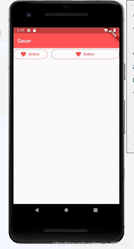
 Row(
          children: <Widget>[
            Expanded(
                child: OutlineButton.icon(
              icon: Icon(Icons.favorite),
              label: Text('Button'),
              onPressed: () {},
              splashColor: Theme.of(context).primaryColor, //渐墨颜色
              highlightedBorderColor: Colors.blue, //点击时按钮的颜色
              borderSide:
                  BorderSide(color: Theme.of(context).primaryColor //边框颜色颜色
                      ),
              textColor: Theme.of(context).primaryColor,
              shape: StadiumBorder(), //圆角按钮 默认是方的
            )),
            SizedBox(width: 16),
            Expanded(
                flex: 2,//通过flex控制比例
                child: OutlineButton.icon(
                  icon: Icon(Icons.favorite),
                  label: Text('Button'),
                  onPressed: () {},
                  splashColor: Theme.of(context).primaryColor, //渐墨颜色
                  highlightedBorderColor: Colors.blue, //点击时按钮的颜色
                  borderSide:
                      BorderSide(color: Theme.of(context).primaryColor //边框颜色颜色
                          ),
                  textColor: Theme.of(context).primaryColor,
                  shape: StadiumBorder(), //圆角按钮 默认是方的
                ))
          ],
        )
PopupMenuButton
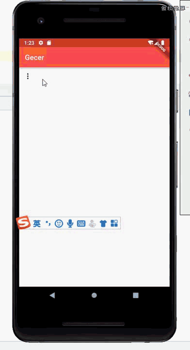
 PopupMenuButton(
          //获取点中的按钮value
          onSelected: (value) {
            print(value);
          },
          itemBuilder: (BuildContext context) => [
            PopupMenuItem(
              value: '2020',
              child: Text('2020'),
            ),
            PopupMenuItem(
              value: '新年快乐',
              child: Text('新年快乐'),
            )
          ],
        )
showDatePicker
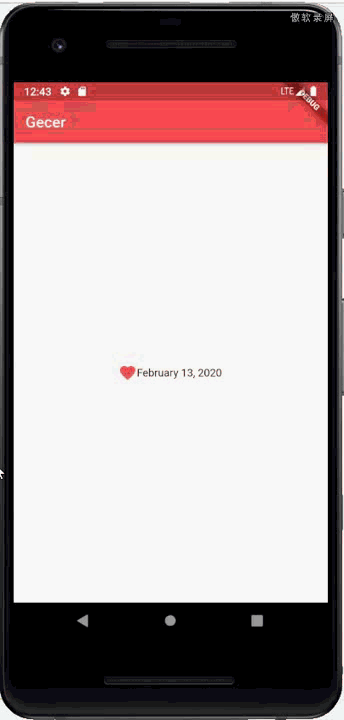
 DateTime _selectedDate = DateTime.now();
  //异步显示选择日期
  Future<void> _selectDate() async {
    final DateTime date = await showDatePicker(
      context: context,
      initialDate: _selectedDate, //初始选中的日期
      firstDate: DateTime(1900), //开始日期
      lastDate: DateTime(2100), //结束日期作为选择范围
    );

    if (date == null) return;

    setState(() {
      _selectedDate = date;
    });
  }

  @override
  Widget build(BuildContext context) {
    return Scaffold(
        appBar: AppBar(title: Text('Gecer')),
        body: Column(
            mainAxisAlignment: MainAxisAlignment.center,
            children: <Widget>[
              //使用InkWell 是为了给子元素添加点击事件
              InkWell(
                onTap: _selectDate,
                child: Row(
                    mainAxisAlignment: MainAxisAlignment.center,
                    children: <Widget>[
                      Icon(
                        Icons.favorite,
                        color: Colors.redAccent,
                      ),
                      //DateFormat 引用于intl
                      Text(DateFormat.yMMMMd().format(_selectedDate))
                    ]),
              )
            ]));
  }
showTimePicker
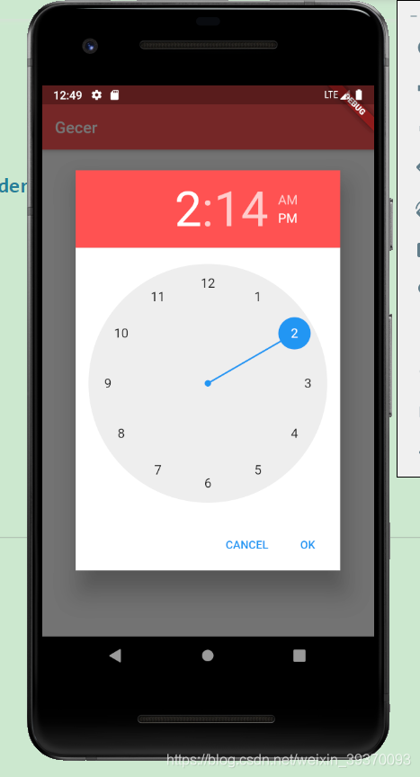
TimeOfDay _selectedTime = TimeOfDay.now();
  //异步显示选择时间
  Future<void> _selectTime() async {
    final TimeOfDay time = await showTimePicker(
      context: context,
      initialTime: _selectedTime,
    );

    if (time == null) return;

    setState(() {
      _selectedTime = time;
    });
  }

  @override
  Widget build(BuildContext context) {
    return Scaffold(
        appBar: AppBar(title: Text('Gecer')),
        body: Column(
            mainAxisAlignment: MainAxisAlignment.center,
            children: <Widget>[
              //使用InkWell 是为了给子元素添加点击事件
              InkWell(
                onTap: _selectTime,
                child: Row(
                    mainAxisAlignment: MainAxisAlignment.center,
                    children: <Widget>[
                      Icon(
                        Icons.favorite,
                        color: Colors.redAccent,
                      ),
                      //DateFormat 引用于intl
                      Text(_selectedTime.format(context))
                    ]),
              )
            ]));
  }

开源鸿蒙跨平台开发社区汇聚开发者与厂商,共建“一次开发,多端部署”的开源生态,致力于降低跨端开发门槛,推动万物智联创新。
更多推荐
 0
0 0
0- 0


 已为社区贡献14条内容

所有评论(0)