Flutter 项目实战 编辑框(TextField) 自定义 七
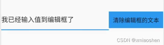
编辑框控制器销毁@override输入文本到编辑框I/flutter ( 1091): 编辑输入的值:我I/flutter ( 1091): 编辑输入的值:我已经I/flutter ( 1091): 编辑输入的值:我已经输入值I/flutter ( 1091): 编辑输入的值:我已经输入值到I/flutter ( 1091): 编辑输入的值:我已经输入值到编辑框I/flutter ( 1091):
),
flex: 1,
),
GestureDetector(
onTap: () {
_controller!.clear();
},
child: Container(
padding: EdgeInsets.all(10.0),
color: Colors.blue,
child: Text('清除编辑框的文本'),
),
)
],
),
),
);
}
编辑框控制器销毁
@override
void dispose() {
// TODO: implement dispose
_controller!.clear();
_controller!.removeListener(_conListener!);
_controller!.dispose();
_controller = null;
super.dispose();
}
输入文本到编辑框
I/flutter ( 1091): 编辑输入的值:我
I/flutter ( 1091): 编辑输入的值:我已经
I/flutter ( 1091): 编辑输入的值:我已经输入值
I/flutter ( 1091): 编辑输入的值:我已经输入值到
I/flutter ( 1091): 编辑输入的值:我已经输入值到编辑框
I/flutter ( 1091): 编辑输入的值:我已经输入值到编辑框了
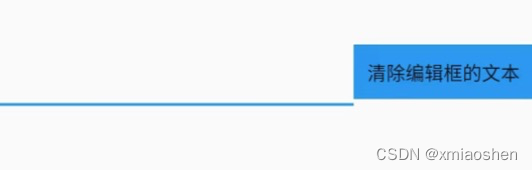
点击清除编辑框文本
I/flutter ( 1091): 编辑输入的值:
FocusNode? focusNode
编辑框输入获取或失去焦点监听 . 编辑框首次显示输入光标时默认为没有获取焦点 , 当进行了输入操作后就等同于获取了焦点 .
///编辑框获取或者失去焦点监听
VoidCallback? _focusNodeListener;
FocusNode _focusNode = FocusNode();
@override
void initState() {
super.initState();
_controller = TextEditingController();
_conListener = () {
print('编辑输入的值:' + _controller!.text);
};
_controller!.addListener(_conListener!);
_focusNodeListener = () {
print('编辑框是否获取焦点:${_focusNode.hasFocus}');
};
_controller!.addListener(_focusNodeListener!);
}
TextField(
controller: _controller,
focusNode: _focusNode,
),
编辑框首次显示输入光标时默认为没有获取焦点
I/flutter ( 8761): 编辑输入的值:
I/flutter ( 8761): 编辑框是否获取焦点:false
W/IInputConnectionWrapper( 8761): getSelectedText on inactive InputConnection
W/IInputConnectionWrapper( 8761): getTextAfterCursor on inactive InputConnection
W/IInputConnectionWrapper( 8761): getTextBeforeCursor on inactive InputConnection
W/IInputConnectionWrapper( 8761): getTextAfterCursor on inactive InputConnection
编辑框输入文本或者删除文本后
I/flutter ( 8761): 编辑输入的值:我正在
I/flutter ( 8761): 编辑框是否获取焦点:true
I/flutter ( 8761): 编辑输入的值:我正在向
I/flutter ( 8761): 编辑框是否获取焦点:true
I/flutter ( 8761): 编辑输入的值:我正在向编辑框
I/flutter ( 8761): 编辑框是否获取焦点:true
I/flutter ( 8761): 编辑输入的值:我正在向编辑框输入
I/flutter ( 8761): 编辑框是否获取焦点:true
I/flutter ( 8761): 编辑输入的值:我正在向编辑框输入值
InputDecoration? decoration
自定义编辑框样式 (图标、label、提示文本、错误文本、获取焦点文本颜色、失去焦点文本颜色、字体样式、边框等…)
InputDecoration({
this.icon, //位于装饰器外部和输入框前面的图片
this.labelText, //用于描述输入框,例如这个输入框是用来输入用户名还是密码的,当输入框获取焦点时默认会浮动到上方,
this.labelStyle, // 控制labelText的样式,接收一个TextStyle类型的值
this.helperText, //辅助文本,位于输入框下方,如果errorText不为空的话,则helperText不会显示
this.helperStyle, //helperText的样式
this.hintText, //提示文本,位于输入框内部
this.hintStyle, //hintText的样式
this.hintMaxLines, //提示信息最大行数
this.errorText, //错误信息提示
this.errorStyle, //errorText的样式
this.errorMaxLines, //errorText最大行数
this.hasFloatingPlaceholder = true, //labelText是否浮动,默认为true,修改为false则labelText在输入框获取焦点时不会浮动且不显示
this.isDense, //改变输入框是否为密集型,默认为false,修改为true时,图标及间距会变小
this.contentPadding, //内间距
this.prefixIcon, //位于输入框内部起始位置的图标。
this.prefix, //预先填充的Widget,跟prefixText同时只能出现一个
this.prefixText, //预填充的文本,例如手机号前面预先加上区号等
this.prefixStyle, //prefixText的样式
this.suffixIcon, //位于输入框后面的图片,例如一般输入框后面会有个眼睛,控制输入内容是否明文
this.suffix, //位于输入框尾部的控件,同样的不能和suffixText同时使用
this.suffixText,//位于尾部的填充文字
this.suffixStyle, //suffixText的样式
this.counter,//位于输入框右下方的小控件,不能和counterText同时使用
this.counterText,//位于右下方显示的文本,常用于显示输入的字符数量
this.counterStyle, //counterText的样式
this.filled, //如果为true,则输入使用fillColor指定的颜色填充
this.fillColor, //相当于输入框的背景颜色
this.errorBorder, //errorText不为空,输入框没有焦点时要显示的边框
this.focusedBorder, //输入框有焦点时的边框,如果errorText不为空的话,该属性无效
this.focusedErrorBorder, //errorText不为空时,输入框有焦点时的边框
this.disabledBorder, //输入框禁用时显示的边框,如果errorText不为空的话,该属性无效
this.enabledBorder, //输入框可用时显示的边框,如果errorText不为空的话,该属性无效
this.border, //正常情况下的border
this.enabled = true, //输入框是否可用
this.semanticCounterText,
this.alignLabelWithHint,
})
decoration: const InputDecoration(
icon: Icon(Icons.message),),
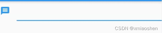
icon 编辑框前面图标
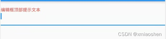
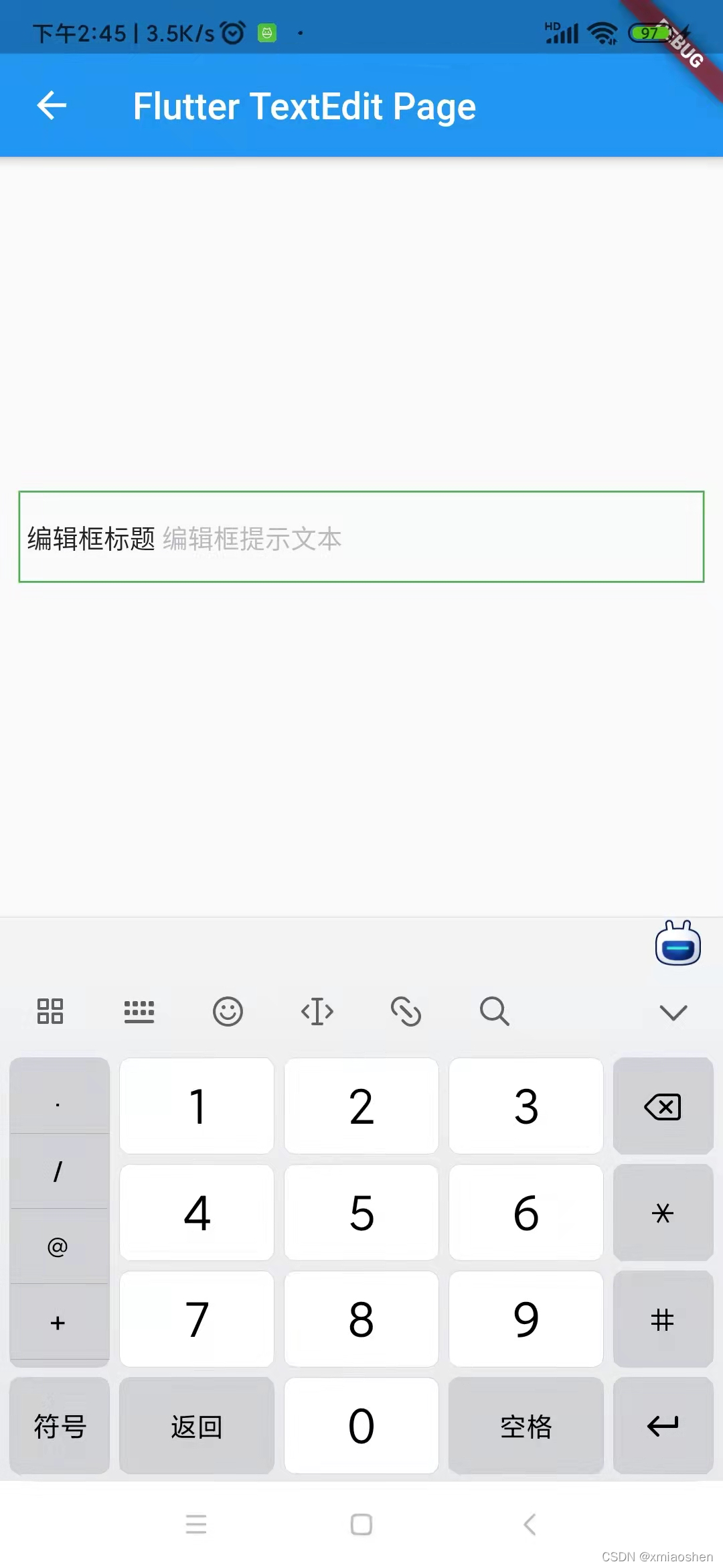
InputDecoration( labelText: ‘编辑框顶部提示文本’ ),
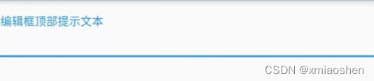
labelText
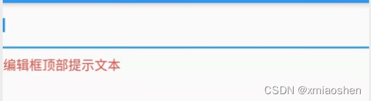
InputDecoration(
labelText: ‘编辑框顶部提示文本’,
labelStyle: TextStyle(color: Colors.red, fontSize: 14.0)),
labelTextStyle
InputDecoration(
helperText: ‘编辑框底部提示文本’,
helperStyle: TextStyle(color: Colors.red, fontSize: 14.0))
helperText / helperStyle
编辑框底部提示文本行数(显示1行或者多行,如果文本值超过一行显示省略号)
InputDecoration(
helperMaxLines: 1,
helperText: ‘编辑框底部提示文本/编辑框底部提示文本/编辑框底部提示文本/编辑框底部提示文本/编辑框底部提示文本’,
helperStyle: TextStyle(color: Colors.red, fontSize: 14.0))
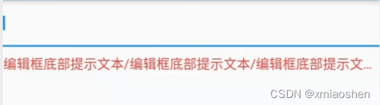
helperMaxLines
InputDecoration(
hintMaxLines: 1,
hintText: ‘编辑框内提示文本/编辑框内提示文本/编辑框内提示文本/编辑框内提示文本’,
hintTextDirection: TextDirection.rtl,
hintStyle: TextStyle(color: Colors.red, fontSize: 14.0))
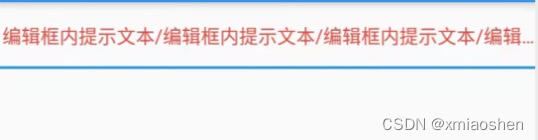
hintText / hintStyle / hintTextDirection / hintMaxLines
InputDecoration(
errorMaxLines: 1,
errorText: ‘编辑框错误文本提示一’,
errorBorder: UnderlineInputBorder(
borderRadius: BorderRadius.all(
Radius.circular(30), //边角为30
),
borderSide: BorderSide(
color: Colors.amber, //边线颜色为黄色
width: 2, //边线宽度为2
),),
errorStyle: TextStyle(color: Colors.blue, fontSize: 14.0))
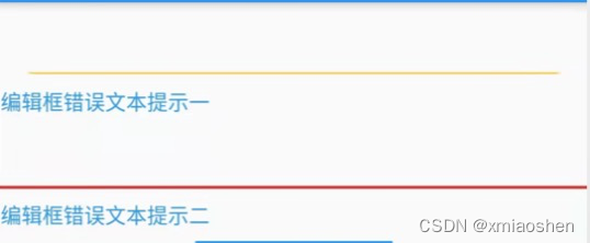
errorMaxLines/errorText/errorBorder/errorStyle
TextField(
decoration: const InputDecoration(
enabledBorder: OutlineInputBorder(
borderRadius: BorderRadius.all(
Radius.circular(30), //边角为30
),
borderSide: BorderSide(
color: Colors.amber, //边线颜色为红色
width: 2, //边线宽度为2
),
),
focusedBorder: OutlineInputBorder(
borderRadius: BorderRadius.all(
Radius.circular(30), //边角为30
),
borderSide: BorderSide(
color: Colors.green, //边框颜色为绿色
width: 5, //宽度为5
))),
),
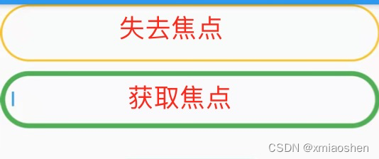
enabledBorder/focusedBorder
/ 自定义编辑框 /
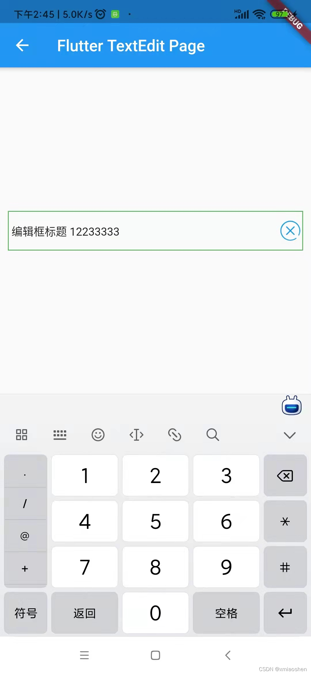
编辑框一键删除
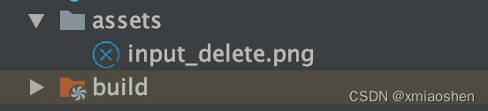
assets文件夹下放置用来进行一键删除的图标
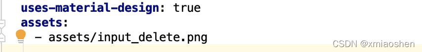
pubspec.yaml 注册图标依赖
initState函数里面初始化一键删除编辑框控制器
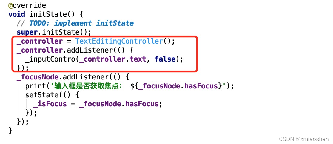
//定义一个controller
late TextEditingController _controller;
bool _isShoDel = false;
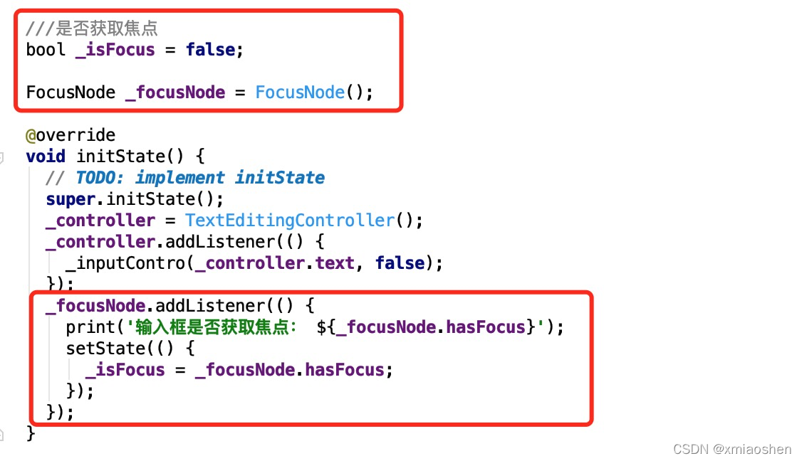
///是否获取焦点
bool _isFocus = false;
FocusNode _focusNode = FocusNode();
@override
void initState() {
// TODO: implement initState
super.initState();
_controller = TextEditingController();
_controller.addListener(() {
_inputContro(_controller.text, false);
});
_focusNode.addListener(() {
print('输入框是否获取焦点: ${_focusNode.hasFocus}');
setState(() {
_isFocus = _focusNode.hasFocus;
});
});
}
失去焦点或者编辑框不存在文本时 , 一键删除图标隐藏
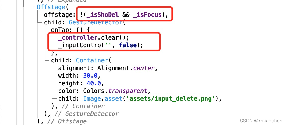
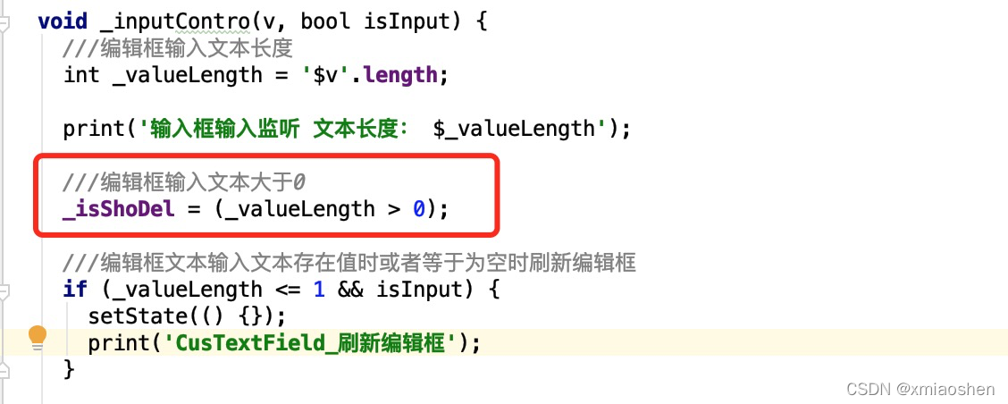
编辑框粘贴需用用到编辑控制器 , 复制文本粘贴到编辑会显示一键删除
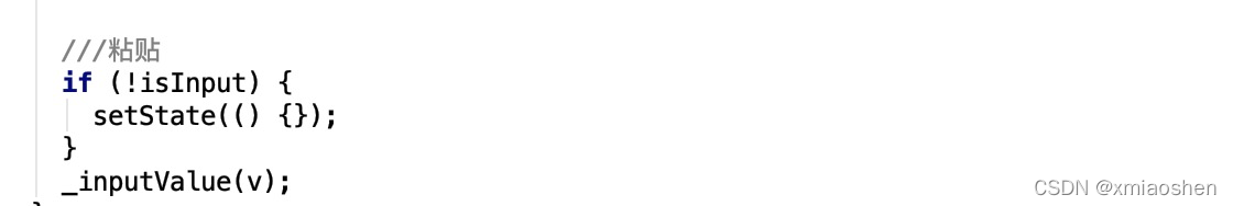
编辑框输入文本后并失去焦点 , 一键删除按钮隐藏
编辑框输入完成后替换空格 ,网络请求数据只会上传除开空格后的文本
编辑框完整编码
import ‘package:flutter/cupertino.dart’;
import ‘package:flutter/material.dart’;
///自定义编辑
class CusTextField extends StatefulWidget {
final InputValueCallBack? _inputValueCallBack;
///编辑框输入颜色值
final inputColorValue;
///编辑框默认提示文本
final hintText;
///边框
final border;
///编辑框最外层边框
final bgBorder;
///标题
final Widget? labelText;
///编辑框输入文本大小
final inputFontSize;
///文本位置(左边|右边|中间)
final TextAlign? textAlign;
final keyboardType;
//文本行数

更多学习和讨论,欢迎加入我们!
有许多来自一线的技术大牛,也有在小厂或外包公司奋斗的码农,我们致力打造一个平等,高质量的Android交流圈子,不一定能短期就让每个人的技术突飞猛进,但从长远来说,眼光,格局,长远发展的方向才是最重要的。
这里有2000+小伙伴,让你的学习不寂寞~·
网上学习资料一大堆,但如果学到的知识不成体系,遇到问题时只是浅尝辄止,不再深入研究,那么很难做到真正的技术提升。
一个人可以走的很快,但一群人才能走的更远!不论你是正从事IT行业的老鸟或是对IT行业感兴趣的新人,都欢迎加入我们的的圈子(技术交流、学习资源、职场吐槽、大厂内推、面试辅导),让我们一起学习成长!
///边框
final border;
///编辑框最外层边框
final bgBorder;
///标题
final Widget? labelText;
///编辑框输入文本大小
final inputFontSize;
///文本位置(左边|右边|中间)
final TextAlign? textAlign;
final keyboardType;
//文本行数
[外链图片转存中…(img-pgENvmP3-1714487948275)]
更多学习和讨论,欢迎加入我们!
有许多来自一线的技术大牛,也有在小厂或外包公司奋斗的码农,我们致力打造一个平等,高质量的Android交流圈子,不一定能短期就让每个人的技术突飞猛进,但从长远来说,眼光,格局,长远发展的方向才是最重要的。
这里有2000+小伙伴,让你的学习不寂寞~·
网上学习资料一大堆,但如果学到的知识不成体系,遇到问题时只是浅尝辄止,不再深入研究,那么很难做到真正的技术提升。
一个人可以走的很快,但一群人才能走的更远!不论你是正从事IT行业的老鸟或是对IT行业感兴趣的新人,都欢迎加入我们的的圈子(技术交流、学习资源、职场吐槽、大厂内推、面试辅导),让我们一起学习成长!

开源鸿蒙跨平台开发社区汇聚开发者与厂商,共建“一次开发,多端部署”的开源生态,致力于降低跨端开发门槛,推动万物智联创新。
更多推荐
 12
12 0
0- 0


 已为社区贡献3条内容

所有评论(0)