Flutter-微信项目实战框架搭建
Flutter-微信项目实战框架搭建

1. 写在前面
今天就来个实战项目,搭建一下微信的框架吧!
2. 新建项目
- 新建项目
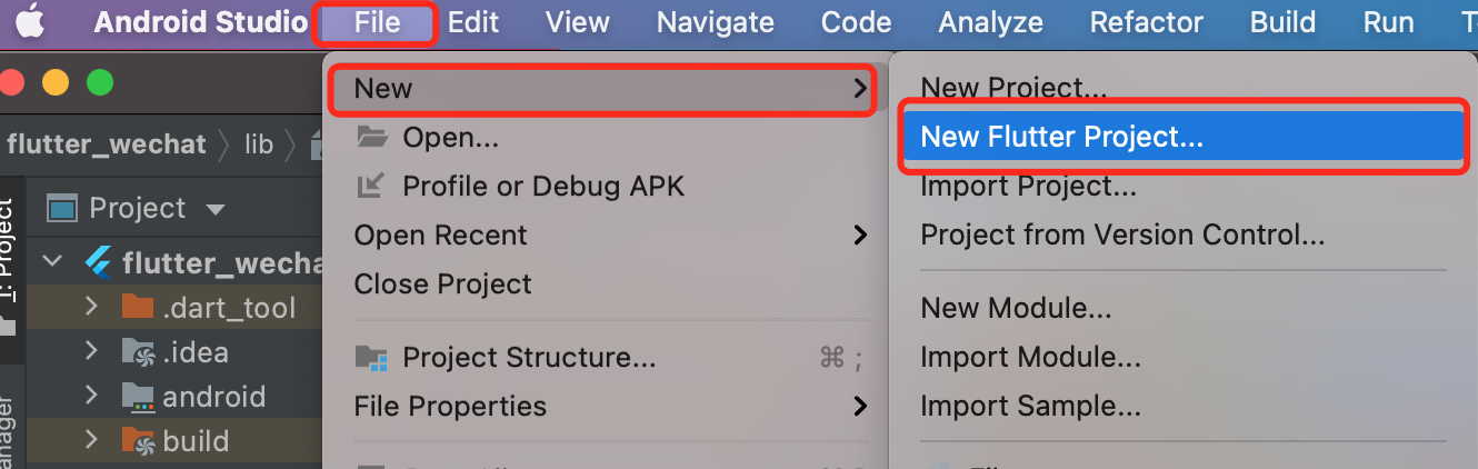
选择File -> New -> New Flutter Project新建一个 flutter 项目
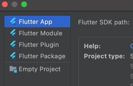
- 选择 Flutter App
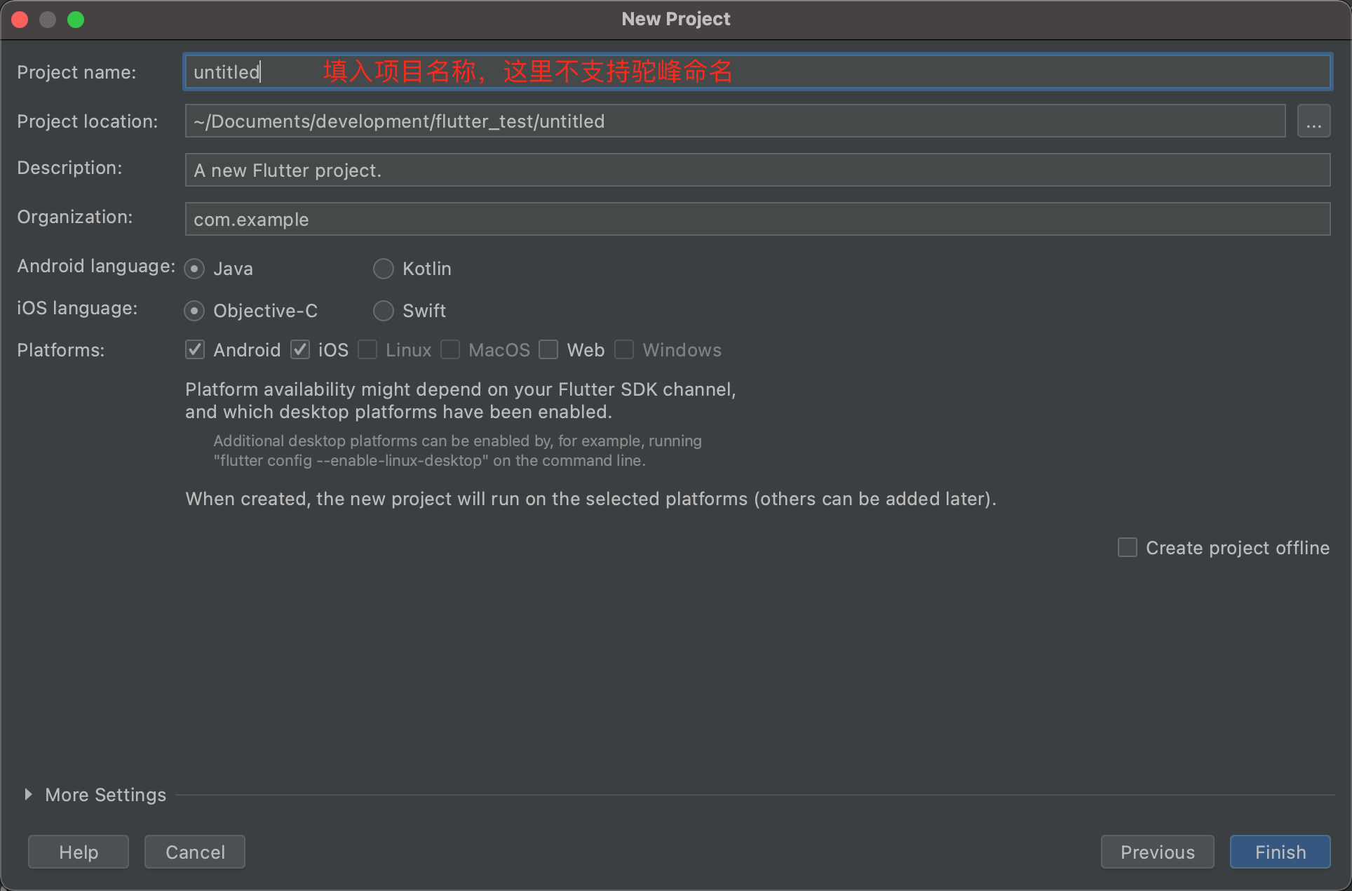
- 设置项目名称为
flutter_wechat
3. main.dart
3.1 main函数
void main() {
runApp(const MyApp());
}
class MyApp extends StatelessWidget {
const MyApp({Key? key}) : super(key: key);
// This widget is the root of your application.
@override
Widget build(BuildContext context) {
return MaterialApp(
debugShowCheckedModeBanner: true,//去掉 debug 标记
theme:ThemeData(
primarySwatch: Colors.blue,//导航栏颜色
),
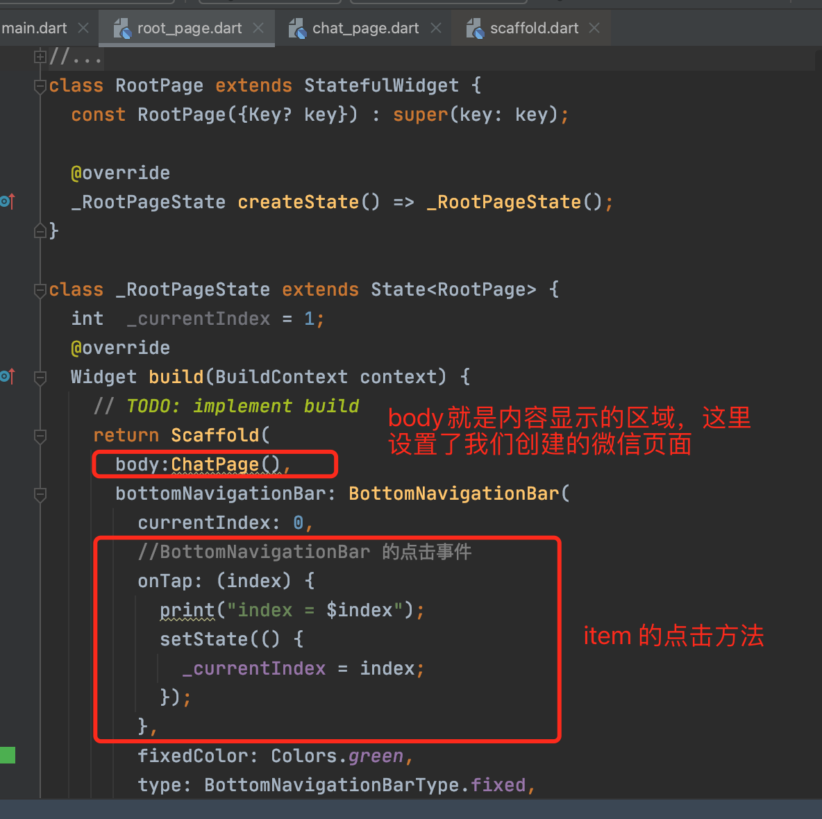
home: RootPage(),
);
}
}
home: 相当于 OC 中的 UITabBarController,这是 APP 的骨架debugShowCheckedModeBanner:去掉 debug的标记,设置 false就不展示theme:主题的设置
3.2 创建根视图
- 根视图
RootPage设置,
先来创建一个文件root_page.dart,设置 tabbar
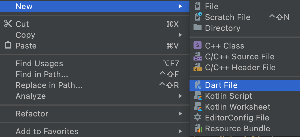
- 新建 dart 文件
3.3 设置BottomNavigationBar
bottomNavigationBar
在Scaffold组件里面有个属性bottomNavigationBar,这个就是相当于我们 OC 中的 tabbar,它是继承自StatefulWidget。通过BottomNavigationBar的items来设置 4 个页面,用BottomNavigationBarItem来构造。
bottomNavigationBar: BottomNavigationBar(
currentIndex: 0,
fixedColor: Colors.green,
type: BottomNavigationBarType.fixed,
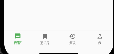
items: const [
BottomNavigationBarItem(
icon: Icon(Icons.message),
label: '微信'),
BottomNavigationBarItem(
icon: Icon(Icons.bookmark),
label: '通讯录'),
BottomNavigationBarItem(
icon: Icon(Icons.history),
label: '发现'),
BottomNavigationBarItem(
icon: Icon(Icons.person_outline),
label: '我'),
],
)
3.4 BottomNavigationBar
BottomNavigationBar的一些属性介绍:
type:BottomNavigationBarItem的模式,BottomNavigationBarType是枚举,有fixed和shifting两种模式设置。
currentIndex:当前选中的是哪个 item,就是底部 4 个 item的切换选中的值,可以通过点击的方法切换改值
fixedColor:填充的颜色,item 的填充颜色
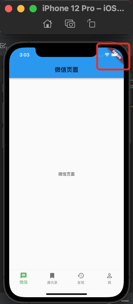
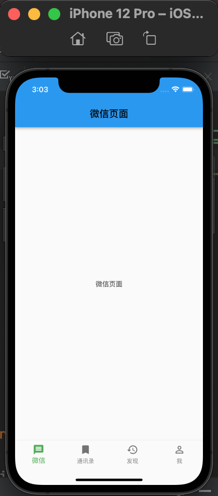
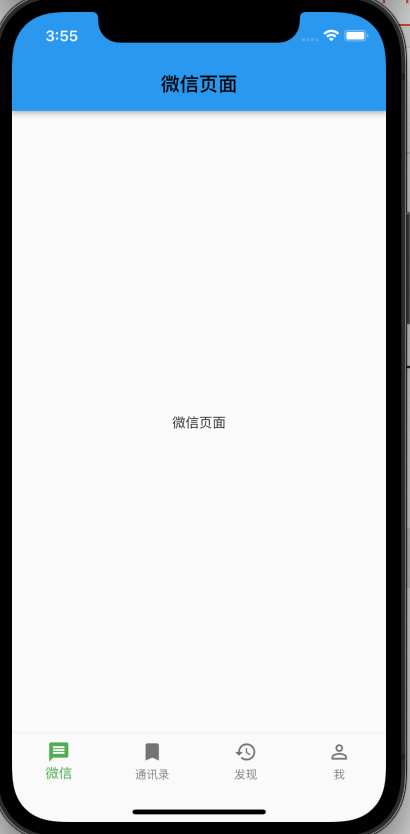
3.5 创建微信页面
- 微信界面
一个 BottomNavigationBarItem 对应的页面就相当于 OC 中的 UIViewController。
class ChatPage extends StatefulWidget {
  const ChatPage({Key? key}) : super(key: key);
  @override
  _ChatPageState createState() => _ChatPageState();
}

class _ChatPageState extends State<ChatPage> {
  @override
  Widget build(BuildContext context) {
    return  Scaffold(
      appBar: AppBar(
        title: const Text(
          '微信页面',
          style: TextStyle(color: Colors.black),
        ),
      ),
      body:const Center(
        child: Text('微信页面'),
      ),
    );
  }
}
- BottomNavigationBarItem的切换
BottomNavigationBarItem的切换需要实现onTap 点击方法来进行切换。
//BottomNavigationBar 的点击事件
        onTap: (index) {
          print("index = $index");
          setState(() {
            _currentIndex = index;
          });
        },
在onTap方法的回调里面,可以拿到点击的 item 的值,就可以设置当前需要显示的页面时哪个,通过_currentIndex = index;来改变。
注意:
因为涉及到状态的改变,所以Widget必须使用带状态的StatefulWidget,在回调方法里面,需要使用setState来设置状态的改变。
4个页面的切换也搭建出来

要实现上面动图的效果,我们先建立 4 个界面。
- chat_page:微信聊天页面
- friends_page:通讯录页面
- discover_page:发现页面
- mine_page:我的界面
导入上面建立的四个界面到根视图root_page里面,建立一个List存放 4 个Widget,在切换 item 的时候,获取List里面的对应的Widget就可以达到切换的效果了。
import 'package:flutter_wechat/chat_page.dart';
import 'package:flutter_wechat/discover_page.dart';
import 'package:flutter_wechat/friends_page.dart';
import 'package:flutter_wechat/mine_page.dart';
- 具体的代码如下:

我们今天主要实现的界面是我的界面,效果如下图所示,那么改怎么实现呢?

我们先来实现上面的头部部分,下面是一个ListView来实现,大体分为上下两部分。

3. 实现头部
3.1 结构分析
头部也可以分为左右和上下来分解,左边是头像,右边是昵称、微信号、箭头部分,右边又是上下结构的,由此可以得到如下结构图。

头部整体可以使用Container,左右的布局我们使用Row,上下布局使用Column,头像可以使用一个Container,右边的Container里面使用又是上下的Container,使用Container是可以设置背景颜色,方便我们看布局,相当于 OC 中的 View,是充当一个容器的作用。

- 头像
Container(
                  width: 70,
                  height: 70,
                  decoration: BoxDecoration(
                    // color: Colors.blue,
                      borderRadius: BorderRadius.circular(10),
                      image: const DecorationImage(
                          image: AssetImage("images/avatar.jpeg"),
                          fit:BoxFit.cover
                      )
                  ),
                ),
3.2 头像设置圆角
头像设置圆角需要一个decoration(装饰器),里面可以设置borderRadius和图片,我们图片是使用了AssetImage本地的路径图片。
使用AssetImage需要在本地的pubspec.yaml 文件里面设置一下路径。如下图打开注释,设置文件夹:

打开注释,设置图片文件夹,注意要对齐代码,这里的 images 是我本地工程里面的文件夹,这是是设置路径,当然你可以设置你自己的文件路径。
设置头像image: AssetImage("images/avatar.jpeg"),设置微信昵称和微信号代码如下:
Container(
                  width: screenWidth(context)-90,
                  padding: const EdgeInsets.only(left: 10,top: 8),
                  child: Column(
                    crossAxisAlignment: CrossAxisAlignment.start,
                    children:<Widget>[
                      //昵称
                       Container(
                        height: 35,
                        child:  Text("RENO",style: TextStyle(fontSize: 25,color: Colors.grey),),
                      ),
                      //微信号
                      Container(
                        height: 35,
                        child:Row(
                          mainAxisAlignment: MainAxisAlignment.spaceBetween,
                          children: const <Widget>[
                            Text("微信号:12345",style: TextStyle(fontSize: 17,color: Colors.grey),),
                            Image(image: AssetImage("images/icon_right.png"),width: 15,)
                          ],
                        ) ,),
                    ],
                  ),

                )
3.3 获取屏幕宽高
- screenWidth是屏幕宽度,可以自己定义一个全局的文件来使用,也可以单独获取也可以。
double screenWidth(BuildContext context){
  return MediaQuery.of(context).size.width;
}
继续来写微信实战项目,包括自定义cell!

2. 列表实现分析
我们先来分析一下列表List 的结构组成,有图片,有文字,有左边的有右边的,cell 之间还有灰色的间隔,还有分割线。

一个 cell 的整体肯定是一个Container,左右也是一个Container,图片和文字可以是Container包裹一个Row,是左右的布局。
整个列表的肯定是ListView, cell 之间是上下结构,可以使用Column来布局。
3. 自定义 cell
自定义 cell,我们要考虑扩展性,看看是否其他页面也可以共用,我的界面的 cell 里面是有图片、文字、箭头。
在发现页面的 cell 还有子标题和子图片,如下:

那么在cell 的属性就有标题、图片、子标题、子图标,箭头,箭头是每个 cell 都有的,就不需要设置属性了,直接代码里面写就可以了。
  final String? title;//标题
  final String? subTitle;//子标题
  final String? imageName;//图标
  final String? subImageName;//子图标
  //构造方法
  const MineCell({this.title, this.subTitle, this.imageName, this.subImageName});
在构造方法里面用
{ }括起来的就是可选的参数,?号修饰是表示空安全,可以为 null,就是类型于Swift里面的可选的意思,使用的时候要用!号修饰,表示不为 null 是有值的,下面代码里面会有使用到。
cell要响应点击的事件,那么就需要一个GestureDetector来包裹起来,并且实现点击的方法。

- left
//left
            Container(
              padding: const EdgeInsets.all(10),
              child: Row(
                children: <Widget>[
                  Image(
                    image: AssetImage(imageName!),
                    width: 20,
                  ),
                  SizedBox(
                    width: 15,
                  ),
                  Text(title!),
                ],
              ),
            )
SizedBox可以创建一个固定大小的框,具有固定宽高的组件,可以设置宽高,这里是用来分割、占位用的。
- right
Container(
              padding: EdgeInsets.all(10),
              child: Row(
                children: <Widget>[
                  subTitle != null ? Text(subTitle!) : const Text(''),
                  subImageName != null
                      ? Image(
                    image: AssetImage(subImageName!),
                    width: 12,
                  )
                      : Container(),
                  //箭头
                  const Image(
                    image: AssetImage('images/icon_right.png'),
                    width: 14,
                  )
                ],
              ),
            )
现在就实现了 cell 的自定义了,那么接下来就是列表的整体实现了。
4. ListView 实现列表
我们把自定义的 cell的头文件导入到我的界面mine_page 里面。大体代码结构如下:

- ListView 代码如下
........部分代码省略............

children: [
                    const SizedBox(height: 10,),
                    const MineCell(
                      imageName: 'images/微信支付.png',
                      title: '支付',
                    ),
                    const SizedBox(
                      height: 10,
                    ),
                    const MineCell(
                      imageName: 'images/微信收藏.png',
                      title: '收藏',
                    ),
                    //cell 底部分割线
                    Row(
                      children: <Widget>[
                        //左右
                        Container(width: 50, height: 0.5, color: Colors.white),
                        //Container(height: 0.5, color: Colors.grey)
                      ],
                    )

  ........部分代码省略............

                ]
cell之间大的间隙我们使用SizedBox来实现,cell 底部的间隙,这里的实现是:
Row(
   children: <Widget>[
   //左右
  Container(width: 50, height: 0.5, color:  Colors.white),
  Container(height: 0.5, color: Colors.grey)
        ],
 )
cell底部的分割线是没有占满屏幕宽度的,我们可以使用Row左右布局,左边固定一个宽度和高度的Container,右边固定一个高度Container,那么宽度就自动拉满了,然后设置一下颜色就 OK 了。
Flutter的布局还是很方便的,也很灵活,有兴趣的老铁自己动手去实现一下吧!
🌹 喜欢就点个赞吧👍🌹
🌹 觉得有收获的,可以来一波 收藏+关注,以免你下次找不到我😁🌹
🌹欢迎大家留言交流,批评指正,
转发请注明出处,谢谢支持!🌹

开源鸿蒙跨平台开发社区汇聚开发者与厂商,共建“一次开发,多端部署”的开源生态,致力于降低跨端开发门槛,推动万物智联创新。
更多推荐

 3
3 0
0- 0


 已为社区贡献5条内容

所有评论(0)