flutter 圆角_Flutter 实战篇 | 各种各样形状的组件
内容转载自:CSDN博主【老孟Flutter】老孟导读:Flutter中很多组件都有一个叫做shape的属性,类型是ShapeBorder,比如Button类、Card等组件,shape表示控件的形状,系统已经为我们提供了很多形状,对于没有此属性的组件,可以使用 Clip 类组件进行裁剪。BeveledRectangleBorder斜角矩形边框,用法如下:RaisedButton(shape:..
内容转载自:CSDN博主【老孟Flutter】

老孟导读:Flutter中很多组件都有一个叫做shape的属性,类型是ShapeBorder,比如Button类、Card等组件,shape表示控件的形状,系统已经为我们提供了很多形状,对于没有此属性的组件,可以使用 Clip 类组件进行裁剪。
BeveledRectangleBorder
斜角矩形边框,用法如下:
RaisedButton( shape: BeveledRectangleBorder( side: BorderSide(width: 1, color: Colors.red), borderRadius: BorderRadius.circular(10)), child: Text('老孟'), onPressed: () {},)123456
如果设置的半径比控件还大,就会变成菱形:
3RaisedButton( shape: BeveledRectangleBorder( side: BorderSide(width: 1, color: Colors.red), borderRadius: BorderRadius.circular(100)), child: Text('老孟'), onPressed: () {},)123456
同理,如果半径设置为0,就是矩形。
RaisedButton( shape: BeveledRectangleBorder( side: BorderSide(width: 1, color: Colors.red), borderRadius: BorderRadius.circular(0)), child: Text('老孟'), onPressed: () {},)123456
Border
Border允许单独设置每一个边上的线条样式.
RaisedButton( shape: Border( top: BorderSide(color: Colors.red,width: 2) ), child: Text('老孟'), onPressed: () {},)123456
设置全部
RaisedButton( shape: Border( top: BorderSide(color: Colors.red,width: 10), right: BorderSide(color: Colors.blue,width: 10), bottom: BorderSide(color: Colors.yellow,width: 10), left: BorderSide(color: Colors.green,width: 10), ), child: Text('老孟'), onPressed: () {}, )123456789
BorderDirectional
BorderDirectional和Border基本一样,区别就是BorderDirectional带有阅读方向,大部分国家阅读是从左到右,但有的国家是从右到左的,比如阿拉伯等。
RaisedButton( shape: BorderDirectional( start: BorderSide(color: Colors.red,width: 2), end: BorderSide(color: Colors.blue,width: 2), ), child: Text('老孟'), onPressed: () {},)1234567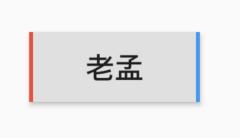
CircleBorder
圆形
RaisedButton( shape: CircleBorder(side: BorderSide(color: Colors.red)), child: Text('老孟'), onPressed: () {},)1234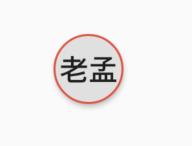
ContinuousRectangleBorder
连续的圆角矩形,直线和圆角平滑连续的过渡,和RoundedRectangleBorder相比,圆角效果会小一些。
RaisedButton( shape: ContinuousRectangleBorder( side: BorderSide(color: Colors.red), borderRadius: BorderRadius.circular(20)), child: Text('老孟'), onPressed: () {},)123456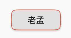
RoundedRectangleBorder
圆角矩形
RaisedButton( shape: RoundedRectangleBorder( side: BorderSide(color: Colors.red), borderRadius: BorderRadius.circular(10)), child: Text('老孟'), onPressed: () {},)123456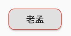
StadiumBorder
类似足球场的形状,两边圆形,中间矩形
RaisedButton( shape: StadiumBorder( side: BorderSide(color: Colors.red),), child: Text('老孟'), onPressed: () {},)12345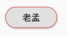
OutlineInputBorder
带外边框
RaisedButton( shape: OutlineInputBorder( borderSide: BorderSide(color: Colors.red), borderRadius: BorderRadius.circular(10), ), child: Text('老孟'), onPressed: () {},)1234567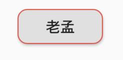
UnderlineInputBorder
下划线边框
RaisedButton( shape: UnderlineInputBorder( borderSide: BorderSide(color: Colors.red), ), child: Text('老孟'), onPressed: () {},)123456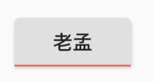
ClipRect
ClipRect组件使用矩形裁剪子组件,通常情况下,ClipRect作用于CustomPaint 、 CustomSingleChildLayout 、 CustomMultiChildLayout 、 Align 、 Center 、 OverflowBox 、 SizedOverflowBox组件,例如ClipRect作用于Align,可以仅显示上半部分,代码如下:
ClipRect( child: Align( alignment: Alignment.topCenter, heightFactor: 0.5, child: Container( height: 150, width: 150, child: Image.asset( 'images/1.png', fit: BoxFit.cover, ), ), ),)12345678910111213全图效果:

裁剪效果:
clipper参数定义裁剪规则,下面具体介绍。
clipBehavior参数定义了裁剪的方式,只有子控件超出父控件的范围才有裁剪的说法,各个方式说明如下:
- none:不裁剪,系统默认值,如果子组件不超出边界,此值没有任何性能消耗。
- hardEdge:裁剪但不应用抗锯齿,速度比none慢一点,但比其他方式快。
- antiAlias:裁剪而且抗锯齿,此方式看起来更平滑,比antiAliasWithSaveLayer快,比hardEdge慢,通常用于处理圆形和弧形裁剪。
- antiAliasWithSaveLayer:裁剪、抗锯齿而且有一个缓冲区,此方式很慢,用到的情况比较少。
ClipRRect
ClipRRect组件可以对子组件进行圆角裁剪,默认圆角半径为0,注意ClipRRect有2个R,不是上面介绍的ClipRect。
用法如下:
ClipRRect( borderRadius: BorderRadius.circular(20), child: Container( height: 150, width: 150, child: Image.asset( 'images/1.png', fit: BoxFit.cover, ), ),)12345678910效果如图:

ClipOval
ClipOval裁剪为椭圆形,椭圆形的大小为正切父组件,因此如果父组件为正方形,切出来是圆形,用法如下:
ClipOval( child: Container( height: 150, width: 250, child: Image.asset( 'images/1.png', fit: BoxFit.cover, ), ),)123456789效果如下:

ClipPath
ClipPath组件根据路径进行裁剪,我们自定义裁剪路径也可以使用系统提供的,用法如下:
ClipPath.shape( shape: StadiumBorder(), child: Container( height: 150, width: 250, child: Image.asset( 'images/1.png', fit: BoxFit.cover, ), ),)12345678910shape参数是ShapeBorder类型,系统已经定义了很多形状,介绍如下:
- RoundedRectangleBorder:圆角矩形
- ContinuousRectangleBorder:直线和圆角平滑连续的过渡,和RoundedRectangleBorder相比,圆角效果会小一些。
- StadiumBorder:类似于足球场的形状,两端半圆。
- BeveledRectangleBorder:斜角矩形。效果如图:
- CircleBorder:圆形。
CustomClipper
CustomClipper并不是一个组件,而是一个abstract(抽象)类,使用CustomClipper可以绘制出任何我们想要的形状,比如三角形,代码如下:
@overrideWidget build(BuildContext context) { return Center( child: ClipPath( clipper: TrianglePath(), child: Container( height: 150, width: 250, child: Image.asset( 'images/1.png', fit: BoxFit.cover, ), ), ), );}123456789101112131415自定义TrianglePath代码如下:
class TrianglePath extends CustomClipper{ @override Path getClip(Size size) { var path = Path(); path.moveTo(size.width/2, 0); path.lineTo(0, size.height); path.lineTo(size.width, size.height); return path; } @override bool shouldReclip(CustomClipper oldClipper) { return true; }}1234567891011121314效果如下:

我们还可以绘制五角星,代码如下:
class StarPath extends CustomClipper { StarPath({this.scale = 2.5}); final double scale; double perDegree = 36; /// 角度转弧度公式 double degree2Radian(double degree) { return (pi * degree / 180); } @override Path getClip(Size size) { var R = min(size.width / 2, size.height / 2); var r = R / scale; var x = size.width / 2; var y = size.height / 2; var path = Path(); path.moveTo(x, y - R); path.lineTo(x - sin(degree2Radian(perDegree)) * r, y - cos(degree2Radian(perDegree)) * r); path.lineTo(x - sin(degree2Radian(perDegree * 2)) * R, y - cos(degree2Radian(perDegree * 2)) * R); path.lineTo(x - sin(degree2Radian(perDegree * 3)) * r, y - cos(degree2Radian(perDegree * 3)) * r); path.lineTo(x - sin(degree2Radian(perDegree * 4)) * R, y - cos(degree2Radian(perDegree * 4)) * R); path.lineTo(x - sin(degree2Radian(perDegree * 5)) * r, y - cos(degree2Radian(perDegree * 5)) * r); path.lineTo(x - sin(degree2Radian(perDegree * 6)) * R, y - cos(degree2Radian(perDegree * 6)) * R); path.lineTo(x - sin(degree2Radian(perDegree * 7)) * r, y - cos(degree2Radian(perDegree * 7)) * r); path.lineTo(x - sin(degree2Radian(perDegree * 8)) * R, y - cos(degree2Radian(perDegree * 8)) * R); path.lineTo(x - sin(degree2Radian(perDegree * 9)) * r, y - cos(degree2Radian(perDegree * 9)) * r); path.lineTo(x - sin(degree2Radian(perDegree * 10)) * R, y - cos(degree2Radian(perDegree * 10)) * R); return path; } @override bool shouldReclip(StarPath oldClipper) { return oldClipper.scale != this.scale; }}123456789101112131415161718192021222324252627282930313233343536373839404142434445464748scale参数表示间隔的点到圆心的缩放比例,五角星效果如下:

下面用动画动态设置scale,代码如下:
class StartClip extends StatefulWidget { @override State createState() => _StartClipState();}class _StartClipState extends State with SingleTickerProviderStateMixin { AnimationController _controller; Animation _animation; @override void initState() { _controller = AnimationController(duration: Duration(seconds: 2), vsync: this) ..addStatusListener((status) { if (status == AnimationStatus.completed) { _controller.reverse(); } else if (status == AnimationStatus.dismissed) { _controller.forward(); } }); _animation = Tween(begin: 1.0, end: 4.0).animate(_controller); _controller.forward(); super.initState(); } @override Widget build(BuildContext context) { return Center( child: AnimatedBuilder( animation: _animation, builder: (context, child) { return ClipPath( clipper: StarPath(scale: _animation.value), child: Container( height: 150, width: 150, color: Colors.red, ), ); }), ); }}12345678910111213141516171819202122232425262728293031323334353637383940414243效果如下:


开源鸿蒙跨平台开发社区汇聚开发者与厂商,共建“一次开发,多端部署”的开源生态,致力于降低跨端开发门槛,推动万物智联创新。
更多推荐
 0
0 0
0- 0


 已为社区贡献1条内容

所有评论(0)