

1.runApp函数接受一个给定的Widget并使其成为widget树的根
void main() => runApp(MyApp());
2.
无状态的widget: StatelessWidget
有状态的widget: StatefulWidget
3.build
widge的主要工作是实现一个build函数,用以构建自身
class MyApp extends StatelessWidget {
  @override
  Widget build(BuildContext context) {
    return new MaterialApp(
      title: 'Startup Name Generator',
      theme: new ThemeData(
        primaryColor: Colors.white
      ),
      home: new RandomWords(),
    );
  }
}
4.Material组件aterial应用程序以Material widget开始
Navigator管理由字符串标识的Widge栈(页面路由栈)
class MyApp extends StatelessWidget {
  @override
  Widget build(BuildContext context) {
    return new MaterialApp(
      title: 'Startup Name Generator',
      theme: new ThemeData(
        primaryColor: Colors.white
      ),
      home: new RandomWords(),
    );
  }
}
5.GestureDetector监听手势
6.位置类似于flex布局
crossAaisAlignment:子元素放置位置(十字轴)
mainAxisAlignment:子元素放置位置(主轴)
mainAxisSize:主轴占用多少空间
1.在Dart语言中使用下划线前缀表四符,会强制其变成私有的
2.i ~/ 2表示i除以2,但返回值是整型(向下取整)
1.Expanded:用于展开Row,Column或Flex的子项的窗口小部件
2.Scaffold:
appBar:水平栏,在程序的顶部
BottomAppBar:水平条,通常位于程序底部
3.appBar
actions:要在标题小部件后显示的小部件
4.Flutter之Offstage组件
/
**
* 控制child是否显示
*
当offstage为true,控件隐藏; 当offstage为false,显示;
当Offstage不可见的时候,如果child有动画等,需要手动停掉,Offstage并不会停掉动画等操作。
const Offstage({ Key key, this.offstage = true, Widget child })
*/
  Navigator.of(context).push(new MaterialPageRoute(builder: (context)      {
      //指定跳转的页面
      return new Demo1();
    },));
Wrap({
    Key key,
    this.direction = Axis.horizontal,   //排列方向,默认水平方向排列
    this.alignment = WrapAlignment.start,  //子控件在主轴上的对齐方式
    this.spacing = 0.0,  //主轴上子控件中间的间距
    this.runAlignment = WrapAlignment.start,  //子控件在交叉轴上的对齐方式
    this.runSpacing = 0.0,  //交叉轴上子控件之间的间距
    this.crossAxisAlignment = WrapCrossAlignment.start,   //交叉轴上子控件的对齐方式
    this.textDirection,   //textDirection水平方向上子控件的起始位置
    this.verticalDirection = VerticalDirection.down,  //垂直方向上子控件的其实位置
    List<Widget> children = const <Widget>[],   //要显示的子控件集合
  })
 SafeArea(
      child: Align(
        alignment: Alignment(-1, -1),
        child: Container(
          child: Text(
            "Hello",
          ),
        ),
      ),
  );
 child: new Text(
        'Hello, How are you?Hello, How are you?Hello, How are you?Hello, How are you?',
        textAlign: TextAlign.center,
        overflow: TextOverflow.ellipsis,
        style: TextStyle(fontWeight: FontWeight.bold,fontSize: 48.0),
        maxLines: 2,
      ),
git checckout v0.8.1  切换到某个版本
flutter upgrade  //同时更新Flutter SDK和你的依赖包
使用脚手架Scaffold可以设置AppBar,想要设置高度,在AppBar外包一层PreferredSize,设置preferredSize的属性为想要的高度即可
   Scaffold(
        appBar: PreferredSize(
        child: AppBar(
        ),
        preferredSize: Size.fromHeight(screenSize.height * 0.07))
);
final size =MediaQuery.of(context).size;
final width =size.width;
final height =size.height;
注意:
MediaQuery.of(context) 要在WidgetsApp or MaterialApp 中,不然会报错


(在使用 MediaQuery.of(context)的地方并没有一个 WidgetsApp or MaterialApp 来提供数据)
例:
import 'package:flutter/material.dart';


class GetWidgetWidthAndHeiget extends StatelessWidget {
  @override
  Widget build(BuildContext context) {
    return MaterialApp(
      home: HomePage(),
    );
  }
}


class HomePage extends StatelessWidget {
  @override
  Widget build(BuildContext context) {
    final size = MediaQuery.of(context).size;
    final width = size.width;
    final height = size.height;
    print('width is $width; height is $height');
    return Scaffold(
      appBar: AppBar(
        title: Text('Width & Height'),
      ),
      body: Center(
        child: Container(
          color: Colors.redAccent,
          width: width / 2,
          height: height / 2,
        ),
      ),
    );
  }
}
import 'package:flutter/material.dart';


void main() {
  runApp(new MaterialApp(
    title: "我的应用",
    home: new MyButton(),
  ));
}


class MyButton extends StatelessWidget {
  @override
  Widget build(BuildContext context) {
    //GestureDetector并不具有显示效果,而是检测由用户做出的手势(点击拖动和缩放)
    return new GestureDetector(
      //发生点击事件后回调
      onTap: () {
        print("hia");
      },
      //发生双击时间后回调
      onDoubleTap: (){
        print("hia hia");
      },
     // 长按事件
      onLongPress: (){
        print("hia hia hia........");
      },
      child: new Container(
        height: 36.0,
        padding: const EdgeInsets.all(8.0),
        //上下左右都偏移8像素边距
        margin: const EdgeInsets.symmetric(horizontal: 8.0),
        //symmetric的参数是可选的 水平方向
        // 背景装饰
        decoration: new BoxDecoration(
          //圆角和颜色
            borderRadius: new BorderRadius.circular(5.0),
            color: Colors.lightGreen[500]),
        child: new Center(child: new Text("点击监听")),
      ),
    );
  }
Color c = const Color(0xFF0099ff);//0x 后面开始 两位FF表示透明度16进制,
Color c = const Colors.red[100];
Color c = const Color.fromARGB(0xFF, 0x42, 0xA5, 0xF5);
Color c = const Color.fromARGB(255, 66, 165, 245);
Color c = const Color.fromRGBO(66, 165, 245, 1.0);//opacity:不透明度
const TextField({
    Key key,
    this.controller,            //控制器,控制TextField文字
    this.focusNode,
    this.decoration: const InputDecoration(),      //输入器装饰
    TextInputType keyboardType: TextInputType.text, //输入的类型
    this.style,
    this.textAlign: TextAlign.start, //文本对齐方式
    this.autofocus: false,    //是否自动对焦
    this.obscureText: false,  //是否隐藏输入
    this.autocorrect: true,   //是否自动更正
    this.maxLines: 1,         //最大行数
    this.maxLength,           //最大长度
    this.maxLengthEnforced: true,
    this.onChanged,            //文字改变触发
    this.onSubmitted,          //文字提交触发(键盘按键)
    this.onEditingComplete,  //当用户提交可编辑内容时调用
    this.inputFormatters,
    this.enabled,           //是否禁用

    this.cursorWidth = 2.0,//光标的样式
    this.cursorRadius,     //光标的样式
    this.cursorColor,      //光标的样式
    this.keyboardAppearance,
  })
Slider 各部分的术语是:
- thumb - 用户拖动时水平滑动的形状。
- track - 滑块拇指滑过的线。
- value - 当用户拖动拇指指示所选值时弹出的形状。
- active - 滑块的“活动”一侧是拇指和最小值之间的一侧。
- inactive - 滑块的“非活动”侧是拇指和最大值之间的一侧。
Slider 有以下常用属性:
- activeColor → Color - 激活时的颜色。
- divisions → int - 离散部分的数量。
- inactiveColor → Color - 滑块轨道的非活动部分的颜色。
- label → String 滑块处于活动状态时显示在滑块上方的标签。
- max → double - 用户可以选择的最大值。
- min → double - 用户可以选择的最小值。
- onChanged → ValueChanged - 改变时触发。
- onChangeEnd → ValueChanged - 改变后触发。
- onChangeStart → ValueChanged - 改变前触发。
- value → double - 滑块的值。
Switch 有以下常用属性:
activeColor → Color - 激活时原点的颜色。
activeThumbImage → ImageProvider - 原点还支持图片,激活时的效果。
activeTrackColor → Color - 激活时横条的颜色。
inactiveThumbColor → Color - 非激活时原点的颜色。
inactiveThumbImage → ImageProvider - 非激活原点的图片效果。
inactiveTrackColor → Color - 非激活时横条的颜色。
onChanged → ValueChanged - 改变时触发。
value → bool - 切换按钮的值。
value: 是否选中 是否打开
onChanged: 当打开关闭的时候的回调
activeColor: 选中时 滑块的颜色
activeTrackColor: 选中时 滑道的颜色
inactiveThumbColor: 未选中时 滑块的颜色
inactiveTrackColor: 未选中时 滑道的颜色
activeThumbImage: 选中时 滑块的图片
inactiveThumbImage: 未选中时 滑块的图片
title: 标题 典型的是 Text
subtitle: 副标题 在标题下面的 典型的是 Text
isThreeLine = false: 是不是三行, true 时: subtitle 不能为null, false时可以为 null
dense: 是否垂直密集居中
secondary: 左边的一个东西
selected = false: 如果为 true ,则 text 和 icon 都用 activeColor 时的color
textAlign: TextAlign.center, //文本对齐方式  居中
textDirection: TextDirection.ltr, //文本方向
softWrap: false, //是否自动换行 false文字不考虑容器大小  单行显示   超出;屏幕部分将默认截断处理
overflow: TextOverflow
  .ellipsis, //文字超出屏幕之后的处理方式  TextOverflow.clip剪裁   TextOverflow.fade 渐隐  TextOverflow.ellipsis省略号
textScaleFactor: 2.0, //字体显示的赔率
maxLines: 10, //最大行数
style: new TextStyle(
decorationColor: const Color(0xffffffff), //线的颜色
decoration: TextDecoration
    .none, //none无文字装饰   lineThrough删除线   overline文字上面显示线    underline文字下面显示线
decorationStyle: TextDecorationStyle
    .solid, //文字装饰的风格  dashed,dotted虚线(简短间隔大小区分)  double三条线  solid两条线
wordSpacing: 0.0, //单词间隙(负值可以让单词更紧凑)
letterSpacing: 0.0, //字母间隙(负值可以让字母更紧凑)
fontStyle: FontStyle.italic, //文字样式,斜体和正常
fontSize: 20.0, //字体大小
fontWeight: FontWeight.w900, //字体粗细  粗体和正常
color: const Color(0xffffffff), //文字颜色
RaisedButton :凸起的按钮,其实就是Android中的Material Design风格的Button ,继承自MaterialButton
FlatButton :扁平化的按钮,继承自MaterialButton
OutlineButton :带边框的按钮,继承自MaterialButton
IconButton :图标按钮,继承自StatelessWidget
RaisedButton({
    Key key,
  //点击按钮的回调出发事件
    @required VoidCallback onPressed,
  //水波纹高亮变化回调
    ValueChanged<bool> onHighlightChanged,
  //按钮的样式(文字颜色、按钮的最小大小,内边距以及shape)[ Used with [ButtonTheme] and [ButtonThemeData] to define a button's base
//colors, and the defaults for the button's minimum size, internal padding,and shape.]
    ButtonTextTheme textTheme,
    //文字颜色
    Color textColor,
    //按钮被禁用时的文字颜色
    Color disabledTextColor,
    //按钮的颜色
    Color color,
    //按钮被禁用时的颜色
    Color disabledColor,
    //按钮的水波纹亮起的颜色
    Color highlightColor,
    //水波纹的颜色
    Color splashColor,
    //按钮主题高亮
    Brightness colorBrightness,
    //按钮下面的阴影长度
    double elevation,
    //按钮高亮时的下面的阴影长度
    double highlightElevation,
    double disabledElevation,
    EdgeInsetsGeometry padding,
    ShapeBorder shape,
    Clip clipBehavior = Clip.none,
    MaterialTapTargetSize materialTapTargetSize,
    Duration animationDuration,
    Widget child,
  }
FloatingActionButton({
    Key key,
    //  按钮上的组件,可以是Text、icon, etc.
    this.child,
    //长按提示
    this.tooltip,
    // child的颜色(尽在child没有设置颜色时生效)
    this.foregroundColor,
    //背景色,也就是悬浮按键的颜色
    this.backgroundColor,
    this.heroTag = const _DefaultHeroTag(),
    //阴影长度
    this.elevation = 6.0,
    //高亮时阴影长度
    this.highlightElevation = 12.0,
    //按下事件回调
    @required this.onPressed,
    //是小图标还是大图标
    this.mini = false,
    //按钮的形状(例如:矩形Border,圆形图标CircleBorder)
    this.shape = const CircleBorder(),
    this.clipBehavior = Clip.none,
    this.materialTapTargetSize,
    this.isExtended = false,
  })
PopupMenuButton({
    Key key,
//构建弹出式列表数据
    PopupMenuItemBuilder<T> @required this.itemBuilder,
//初始值
   T initialValue,
//选中时的回调
 PopupMenuItemSelected<T> onSelected;,
//当未选中任何条目后弹窗消失时的回调
     final PopupMenuCanceled onCanceled;,
//
    this.tooltip,
//弹窗阴影高度
    this.elevation = 8.0,
//边距
    this.padding = const EdgeInsets.all(8.0),
//弹窗的位置显示的组件,默认为三个点...
    this.child,
//跟child效果一致
    this.icon,
//弹窗偏移位置
    this.offset = Offset.zero,
  })
Chip({
    Key key,
    this.avatar,//标签左侧Widget,一般为小图标
    @required this.label,//标签
    this.labelStyle,
    this.labelPadding,//padding
    this.deleteIcon//删除图标,
    this.onDeleted//删除回调,为空时不显示删除图标,
    this.deleteIconColor//删除图标的颜色,
    this.deleteButtonTooltipMessage//删除按钮的tip文字,
    this.shape//形状,
    this.clipBehavior = Clip.none,
    this.backgroundColor//背景颜色,
    this.padding,
    this.materialTapTargetSize//删除图标material点击区域大小,
  })
cacheExtent → double - 视口在可见区域之前和之后有一个区域,用于缓存用户滚动时即将可见的项目。
controller → ScrollController - 一个可用于控制滚动视图滚动到的位置的对象。
physics → ScrollPhysics - 滚动视图应如何响应用户输入。
primary → bool - 是否是与父级关联的主滚动视图。
reverse → bool - 滚动视图是否在阅读方向上滚动。
scrollDirection → Axis - 滚动视图滚动的轴。
shrinkWrap → bool - 应该根据正在查看的内容确定滚动视图的范围。
其他知识:
EdgeInsets 这个类 通过他可以很好的控制widget上下左右的偏移量 有.all全部设置 也有.symmetric水平和垂直可选 也有.only上下左右可选
EdgeInsets.fromLTRB(10,10,10,10) ,L表示左边距(left缩写),T表示上边距(top缩写),R表示右边距(right缩写),B表示底边距(bottom缩写),四个值可以分开写;
它主要包含三方面的信息:
- 视图是完全由数据驱动。
- 视图产生的事件、回调,通过 Dispatch 发出“意图”,不做具体的实现。
- 需要用到的组件依赖等,通过 ViewService 标准化调用。 比如一个典型的符合 View 签名的函数。
Effect 是对非修改数据行为的标准定义,它是一个函数签名: (Context, Action) => Object,它主要包含四方面的信息:
- 接收来自 View 的“意图”,也包括对应的生命周期的回调,然后做出具体的执行。
- 它的处理可能是一个异步函数,数据可能在过程中被修改,所以我们不崇尚持有数据,而通过上下文来获取最新数据。
- 它不修改数据, 如果修要,应该发一个 Action 到 Reducer 里去处理。
- 它的返回值仅限于 bool or Future, 对应支持同步函数和协程的处理流程。 比如:良好的协程的支持。
它主要包含三方面的信息
- 接收一个“意图”, 做出数据修改。
- 如果要修改数据,需要创建一份新的拷贝,修改在拷贝上。
- 如果数据修改了,它会自动触发 State 的层层数据的拷贝,再以扁平化方式通知组件刷新。
Adapter 也是对局部的展示和功能的封装。它为 ListView 高性能场景而生,它是 Component 实现上的一种变化。
1.它的目标是解决 Component 模型在 flutter-ListView 的场景下的 3 个问题:
- 将一个"Big-Cell"放在 Component 里,无法享受 ListView 代码的性能优化。
- Component 无法区分 appear|disappear 和 init|dispose 。
- Effect 的生命周期和 View 的耦合,在 ListView 的场景下不符合直观的预期。 概括的讲,我们想要一个逻辑上的 ScrollView,性能上的 ListView ,这样的一种局部展示和功能封装的抽象。 做出这样独立一层的抽象是, 我们看实际的效果, 我们对页面不使用框架,使用框架 Component,使用框架 Component+Adapter 的性能基线对比。
2.Reducer is long-lived, Effect is medium-lived, View is short-lived. 我们通过不断的测试做对比,以某 android 机为例。
3.使用框架前 我们的详情页面的 FPS,基线在 52FPS。
4.使用框架, 仅使用 Component 抽象下,FPS 下降到 40, 遭遇“Big-Cell”的陷阱。
5.使用框架,同时使用 Adapter 抽象后,FPS 提升到 53,回到基线以上,有小幅度的提升。
static Action didLoadAction(Home home) {
  return Action(HomePageAction.didLoad, payload: home);
}


void _init(Action action, Context<HomePageState> ctx) async {
  APIs.getHome().then((home) {
    ctx.dispatch(HomePageActionCreator.didLoadAction(home));
  });
}


onSelect(Action action, Context ctx) async {
  String videoId = action.payload["videoId"];
  VideoDetail videoDetail = await APIs.getVideo(videoId);
  Map<String, dynamic> payload = {
    "videoId": videoId,
    "videoDetail": videoDetail
  };
  Navigator.of(ctx.context).push(MaterialPageRoute(builder: (context) {
    return VideoPage().buildPage(payload);
  }));
}
13.颜色透明度
带有accent的颜色每个有4中颜色,如


Colors.redAccent,Colors.redAccent[100], Colors.redAccent[200], Colors.redAccent[400], Colors.redAccent[700],


Color.fromARGB(100, 10, 100, 100),A表示不透明度,值从0-255,RGB值也是从0-255;
Color.fromRGBO(100, 10, 10, 1),O表示不透明度,值从0-1,RGB值是从0-255;
Color.alphaBlend(Color.fromRGBO(10, 10, 255, 0.1), Color.fromRGBO(100, 10, 255, 0.5)) ,这个是颜色的混合,
颜色会根据不透明度进行合并;
如果前者的不透明度为1,就只显示前者颜色,前者为0,颜色为后者,否则就是按照前后者的不透明度和颜色进行混合
tools:replace="android:label"
xmlns:tools="http://schemas.android.com/tools"
tools:replace="android:label,android:allowBackup"
buildToolsVersion '28.0.2'
tools:replace="android:label,android:allowBackup,android:appComponentFactory"
xmlns:tools="http://schemas.android.com/tools"


implementation 'androidx.appcompat:appcompat:1.0.0-alpha1'
implementation 'androidx.constraintlayout:constraintlayout:1.1.2'
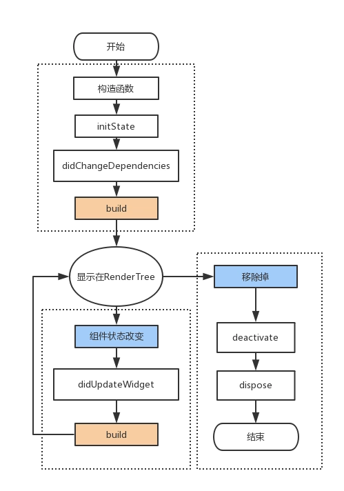
(1)initState
当插入渲染树的时候调用,这个函数在生命周期中只调用一次。这里可以做一些初始化工作,比如初始化State的变量。
(2)didChangeDependencies
使用场景
new DefaultTabController(length: 3, child: new TabBar(
      tabs: [ "主页","订单","我的" ]
      .map( (data)=>new Text(data) ).toList(),
(3)didUpdateWidget
当组件的状态改变的时候就会调用didUpdateWidget,比如调用了setState.实际上这里flutter框架会创建一个新的Widget,绑定本State,并在这个函数中传递老的Widget。这个函数一般用于比较新、老Widget,看看哪些属性改变了,并对State做一些调整。
(4)deactivate
当State对象从树中被移除时,会调用此回调
(5)dispose
一旦到这个阶段,组件就要被销毁了,这个函数一般会移除监听,清理环境。
例子:
假设我们从A页面跳转到B页面, 那么A,B页面的生命周期会是怎样的呢?


B页面进入初始化状态,依次执行4个函数:构造函数 > initState > didChangeDependencies > Widget build , 此时页面加载完成,进入运行态。
此时A页面依次执行deactivate > build函数。注意 此时A页面并未卸载。


然后我们假设B页面只有一个按钮,点击B页面中的按钮,改变按钮的文字,会执行widget的build方法 ,(理论上也应该执行didUpdateWidget,但我这里没有)。


这时,我们点击返回键从B页面返回到A页面。
A页面重新显示,B页面开始卸载。
那么A先执行deactivate > build , 然后B页面依次执行:deactivate > dispose 。
此时A页面进入运行态,B页面移除


 已为社区贡献3条内容

所有评论(0)