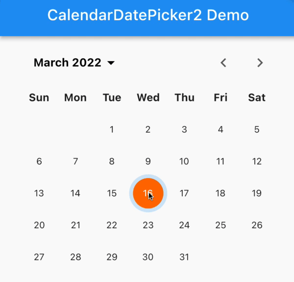
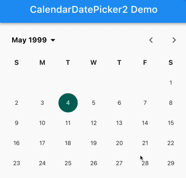
Flutter之日期选择器 calendar_date_picker2
此小部件仅包含日历 UI,并且每当用户点击不同的日期时就会发出事件。(用户可以选择的最早允许的 DateTime)(提供对日历中可以选择的日期的完全控制的功能)(用于在控件中集中年份和月份文本标签的标志)(一周的第一天,0表示周日,6表示周六)(提供对日历日文本样式的完全控制的功能)(所选范围内包含的日期的突出显示颜色)(日历模式切换控件的自定义文本样式)(日历模式切换控件的自定义文本样式。(选定
calendar_date_picker2主要由两个小部件组成:
1、CalendarDatePicker2,此小部件仅包含日历 UI,并且每当用户点击不同的日期时就会发出事件。
2、CalendarDatePicker2WithActionButtons,此小部件包括日历 UI 和操作按钮(取消和确定)。仅当用户点击“确定”按钮时,此小部件才会发出更新的值。
特点:
- 扩展CalendarDatePicker允许
nullinitialDate - 高度可定制的用户界面
- 支持三种模式:单一、多重和范围
- 内置
showCalendarDatePicker2Dialog - 多语言支持
CalendarDatePicker2参数
| Argument | Type | Description |
|---|---|---|
| config | CalendarDatePicker2Config |
Calendar UI related configurations (日历UI的相关配置) |
| value | List<DateTime?> |
The selected [DateTime]s that the picker should display. (选择器应显示的所选日期) |
| onValueChanged | ValueChanged<List<DateTime?>>? |
Called when the selected dates changed (当所选日期更改时的回调函数) |
| displayedMonthDate | DateTime? |
Date to control calendar displayed month (控制日历显示月份的日期) |
| onDisplayedMonthChanged | ValueChanged<DateTime>? |
The initially displayed view of the calendar picker (日历选取器的初始显示视图) |
CalendarDatePicker2Config的参数
| Option | Type | Description |
|---|---|---|
| calendarType | CalendarDatePicker2Type? |
Calendar picker type, has 3 values: single, multi, range (日历选择器类型,有3个值:single、multi、range) |
| firstDate | DateTime? |
The earliest allowable DateTime user can select (用户可以选择的最早允许的 DateTime) |
| lastDate | DateTime? |
The latest allowable DateTime user can select (用户可以选择最新允许的DateTime) |
| currentDate | DateTime? |
The DateTime representing today which will be outlined in calendar (用户当前选择的时间) |
| calendarViewMode | DatePickerMode? |
The initially displayed view of the calendar picker (日历选择器最初显示的视图) |
| weekdayLabels | List<String>? |
Custom weekday labels, should starts with Sunday (自定义工作日标签,应从星期日开始) |
| weekdayLabelTextStyle | TextStyle? |
Custom text style for weekday labels (工作日标签的自定义文本样式) |
| firstDayOfWeek | int? |
Index of the first day of week, where 0 points to Sunday, and 6 points to Saturday. (一周的第一天,0表示周日,6表示周六) |
| controlsHeight | double? |
Custom height for calendar control toggle's height (日历控件切换高度的自定义高度) |
| lastMonthIcon | Widget? |
Custom icon for last month button control (上个月按钮控件的自定义图标) |
| nextMonthIcon | Widget? |
Custom icon for next month button control (下个月按钮控件的自定义图标) |
| controlsTextStyle | TextStyle? |
Custom text style for calendar mode toggle control (日历模式切换控件的自定义文本样式) |
| dayTextStyle | TextStyle? |
Custom text style for calendar day text (日历模式切换控件的自定义文本样式) |
| selectedDayTextStyle | TextStyle? |
Custom text style for selected calendar day text (选定日历日文本的自定义文本样式) |
| selectedRangeDayTextStyle | TextStyle? |
Custom text style for selected range calendar day(s) (选定范围日历日的自定义文本样式) |
| selectedDayHighlightColor | Color? |
The highlight color selected day (所选日期的突出显示颜色) |
| selectedRangeHighlightColor | Color? |
The highlight color for day(s) included in the selected range (所选范围内包含的日期的突出显示颜色) |
| disabledDayTextStyle | TextStyle? |
Custom text style for disabled calendar day(s) (禁用日历日的自定义文本样式) |
| todayTextStyle | TextStyle? | Custom text style for current calendar day (当前日历日的自定义文本样式) |
| yearTextStyle | TextStyle? |
Custom text style for years list (年份列表的自定义文本样式) |
| selectedYearTextStyle | TextStyle? |
Custom text style for selected year (选定年份的自定义文本样式) |
| dayBorderRadius | BorderRadius? |
Custom border radius for day indicator (日期指示器的自定义边框半径) |
| yearBorderRadius | BorderRadius? |
Custom border radius for year indicator (年份指示器的自定义边框半径) |
| selectableDayPredicate | SelectableDayPredicate? |
Function to provide full control over which dates in the calendar can be selected (提供对日历中可以选择的日期的完全控制的功能) |
| dayTextStylePredicate | CalendarDayTextStylePredicate? |
Function to provide full control over calendar days text style (提供对日历日文本样式的完全控制的功能) |
| dayBuilder | CalendarDayBuilder? | Function to provide full control over day widget UI (构造日选择部件UI) |
| yearBuilder | CalendarYearBuilder? |
Function to provide full control over year widget UI (构造年份选择部件UI) |
| disableModePicker | bool? |
Flag to disable mode picker and hide the toggle icon (标记以禁用模式选择器并隐藏切换图标) |
| centerAlignModePicker | bool? |
Flag to centralize year and month text label in controls (用于在控件中集中年份和月份文本标签的标志) |
| customModePickerIcon | Widget? | Custom icon for the mode picker button icon (模式选择器按钮图标的自定义图标) |
| modePickerTextHandler | CalendarModePickerTextHandler? |
Function to control mode picker displayed text (控制模式选择器显示文本的函数) |
CalendarDatePicker2WithActionButtonsConfig 除上面的配置外还有其余9个额外的选项
| Option | Type | Description |
|---|---|---|
| gapBetweenCalendarAndButtons | double? |
The gap between calendar and action buttons (日历和操作按钮之间的间隙) |
| cancelButtonTextStyle | TextStyle? |
Text style for cancel button (取消按钮的文本样式) |
| cancelButton | Widget? |
Custom cancel button (自定义取消按钮) |
| okButtonTextStyle | TextStyle? |
Text style for ok button (确定按钮的文本样式) |
| okButton | Widget? |
Custom ok button (自定义确定按钮) |
| openedFromDialog | bool? |
Is the calendar opened from dialog (日历是从对话框打开的吗) |
| closeDialogOnCancelTapped | bool? |
Close dialog after user taps the CANCEL button (用户点击取消按钮后关闭对话框?) |
| closeDialogOnOkTapped | bool? |
Close dialog after user taps the OK button (用户点击确定按钮后关闭对话框?) |
| buttonPadding | EdgeInsets? |
Custom wrapping padding for Ok & Cancel buttons (用于“确定”和“取消”按钮的自定义包装填充) |
使用步骤:
1、 添加依赖
dependencies:
  calendar_date_picker2: ^0.5.2
写在前面的_getValueText,用于修改日期格式
String _getValueText(CalendarDatePicker2Type datePickerType, List<DateTime?> values,) {
values = values.map((e) => e != null ? DateUtils.dateOnly(e) : null).toList();
var valueText = (values.isNotEmpty ? values[0] : null).toString().replaceAll('00:00:00.000', '');
if (datePickerType == CalendarDatePicker2Type.multi) {
valueText = values.isNotEmpty ? values.map((v) => v.toString().replaceAll('00:00:00.000', '')).join(', ') : 'null';
}
else if (datePickerType == CalendarDatePicker2Type.range) {
if (values.isNotEmpty) {
final startDate = values[0].toString().replaceAll('00:00:00.000', '');
final endDate = values.length > 1 ? values[1].toString().replaceAll('00:00:00.000', '') : 'null';
valueText = '$startDate to $endDate';
}
else {
return 'null';
}
}
return valueText;
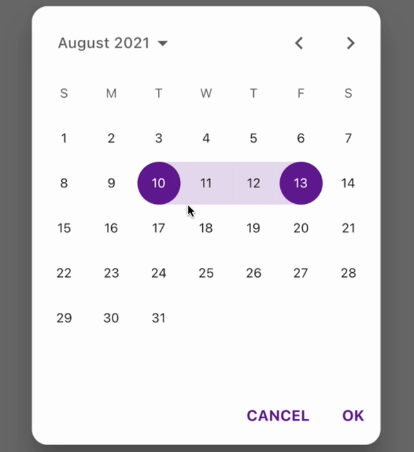
}对话框模式
调用 showCalendarDatePicker2Dialog 其中包含的必选参数:dialogSize、config、context
 //工作日文本样式
    const dayTextStyle = TextStyle(color: Colors.black, fontWeight: FontWeight.w700);
    //周末文本样式
    final weekendTextStyle = TextStyle(color: Colors.grey[500], fontWeight: FontWeight.w600);
    //与当前日期相同的日期
    final anniversaryTextStyle = TextStyle(
      color: Colors.red[400],
      fontWeight: FontWeight.w700,
      decoration: TextDecoration.underline,
    );

    final config = CalendarDatePicker2WithActionButtonsConfig(
      //日文本样式
      dayTextStyle: dayTextStyle,
      //日期选择器类型——范围
      calendarType: CalendarDatePicker2Type.range,
      //所选日期的突出显示颜色
      selectedDayHighlightColor: Colors.purple[800],
      //用户点击取消按钮后关闭对话框
      closeDialogOnCancelTapped: true,
      //一周的第一天,0表示周日,6表示周六
      firstDayOfWeek: 1,
      //工作日标签的自定义文本样式
      weekdayLabelTextStyle: const TextStyle(
        color: Colors.black87,
        fontWeight: FontWeight.bold,
      ),
      //日历模式切换控件的自定义文本样式
      controlsTextStyle: const TextStyle(
        color: Colors.black,
        fontSize: 15,
        fontWeight: FontWeight.bold,
      ),

      //用于在控件中集中年份和月份文本标签的标志
      centerAlignModePicker: true,

      //模式选择器按钮图标的自定义图标
      customModePickerIcon: const SizedBox(),

      //选定日历日文本的自定义文本样式
      selectedDayTextStyle: dayTextStyle.copyWith(color: Colors.white),

      //提供对日历日文本样式的完全控制的功能
      dayTextStylePredicate: ({required date}) {
        TextStyle? textStyle;
        if (date.weekday == DateTime.saturday ||
            date.weekday == DateTime.sunday) {
          textStyle = weekendTextStyle;
        }
        /*if (DateUtils.isSameDay(date, DateTime(2021, 1, 25))) {
          textStyle = anniversaryTextStyle;
        }*/
        if (DateUtils.isSameDay(date, DateTime.now())) {
          textStyle = anniversaryTextStyle;
        }
        return textStyle;
      },

      //构造日部件UI
      dayBuilder: ({required date, textStyle, decoration, isSelected, isDisabled, isToday,}) {

        Widget? dayWidget;
        if (date.day % 3 == 0 && date.day % 9 != 0) {
          dayWidget = Container(
            decoration: decoration,
            child: Center(
              child: Stack(
                alignment: AlignmentDirectional.center,
                children: [
                  Text(
                    MaterialLocalizations.of(context).formatDecimal(date.day),
                    style: textStyle,
                  ),
                  Padding(
                    padding: const EdgeInsets.only(top: 27.5),
                    child: Container(
                      height: 4,
                      width: 4,
                      decoration: BoxDecoration(
                        borderRadius: BorderRadius.circular(5),
                        color: isSelected == true
                            ? Colors.white
                            : Colors.grey[500],
                      ),
                    ),
                  ),
                ],
              ),
            ),
          );
        }
        return dayWidget;
      },

      //构造年份选择部件
      yearBuilder: ({required year, decoration, isCurrentYear, isDisabled, isSelected, textStyle,}) {
        return Center(
          child: Container(
            decoration: decoration,
            height: 36,
            width: 72,
            child: Center(
              child: Semantics(
                selected: isSelected,
                button: true,
                child: Row(
                  mainAxisAlignment: MainAxisAlignment.center,
                  children: [
                    Text(
                      year.toString(),
                      style: textStyle,
                    ),
                    if (isCurrentYear == true)
                      Container(
                        padding: const EdgeInsets.all(5),
                        margin: const EdgeInsets.only(left: 5),
                        decoration: const BoxDecoration(
                          shape: BoxShape.circle,
                          color: Colors.redAccent,
                        ),
                      ),
                  ],
                ),
              ),
            ),
          ),
        );
      },
    );

    final selectDate=await showCalendarDatePicker2Dialog(
      context: context,
      config: config,
      dialogSize: const Size(325, 400)
    );
    if (selectDate != null) {

      var values=selectDate.map((e) => e!=null?e:null).toList();
      values.forEach((element) {
        print("values:${element}");
      });
      state.StartdateController.text=values[0].toString().replaceAll('00:00:00.000', '');
      if(values.length>1){
        state.EnddateController.text=values[1].toString().replaceAll('00:00:00.000', '');
      }
      else{
        state.EnddateController.text=values[0].toString().replaceAll('00:00:00.000', '');
      }

    update();
  }
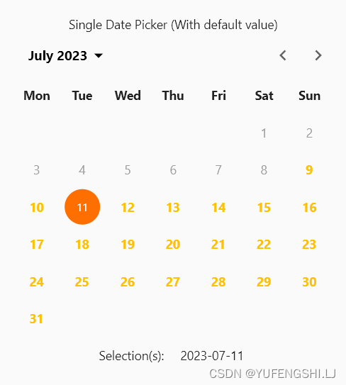
单模式
  List<DateTime?> _singleDatePickerValueWithDefaultValue = [DateTime.now(),];
  //单模式
  Widget _buildDefaultSingleDatePickerWithValue() {
    final config = CalendarDatePicker2Config(
      selectedDayHighlightColor: Colors.amber[900],
      weekdayLabels: ['Sun', 'Mon', 'Tue', 'Wed', 'Thu', 'Fri', 'Sat'],
      weekdayLabelTextStyle: const TextStyle(
        color: Colors.black87,
        fontWeight: FontWeight.bold,
      ),
      firstDayOfWeek: 1,
      controlsHeight: 50,
      controlsTextStyle: const TextStyle(
        color: Colors.black,
        fontSize: 15,
        fontWeight: FontWeight.bold,
      ),
      dayTextStyle: const TextStyle(
        color: Colors.amber,
        fontWeight: FontWeight.bold,
      ),
      disabledDayTextStyle: const TextStyle(
        color: Colors.grey,
      ),
      selectableDayPredicate: (day) => !day.difference(DateTime.now().subtract(const Duration(days: 3))).isNegative,
    );
    return Column(
      mainAxisSize: MainAxisSize.min,
      children: [
        const SizedBox(height: 10),
        const Text('Single Date Picker (With default value)'),
        CalendarDatePicker2(
          config: config,
          value: _singleDatePickerValueWithDefaultValue,
          onValueChanged: (dates) =>
              setState(() => _singleDatePickerValueWithDefaultValue = dates),
        ),
        const SizedBox(height: 10),
        Row(
          mainAxisSize: MainAxisSize.min,
          children: [
            const Text('Selection(s):  '),
            const SizedBox(width: 10),
            Text(
              _getValueText(
                config.calendarType,
                _singleDatePickerValueWithDefaultValue,
              ),
            ),
          ],
        ),
        const SizedBox(height: 25),
      ],
    );
  }
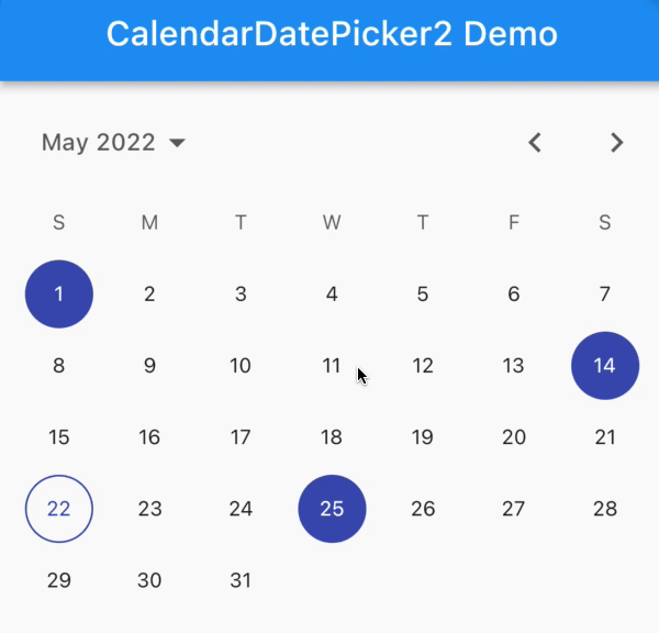
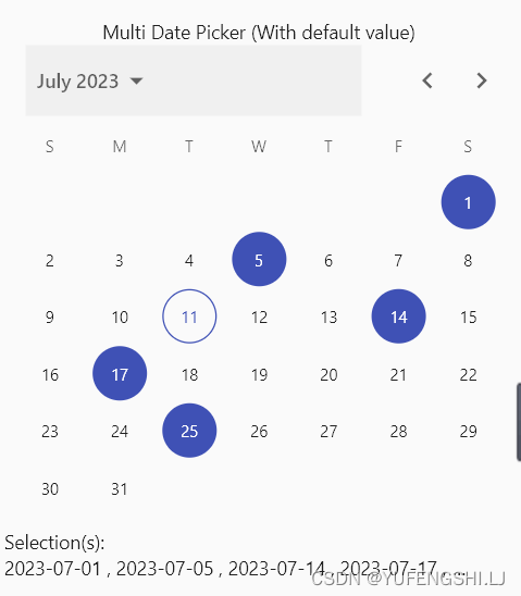
多模式
List<DateTime?> _multiDatePickerValueWithDefaultValue = [
    DateTime(today.year, today.month, 1),
    DateTime(today.year, today.month, 5),
    DateTime(today.year, today.month, 14),
    DateTime(today.year, today.month, 17),
    DateTime(today.year, today.month, 25),
  ];
//多模式
  Widget _buildDefaultMultiDatePickerWithValue() {
    final config = CalendarDatePicker2Config(
      calendarType: CalendarDatePicker2Type.multi,
      selectedDayHighlightColor: Colors.indigo,
    );
    return Column(
      mainAxisSize: MainAxisSize.min,
      children: [
        const SizedBox(height: 10),
        const Text('Multi Date Picker (With default value)'),
        CalendarDatePicker2(
          config: config,
          value: _multiDatePickerValueWithDefaultValue,
          onValueChanged: (dates) =>
              setState(() => _multiDatePickerValueWithDefaultValue = dates),
        ),
        const SizedBox(height: 10),
        Wrap(
          children: [
            const Text('Selection(s):  '),
            const SizedBox(width: 10),
            Text(
              _getValueText(
                config.calendarType,
                _multiDatePickerValueWithDefaultValue,
              ),
              overflow: TextOverflow.ellipsis,
              maxLines: 1,
              softWrap: false,
            ),
          ],
        ),
        const SizedBox(height: 25),
      ],
    );
  }
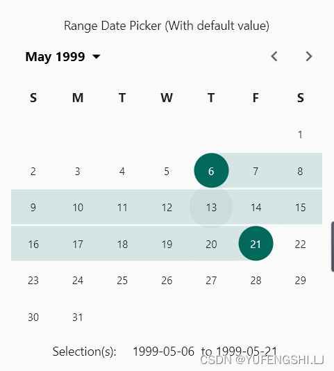
范围模式
 List<DateTime?> _rangeDatePickerValueWithDefaultValue = [
    DateTime(1999, 5, 6),
    DateTime(1999, 5, 21),
  ];
//范围模式
  Widget _buildDefaultRangeDatePickerWithValue() {
    final config = CalendarDatePicker2Config(
      calendarType: CalendarDatePicker2Type.range,
      selectedDayHighlightColor: Colors.teal[800],
      weekdayLabelTextStyle: const TextStyle(
        color: Colors.black87,
        fontWeight: FontWeight.bold,
      ),
      controlsTextStyle: const TextStyle(
        color: Colors.black,
        fontSize: 15,
        fontWeight: FontWeight.bold,
      ),
    );
    return Column(
      mainAxisSize: MainAxisSize.min,
      children: [
        const SizedBox(height: 10),
        const Text('Range Date Picker (With default value)'),
        CalendarDatePicker2(
          config: config,
          value: _rangeDatePickerValueWithDefaultValue,
          onValueChanged: (dates) =>
              setState(() => _rangeDatePickerValueWithDefaultValue = dates),
        ),
        const SizedBox(height: 10),
        Row(
          mainAxisSize: MainAxisSize.min,
          children: [
            const Text('Selection(s):  '),
            const SizedBox(width: 10),
            Text(
              _getValueText(
                config.calendarType,
                _rangeDatePickerValueWithDefaultValue,
              ),
            ),
          ],
        ),
        const SizedBox(height: 25),
      ],
    );
  }
按钮确认调用CalendarDatePicker2WithActionButtons,仅当用户点击“确定”按钮时,此小部件才会发出更新的值
List<DateTime?> _rangeDatePickerWithActionButtonsWithValue = [
    DateTime.now(),
    DateTime.now().add(const Duration(days: 5)),
  ];
 //按钮确定
  Widget _buildCalendarWithActionButtons() {
    final config = CalendarDatePicker2WithActionButtonsConfig(
      calendarType: CalendarDatePicker2Type.range,
      disableModePicker: true,
    );
    return Column(
      mainAxisSize: MainAxisSize.min,
      children: [
        const SizedBox(height: 10),
        const Text('Date Picker With Action Buttons'),
        CalendarDatePicker2WithActionButtons(
          config: config,
          value: _rangeDatePickerWithActionButtonsWithValue,
          onValueChanged: (dates) => setState(
                  () => _rangeDatePickerWithActionButtonsWithValue = dates),
        ),
        const SizedBox(height: 10),
        Row(
          mainAxisSize: MainAxisSize.min,
          children: [
            const Text('Selection(s):  '),
            const SizedBox(width: 10),
            Flexible(
              child: Text(
                _getValueText(
                  config.calendarType,
                  _rangeDatePickerWithActionButtonsWithValue,
                ),
              ),
            ),
          ],
        ),
        const SizedBox(height: 25),
      ],
    );
  }

原文:https://pub.dev/packages/calendar_date_picker2

开源鸿蒙跨平台开发社区汇聚开发者与厂商,共建“一次开发,多端部署”的开源生态,致力于降低跨端开发门槛,推动万物智联创新。
更多推荐


 2
2 0
0- 0


 已为社区贡献15条内容

所有评论(0)