按钮下拉框设计java_Flutter 74: 图解基本 DropdownButton 下拉选项框按钮
和尚对于 Flutter 并不系统,总是遇到问题才会准备尝试,今天和尚准备学习一下下拉选择框;Android 提供了便利的 Spinner 而 Flutter 对应的是 DropdownButton;源码分析DropdownButton({Key key,@required this.items,// 下拉选项列表this.selectedItemBuilder,// 选项 i...
和尚对于 Flutter 并不系统,总是遇到问题才会准备尝试,今天和尚准备学习一下下拉选择框;Android 提供了便利的 Spinner 而 Flutter 对应的是 DropdownButton;
源码分析
DropdownButton({
Key key,
@required this.items, // 下拉选项列表
this.selectedItemBuilder, // 选项 item 构造器
this.value, // 选中内容
this.hint, // 启动状态下默认内容
this.disabledHint, // 禁用状态下默认内容
@required this.onChanged, // 选择 item 回调
this.elevation = 8, // 阴影高度
this.style, // 选项列表 item 样式
this.underline, // 按钮下划线
this.icon, // 下拉按钮图标
this.iconDisabledColor, // 禁用状态下图标颜色
this.iconEnabledColor, // 启动时图标颜色
this.iconSize = 24.0, // 图标尺寸
this.isDense = false, // 是否降低按钮高度
this.isExpanded = false, // 是否将下拉列表内容设置水平填充
})
const DropdownMenuItem({
Key key,
this.value, // 对应选中状态内容
@required this.child, // 下拉列表 item 内容
})
分析源码可知,items 和 onChanged 回调是必须参数,且在不同状态下,展示的效果不同;其中 items 或 onChanged 为 null 时为禁用状态,和尚接下来逐一分析各属性;
案例分析
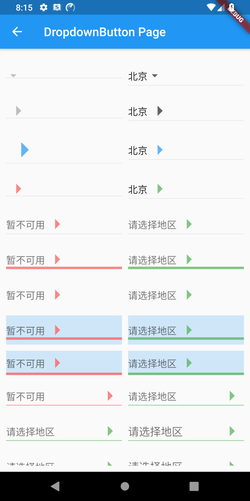
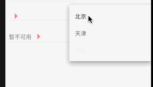
items 为下拉选项列表,onChanged 为选中回调;两者其中一个为 null 时为按钮禁用状态,不可点击,默认下拉 icon 为灰色;items 不为空时,需为相同类型的 DropdownMenuItem 类型列表;
DropdownButton(items: null, onChanged: null);
DropdownButton(items: [
DropdownMenuItem(child: Text('北京')),
DropdownMenuItem(child: Text('天津')),
DropdownMenuItem(child: Text('河北'))
], onChanged: (value) {});

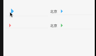
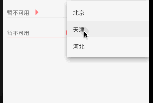
icon 为下拉按钮右侧图标,iconSize 为下拉按钮图标尺寸,禁用和启动状态下均可设置;若 icon 设置尺寸以 icon 尺寸为准;
icon: Icon(Icons.arrow_right),
// icon: Icon(Icons.arrow_right, color: Colors.blue.withOpacity(0.7), size: 60),
iconSize: 40,

iconDisabledColor 为禁用状态下设置 icon 颜色,iconEnabledColor 为按钮启用状态下设置 icon 颜色;但若 icon 设置固定颜色后,以 icon 设置为准;
// 禁用 icon 颜色
iconDisabledColor: Colors.redAccent.withOpacity(0.7),
// 启用 icon 颜色
iconEnabledColor: Colors.green.withOpacity(0.7),

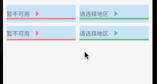
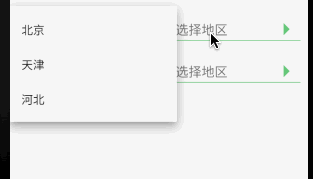
4. disabledHint 为禁用状态下默认展示内容,hint 为按钮启用状态下默认展示内容,采用 hint 时 DropdownMenuItem 中 type 不为空,否则只会显示第一条 item;
// 禁用默认内容
disabledHint: Text('暂不可用'),
// 启用默认内容
DropdownButton(icon: Icon(Icons.arrow_right), iconSize: 40, iconEnabledColor: Colors.green.withOpacity(0.7),
hint: Text('请选择地区'),
items: [
DropdownMenuItem(child: Text('北京'), value: 1), DropdownMenuItem(child: Text('天津'), value: 2),
DropdownMenuItem(child: Text('河北'), value: 3)
], onChanged: (value) {});
5. underline 用来设置按钮下划线样式,若设置 null 显示的是高度为 1.0 的默认下划线样式,若需要隐藏下划线可以设置 Container 高度为 0.0;
underline: Container(height: 4, color: Colors.green.withOpacity(0.7)),
// 隐藏下划线
underline: Container(height: 0),

isDense 用来调整按钮高度,true 时将按钮高度缩小,缩小的高度通过 Theme _kDenseButtonHeight 决定,但不会缩小太多导致图标剪切;
// 源码
double get _denseButtonHeight {
final double fontSize = _textStyle.fontSize ?? Theme.of(context).textTheme.subhead.fontSize;
return math.max(fontSize, math.max(widget.iconSize, _kDenseButtonHeight));
}
isExpanded 用于是否填充按钮宽度到父控件,true 为填充,false 为默认不填充;
// 源码
if (widget.isExpanded)
Expanded(child: innerItemsWidget)

elevation 是 z 轴上垂直阴影,只能是 1 / 2 / 3 / 4 / 6 / 8 / 9 / 12 / 16 / 24,默认阴影高度是 8,若设置其他值不显示;
//源码
8: [
BoxShadow(offset: Offset(0.0, 5.0), blurRadius: 5.0, spreadRadius: -3.0, color: _kKeyUmbraOpacity),
BoxShadow(offset: Offset(0.0, 8.0), blurRadius: 10.0, spreadRadius: 1.0, color: _kKeyPenumbraOpacity),
BoxShadow(offset: Offset(0.0, 3.0), blurRadius: 14.0, spreadRadius: 2.0, color: _kAmbientShadowOpacity),
],
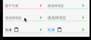
style 为下拉选项列表中文字样式;但下拉列表 item 设置文本样式后,以 item 设置为准;
DropdownButton(style: style,
icon: Icon(Icons.arrow_right), iconSize: 40, iconEnabledColor: Colors.green.withOpacity(0.7),
hint: Text('请选择地区'), isExpanded: true, underline: Container(height: 1, color: Colors.green.withOpacity(0.7)),
items: [
DropdownMenuItem(
child: Row(children: [Text('北京'), SizedBox(width: 10), Icon(Icons.ac_unit) ]),
value: 1),
DropdownMenuItem(
child: Row(children: [Text('天津'), SizedBox(width: 10), Icon(Icons.content_paste) ]),
value: 2),
DropdownMenuItem(
child: Row(children: [Text('河北', style: TextStyle(color: Colors.purpleAccent, fontSize: 16)), SizedBox(width: 10), Icon(Icons.send, color: Colors.purpleAccent) ]),
value: 3)
],
onChanged:(value) {});
对于 DropdownButton 选中回调,其中 items 中 value 是必须参数,且不相同;回调返回的内容是 DropdownMenuItem 中 child 内容;
DropdownButton(
value: _value, style: style,
icon: Icon(Icons.arrow_right), iconSize: 40, iconEnabledColor: Colors.green.withOpacity(0.7),
hint: Text('请选择地区'), isExpanded: true, underline: Container(height: 1, color: Colors.green.withOpacity(0.7)),
items: [
DropdownMenuItem(
child: Row(children: [Text('北京'), SizedBox(width: 10), Icon(Icons.ac_unit) ]),
value: 1),
DropdownMenuItem(
child: Row(children: [Text('天津'), SizedBox(width: 10), Icon(Icons.content_paste) ]),
value: 2),
DropdownMenuItem(
child: Row(children: [Text('河北', style: TextStyle(color: Colors.purpleAccent, fontSize: 16)), SizedBox(width: 10), Icon(Icons.send, color: Colors.purpleAccent) ]),
value: 3)
],
onChanged: (value) => setState(() => _value = value));
和尚对 DropdownButton 的尝试仅限于基本属性的应用,对于使用 PopupRoute 浮层展示 DropdownMenuItem 列表的源码层涉及较少;如有错误请多多指导!
来源: 阿策小和尚

开源鸿蒙跨平台开发社区汇聚开发者与厂商,共建“一次开发,多端部署”的开源生态,致力于降低跨端开发门槛,推动万物智联创新。
更多推荐
 0
0 0
0- 0


 已为社区贡献1条内容

所有评论(0)