php顶部导航条代码,初识顶部导航栏【flutter20个实例之一】
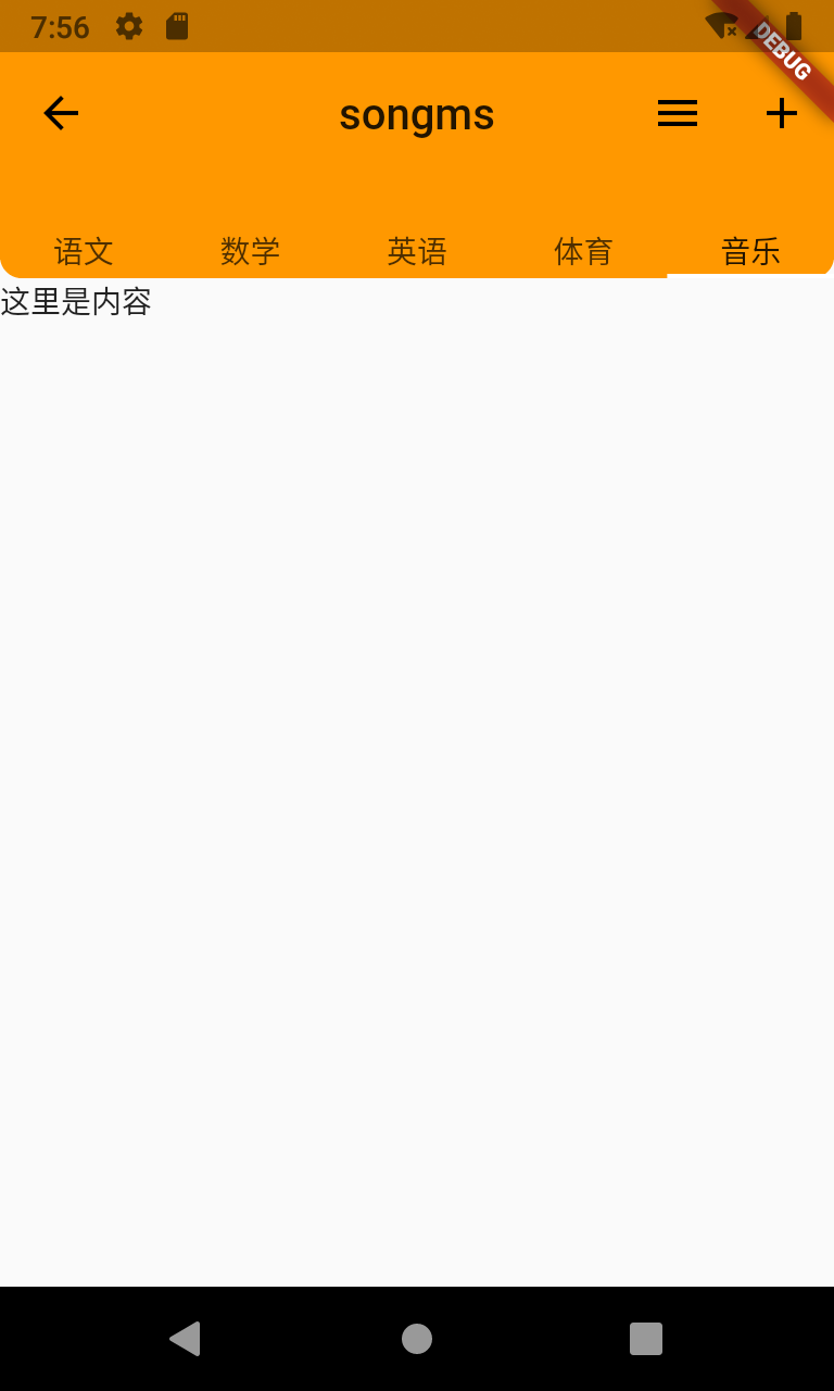
一、老套路,先看样式右侧图是我的实际开发中业务界面,用作展示而已二、讲解(后附源码)1.这里主要是用户AppBar组件/**AppBar({Key key,this.leading,//在标题前面显示的一个控件,在首页通常显示应用的 logo;在其他界面通常显示为返回按钮this.automaticallyImplyLeading = true,this.title,...
一、老套路,先看样式
右侧图是我的实际开发中业务界面,用作展示而已
二、讲解(后附源码)
1.这里主要是用户AppBar组件
/**
AppBar({
Key key,
this.leading,//在标题前面显示的一个控件,在首页通常显示应用的 logo;在其他界面通常显示为返回按钮
this.automaticallyImplyLeading = true,
this.title,//Toolbar 中主要内容,通常显示为当前界面的标题文字
this.actions,//一个 Widget 列表,代表 Toolbar 中所显示的菜单,对于常用的菜单,通常使用 IconButton 来表示;对于不常用的菜单通常使用 PopupMenuButton 来显示为三个点,点击后弹出二级菜单
this.flexibleSpace,//一个显示在 AppBar 下方的控件,高度和 AppBar 高度一样,可以实现一些特殊的效果,该属性通常在 SliverAppBar 中使用
this.bottom,//一个 AppBarBottomWidget 对象,通常是 TabBar。用来在 Toolbar 标题下面显示一个 Tab 导航栏
this.elevation = 4.0,//纸墨设计中控件的 z 坐标顺序,默认值为 4,对于可滚动的 SliverAppBar,当 SliverAppBar 和内容同级的时候,该值为 0, 当内容滚动 SliverAppBar 变为 Toolbar 的时候,修改 elevation 的值
this.backgroundColor,//APP bar 的颜色,默认值为 ThemeData.primaryColor。改值通常和下面的三个属性一起使用
this.brightness,//App bar 的亮度,有白色和黑色两种主题,默认值为 ThemeData.primaryColorBrightness
this.iconTheme,//App bar 上图标的颜色、透明度、和尺寸信息。默认值为 ThemeData.primaryIconTheme
this.textTheme,//App bar 上的文字样式。默认值为 ThemeData.primaryTextTheme
this.primary = true,
this.centerTitle,//标题是否居中显示,默认值根据不同的操作系统,显示方式不一样,true居中 false居左
this.titleSpacing = NavigationToolbar.kMiddleSpacing,
this.toolbarOpacity = 1.0,
this.bottomOpacity = 1.0,
})
*/
2.leading默认是一个返回箭头,有时候我们需要定义,有时候也仅是简单的返回上一层,就需要自定义了,他支持子组件。
如果leading属性未设置,且Scaffold设置了Drawer则显示打开Drawer的图标
如果leading属性未设置,Scaffold也未设置Drawer,此时如果有前一个路由,则显示BackButton
leading: IconButton(
icon: Icon(
Icons.arrow_back,
color: Colors.black,
),
onPressed: () {
print('返回');
},
),
3.AppBar默认底部有个阴影,如果要去掉
elevation:0;
4.如果想要下方出现一点角度的话
vertical支持顶部和底部
horizontal支持左边和右边
shape: RoundedRectangleBorder(borderRadius: BorderRadius.vertical(bottom: Radius.circular(10))),
5.底部tab需要用到bottom属性
bottom: TabBar(
tabs: [
Text('语文'),
Text('数学'),
Text('英语'),
Text('体育'),
Text('音乐'),
],
controller: TabController(length: 5, vsync: ScrollableState()),
)
三、源码
import 'package:flutter/material.dart';
class Mytest extends StatefulWidget {
@override
_MytestState createState() => _MytestState();
}
class _MytestState extends State {
@override
Widget build(BuildContext context) {
return Scaffold(
appBar: AppBar(
leading: IconButton(
icon: Icon(
Icons.arrow_back,
color: Colors.black,
),
onPressed: () {
print('返回');
},
), //自定义返回图标样式
automaticallyImplyLeading: false, //设置为false后将不会自动出现返回箭头
centerTitle: true, //如果想要文字居中的话
actions: [
IconButton(
icon: Icon(Icons.menu),
onPressed: () {},
),
IconButton(
icon: Icon(Icons.add),
onPressed: () {},
)
],
elevation: 0,
title: Text('songms'),
shape: RoundedRectangleBorder(
borderRadius: BorderRadius.vertical(bottom: Radius.circular(10))),
backgroundColor: Colors.orange,
bottom: TabBar(
tabs: [
Text('语文'),
Text('数学'),
Text('英语'),
Text('体育'),
Text('音乐'),
],
controller: TabController(length: 5, vsync: ScrollableState()),
)),//这个是顶部tab样式,如果不需要可以去掉
body: Text('这里是内容'),
);
}
}
持续更新......

开源鸿蒙跨平台开发社区汇聚开发者与厂商,共建“一次开发,多端部署”的开源生态,致力于降低跨端开发门槛,推动万物智联创新。
更多推荐
 0
0 0
0- 0


 已为社区贡献1条内容

所有评论(0)