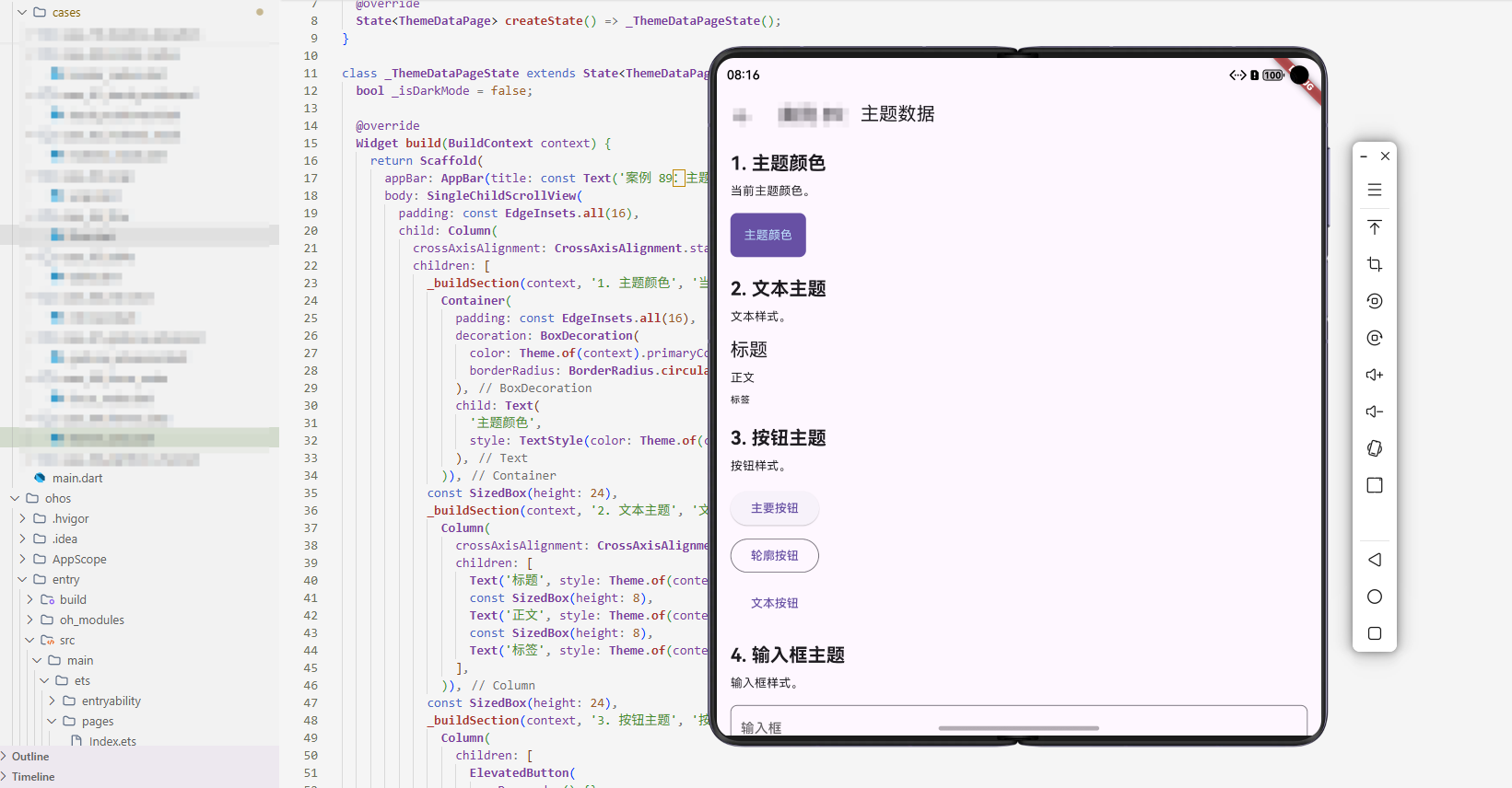
flutter适配openHarmony ThemeData 主题
本文介绍了Flutter中ThemeData的使用方法,包括基础主题设置、自定义主题、暗黑模式切换和颜色方案定制。通过5个代码示例展示了如何定义主色调、组件主题、动态切换主题以及生成协调颜色方案。还探讨了高级功能如响应式设计、动画过渡、无障碍支持等,并提供了PC端适配建议。ThemeData是Flutter应用主题管理的核心工具,支持从简单应用到复杂主题系统的各种需求。
案例概述
ThemeData 用于定义应用的主题。本案例展示了如何使用 ThemeData 创建和自定义主题。
核心概念
1. ThemeData 基础
ThemeData 定义应用的主题。
2. 主题继承
子 Widget 继承主题。
3. 主题切换
可以动态切换主题。
代码详解
示例 1:基础主题
class BasicThemeExample extends StatelessWidget {
Widget build(BuildContext context) {
return MaterialApp(
theme: ThemeData(
primaryColor: Colors.blue,
scaffoldBackgroundColor: Colors.white,
),
home: Scaffold(
appBar: AppBar(title: const Text('基础主题')),
body: const Center(child: Text('主题示例')),
),
);
}
}
代码解释: ThemeData 定义应用主题。primaryColor 是主色调,scaffoldBackgroundColor 是背景色。所有使用这些颜色的组件会自动应用主题。
示例 2:自定义主题
class CustomThemeExample extends StatelessWidget {
Widget build(BuildContext context) {
return MaterialApp(
theme: ThemeData(
primaryColor: Colors.blue,
primarySwatch: Colors.blue,
accentColor: Colors.orange,
scaffoldBackgroundColor: Colors.white,
appBarTheme: const AppBarTheme(
backgroundColor: Colors.blue,
foregroundColor: Colors.white,
),
elevatedButtonTheme: ElevatedButtonThemeData(
style: ElevatedButton.styleFrom(
backgroundColor: Colors.blue,
foregroundColor: Colors.white,
),
),
),
home: Scaffold(
appBar: AppBar(title: const Text('自定义主题')),
body: Center(
child: ElevatedButton(
onPressed: () {},
child: const Text('按钮'),
),
),
),
);
}
}
代码解释: ThemeData 支持为各个组件定制主题。appBarTheme 定制 AppBar,elevatedButtonTheme 定制按钮。这提供了细粒度的主题控制。
示例 3:暗黑主题
class DarkThemeExample extends StatelessWidget {
Widget build(BuildContext context) {
return MaterialApp(
theme: ThemeData.light(),
darkTheme: ThemeData.dark(),
themeMode: ThemeMode.dark,
home: Scaffold(
appBar: AppBar(title: const Text('暗黑主题')),
body: const Center(child: Text('暗黑主题示例')),
),
);
}
}
代码解释: MaterialApp 支持 darkTheme 和 themeMode。ThemeMode.dark 强制使用暗黑主题。ThemeMode.system 会根据系统设置自动切换。
示例 4:主题切换
class ThemeSwitchExample extends StatefulWidget {
State<ThemeSwitchExample> createState() => _ThemeSwitchExampleState();
}
class _ThemeSwitchExampleState extends State<ThemeSwitchExample> {
bool _isDarkMode = false;
Widget build(BuildContext context) {
return MaterialApp(
theme: _isDarkMode ? ThemeData.dark() : ThemeData.light(),
home: Scaffold(
appBar: AppBar(title: const Text('主题切换')),
body: Center(
child: Switch(
value: _isDarkMode,
onChanged: (value) {
setState(() {
_isDarkMode = value;
});
},
),
),
),
);
}
}
代码解释: 通过 setState 动态改变 theme,实现主题切换。Switch 控制 _isDarkMode,改变时重建 MaterialApp 并应用新主题。
示例 5:自定义颜色方案
class CustomColorSchemeExample extends StatelessWidget {
Widget build(BuildContext context) {
return MaterialApp(
theme: ThemeData(
useMaterial3: true,
colorScheme: ColorScheme.fromSeed(
seedColor: Colors.purple,
brightness: Brightness.light,
),
),
home: Scaffold(
appBar: AppBar(title: const Text('自定义颜色方案')),
body: Center(
child: ElevatedButton(
onPressed: () {},
child: const Text('按钮'),
),
),
),
);
}
}
代码解释: ColorScheme.fromSeed 从种子颜色生成完整的颜色方案。useMaterial3 启用 Material 3 设计。这种方式自动生成协调的颜色组合,比手动定义更简洁。
高级话题
1. 动态/响应式设计
根据屏幕大小调整主题。
2. 动画与过渡
自定义主题切换动画。
3. 搜索/过滤/排序
主题可以影响搜索。
4. 选择与批量操作
支持主题选择。
5. 加载与缓存
缓存主题。
6. 键盘导航
支持键盘快捷键。
7. 无障碍支持
提供无障碍支持。
8. 样式自定义
自定义样式。
9. 数据持久化/导出
保存主题设置。
10. 单元测试与集成测试
测试功能。
PC 端适配要点
- 根据屏幕大小调整主题
- 支持键盘快捷键
- 提供清晰的主题指示
实际应用场景
- 应用主题:定义应用主题
- 暗黑模式:支持暗黑模式
- 个性化:个性化主题
- 品牌:品牌主题
扩展建议
- 学习高级主题库
- 研究性能优化
- 探索自定义效果
- 集成主题库
总结
ThemeData 是定义应用主题的有效方式。通过灵活使用 ThemeData,可以创建各种主题效果。欢迎加入开源鸿蒙跨平台社区:https://openharmonycrossplatform.csdn.net

开源鸿蒙跨平台开发社区汇聚开发者与厂商,共建“一次开发,多端部署”的开源生态,致力于降低跨端开发门槛,推动万物智联创新。
更多推荐
 6
6 0
0- 0


 已为社区贡献12条内容

所有评论(0)