Flutter 自定义 Switch 组件:实现自定义宽高与滑动动画效果
特别是当你想要完全控制开关的尺寸、颜色和滑动动画时,使用 Container 或 Transform.scale包裹 CupertinoSwitch 的方式可能无法达到理想的效果。在 Flutter 中,虽然原生的 CupertinoSwitch 很强大,但当我们需要自定义开关的宽高、颜色或者交互动画时,创建一个自定义的 Switch 组件能够带来更多的灵活性。通过上面的代码示例,你可以轻松实现自
在 Flutter 中,CupertinoSwitch 是一个常用的开关组件,但它在设置宽高时可能会遇到一些限制。特别是当你想要完全控制开关的尺寸、颜色和滑动动画时,使用 Container 或 Transform.scale包裹 CupertinoSwitch 的方式可能无法达到理想的效果。在本文中,我将带你实现一个自定义的 Switch 组件,不仅能够设置宽高,还能保证流畅的滑动效果。
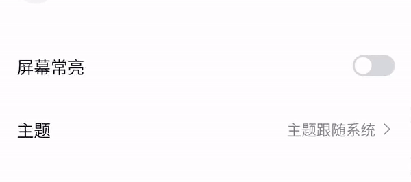
效果图:
1. 问题背景
在开发中,默认的 CupertinoSwitch 可以很好地满足基础的开关功能需求。但当我们需要修改其宽高、滑动效果或者自定义颜色时,Flutter 提供的 CupertinoSwitch 并没有提供足够的灵活性。例如:
• CupertinoSwitch 无法直接通过 Container 改变尺寸。
• Transform.scale 可以改变控件的比例,但缩放后的视觉效果和预期的 UI 效果可能不同。
2. 常规解决方案与问题
在尝试改变 CupertinoSwitch 宽高时,开发者往往会使用类似以下的代码:
Transform.scale(
  scale: 0.8,
  child: CupertinoSwitch(
    value: true,
    onChanged: (value) {},
    activeColor: Colors.blue,
  ),
)
尽管可以通过 Transform.scale 实现比例缩放,但整个 Switch 的外观及交互方式仍然会与设计稿中的预期效果有差距。为了解决这个问题,我们可以通过自定义一个开关组件来完全控制宽高、颜色以及动画效果。
3. 自定义 Switch 组件实现
通过创建一个 CustomSwitch 组件,您可以自定义开关的宽度、高度、滑块颜色以及滑动动画。该组件通过使用 AnimatedContainer 和 AnimatedAlign 来实现平滑的滑动效果。
4. 代码实现与详解
import 'package:flutter/cupertino.dart';
import 'package:flutter/material.dart';
import 'package:flutter_screenutil/flutter_screenutil.dart';

class CustomSwitch extends StatefulWidget {
  final bool value; // 当前开关的状态
  final ValueChanged<bool> onChanged; // 开关状态改变时的回调函数
  final Color activeColor; // 开关打开时的颜色
  final Color trackColor; // 开关关闭时的背景颜色
  final double width; // 开关的宽度
  final double height; // 开关的高度

  const CustomSwitch({
    super.key,
    required this.value,
    required this.onChanged,
    required this.activeColor,
    required this.trackColor,
    this.width = 40,  // 默认宽度
    this.height = 20, // 默认高度
  });

  @override
  State<CustomSwitch> createState() => _CustomSwitchState();
}

class _CustomSwitchState extends State<CustomSwitch>
    with SingleTickerProviderStateMixin {
  late AnimationController _animationController;

  @override
  void initState() {
    super.initState();
    _animationController = AnimationController(
      vsync: this,
      duration: const Duration(milliseconds: 200),
      value: widget.value ? 1.0 : 0.0, // 根据初始状态设置动画进度
    );
  }

  @override
  void didUpdateWidget(covariant CustomSwitch oldWidget) {
    super.didUpdateWidget(oldWidget);
    _animationController.animateTo(widget.value ? 1.0 : 0.0); // 当状态改变时更新动画
  }

  @override
  Widget build(BuildContext context) {
    return GestureDetector(
      onTap: () {
        widget.onChanged(!widget.value); // 切换状态
        _animationController.animateTo(widget.value ? 1.0 : 0.0); // 切换时触发动画
      },
      child: AnimatedContainer(
        duration: const Duration(milliseconds: 100),
        width: widget.width.w,  // 使用设置的宽度
        height: widget.height.h, // 使用设置的高度
        padding: const EdgeInsets.all(2.0),
        decoration: BoxDecoration(
          borderRadius: BorderRadius.circular(10.r), // 设置圆角
          color: widget.value ? widget.activeColor : widget.trackColor, // 根据状态切换颜色
        ),
        child: AnimatedAlign(
          duration: const Duration(milliseconds: 200),
          curve: Curves.easeOut, // 滑动的动画曲线
          alignment: widget.value ? Alignment.centerRight : Alignment.centerLeft, // 滑块的位置
          child: Container(
                width: 16.w, // 滑块的宽度
                height: 16.h, // 滑块的高度
                decoration: const BoxDecoration(
                  shape: BoxShape.circle, // 滑块是一个圆形
                  color: Colors.white, // 滑块颜色
               ),
            ),
         ),
      ),
    );
  }

  @override
  void dispose() {
    _animationController.dispose(); // 销毁动画控制器
    super.dispose();
  }
}
代码详解:
1. 自定义宽高:组件中加入了 width 和 height 参数,允许开发者根据需求自定义开关的宽高,默认的宽高分别为 40 和 20。
2. 动画效果:通过 AnimationController 控制开关的滑动动画,并通过 AnimatedAlign 实现滑块的平滑滑动。
3. 自定义颜色:开发者可以自定义 activeColor(开启时的颜色)和 trackColor(关闭时的颜色)。
4. 点击响应:使用 GestureDetector 监听点击事件,当用户点击开关时,切换开关状态,并触发动画。
5. 总结
在 Flutter 中,虽然原生的 CupertinoSwitch 很强大,但当我们需要自定义开关的宽高、颜色或者交互动画时,创建一个自定义的 Switch 组件能够带来更多的灵活性。通过上面的代码示例,你可以轻松实现自定义的开关组件,不仅可以控制它的外观,还能享受更流畅的动画效果。
这就是如何使用 Flutter 自定义开关组件的实现。如果你有任何问题或想要进一步优化,请随时在评论中讨论!

开源鸿蒙跨平台开发社区汇聚开发者与厂商,共建“一次开发,多端部署”的开源生态,致力于降低跨端开发门槛,推动万物智联创新。
更多推荐
 14
14 0
0- 0


 已为社区贡献6条内容

所有评论(0)