input组件android,React-Native TextInput组件详解及实例代码
同时适配Android和IOS代码注释比较详细/*** Sample React Native App* https://github.com/facebook/react-native* @flow*/import React, {Component} from 'react';import {AppRegistry,StyleSheet,Text,View,TextInput,Platform
同时适配Android和IOS
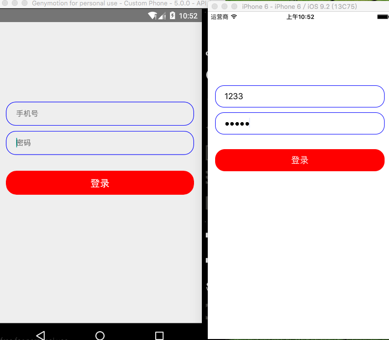
代码注释比较详细
/**
* Sample React Native App
* https://github.com/facebook/react-native
* @flow
*/
import React, {Component} from 'react';
import {
AppRegistry,
StyleSheet,
Text,
View,
TextInput,
Platform,
TouchableOpacity,
} from 'react-native';
//获取屏幕信息
var Dimensions = require('Dimensions');
var width = Dimensions.get('window').width;
class TextInputG extends Component {
render() {
return (
{/*账号输入框在这里用View包裹以便处理器样式*/}
style={styles.textInputStyle}
//站位符
placeholder='手机号'/>
{/*密码输入框*/}
style={styles.textInputStyle}
placeholder='密码'
//密文
secureTextEntry={true}/>
{/*设置控件可点击*/}
{alert('点击登录')}}>
{/*登录按钮*/}
登录
);
}
}
const styles = StyleSheet.create({
container: {
//设置占满屏幕
flex: 1,
// backgroundColor: 'black',
marginTop: 140,
},
//包裹输入框View样式
textInputViewStyle: {
//设置宽度减去30将其居中左右便有15的距离
width: width - 30,
height: 45,
//设置圆角程度
borderRadius: 18,
//设置边框的颜色
borderColor: 'blue',
//设置边框的宽度
borderWidth: 1,
//内边距
paddingLeft: 10,
paddingRight: 10,
//外边距
marginTop: 10,
marginLeft: 20,
marginRight: 20,
//设置相对父控件居中
alignSelf: 'center',
},
//输入框样式
textInputStyle: {
width: width - 30,
height: 35,
paddingLeft: 8,
backgroundColor: '#00000000',
// alignSelf: 'center',
//根据不同平台进行适配
marginTop: Platform.OS === 'ios' ? 4 : 8,
},
//登录按钮View样式
textLoginViewStyle: {
width: width - 30,
height: 45,
backgroundColor: 'red',
borderRadius: 20,
marginTop: 30,
alignSelf: 'center',
justifyContent: 'center',
alignItems: 'center',
},
//登录Text文本样式
textLoginStyle: {
fontSize: 18,
color: 'white',
},
});
module.exports = TextInputG;
感谢阅读,希望能帮助到大家,谢谢大家对本站的支持!

开源鸿蒙跨平台开发社区汇聚开发者与厂商,共建“一次开发,多端部署”的开源生态,致力于降低跨端开发门槛,推动万物智联创新。
更多推荐


 0
0 0
0- 0


 已为社区贡献1条内容

所有评论(0)