Flutter自定义绘制深度解析:从原理到实战, 自定义绘制实现progress, 滑动渐变文字,画板,图表等的实现。
Flutter自定义绘制深度解析:从原理到实战, 实现progress, 滑动渐变文字,画板的实现,图表实现等
本文将深入探讨Flutter自定义绘制的核心原理,详细讲解CustomPaint、CustomPainter与RenderBox之间的关系,并通过渐变文字的完整实现案例,帮助你掌握Flutter自定义绘制的精髓。
目录
- 一、Flutter自定义绘制核心架构
- 二、CustomPaint、CustomPainter与RenderBox的关系
- 三、渐变文字实现深度解析
- 四、动画渐变文字进阶实现
- 五、最佳实践与性能优化
- 私信可发demo
flutter 的K线图仓库: https://github.com/911hzh/ZHKLineFlutter
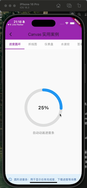
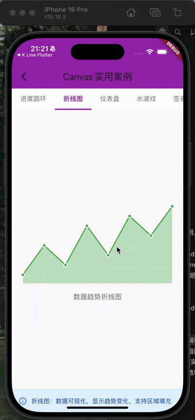
. 先看效果图
一、Flutter自定义绘制核心架构
1.1 Flutter渲染管线概述
Flutter的渲染系统采用了三棵树的架构:
Widget Tree(配置树)
    ↓
Element Tree(中间层)
    ↓
RenderObject Tree(渲染树)
当我们使用CustomPaint进行自定义绘制时,实际上是在与这个渲染管线的最底层打交道。
1.2 自定义绘制的三个核心组件
- Widget层:
CustomPaint- 配置和声明绘制需求 - Painter层:
CustomPainter- 定义具体的绘制逻辑 - RenderObject层:
RenderCustomPaint- 实际执行绘制和布局
二、CustomPaint、CustomPainter与RenderBox的关系
2.1 架构关系图
┌─────────────────────────────────────────┐
│         CustomPaint (Widget)            │
│  - painter: CustomPainter?              │
│  - foregroundPainter: CustomPainter?    │
│  - size: Size                           │
│  - child: Widget?                       │
└──────────────┬──────────────────────────┘
               │ createElement()
               ↓
┌─────────────────────────────────────────┐
│    SingleChildRenderObjectElement       │
│         (Element层)                      │
└──────────────┬──────────────────────────┘
               │ createRenderObject()
               ↓
┌─────────────────────────────────────────┐
│  RenderCustomPaint (RenderBox)          │
│  - painter: CustomPainter?              │
│  - foregroundPainter: CustomPainter?    │
│  + paint(PaintingContext, Offset)       │
│  + performLayout()                      │
└─────────────────────────────────────────┘
2.2 CustomPaint - Widget层
CustomPaint是一个RenderObjectWidget,它的主要职责是:
class CustomPaint extends SingleChildRenderObjectWidget {
const CustomPaint({
Key? key,
this.painter, // 背景画笔
this.foregroundPainter, // 前景画笔
this.size = Size.zero, // 画布尺寸
Widget? child, // 子组件
}) : super(key: key, child: child);
final CustomPainter? painter;
final CustomPainter? foregroundPainter;
final Size size;
RenderCustomPaint createRenderObject(BuildContext context) {
return RenderCustomPaint(
painter: painter,
foregroundPainter: foregroundPainter,
preferredSize: size,
);
}
}
核心职责:
- 持有
CustomPainter实例 - 声明式配置绘制参数
- 创建对应的
RenderCustomPaint对象
2.3 CustomPainter - 绘制策略层
CustomPainter是一个抽象类,定义了绘制的具体逻辑:
abstract class CustomPainter extends Listenable {
  /// 核心绘制方法
  void paint(Canvas canvas, Size size);

  /// 重绘判断逻辑
  bool shouldRepaint(covariant CustomPainter oldDelegate);

  /// 命中测试(用于事件处理)
  bool? hitTest(Offset position) => null;

  /// 语义化描述(用于无障碍)
  SemanticsBuilderCallback? get semanticsBuilder => null;
}
核心职责:
- paint() - 定义所有绘制指令
- shouldRepaint() - 优化性能,避免不必要的重绘
- hitTest() - 实现自定义的点击检测
重要原则:
paint()方法必须是幂等的(多次调用结果一致)- 不要在
paint()中创建对象,会影响性能 shouldRepaint()返回false可大幅提升性能
2.4 RenderCustomPaint - RenderBox实现层
RenderCustomPaint继承自RenderBox,是真正执行绘制的对象:
class RenderCustomPaint extends RenderProxyBox {
RenderCustomPaint({
CustomPainter? painter,
CustomPainter? foregroundPainter,
Size preferredSize = Size.zero,
}) : _painter = painter,
_foregroundPainter = foregroundPainter,
_preferredSize = preferredSize;
// 核心绘制流程
void paint(PaintingContext context, Offset offset) {
// 1. 绘制背景painter
if (_painter != null) {
_painter!.paint(context.canvas, size);
}
// 2. 绘制子组件
super.paint(context, offset);
// 3. 绘制前景painter
if (_foregroundPainter != null) {
_foregroundPainter!.paint(context.canvas, size);
}
}
// 布局逻辑
void performLayout() {
size = constraints.constrain(_preferredSize);
if (child != null) {
child!.layout(constraints, parentUsesSize: true);
}
}
}
核心职责:
- 实现布局算法(
performLayout) - 协调绘制顺序(背景→子组件→前景)
- 响应重绘请求(
markNeedsPaint)
2.5 三者关系总结
| 组件 | 层级 | 职责 | 可变性 |
|---|---|---|---|
| CustomPaint | Widget层 | 配置声明 | 不可变(Immutable) |
| CustomPainter | 策略层 | 绘制逻辑 | 可继承实现 |
| RenderCustomPaint | RenderBox层 | 实际渲染 | 可变(Mutable) |
数据流向:
CustomPaint (配置)
    → RenderCustomPaint (持有Painter引用)
    → CustomPainter.paint() (执行绘制)
    → Canvas (底层Skia引擎)
三、渐变文字实现深度解析
接下来,我们通过一个完整的渐变文字实现案例,深入理解Flutter自定义绘制的实战应用。
3.1 需求分析
我们要实现一个支持以下功能的渐变文字组件:
- 文字可以应用任意渐变效果(线性、径向、扇形)
- 支持多行文字
- 支持文字居中对齐
- 性能优化:只在必要时重绘
3.2 GradientTextPainter完整实现
/// 渐变色文字绘制
class GradientTextPainter extends CustomPainter {
final String text;
final TextStyle textStyle;
final Gradient gradient;
final TextAlign textAlign;
GradientTextPainter({
required this.text,
required this.textStyle,
required this.gradient,
this.textAlign = TextAlign.center,
});
void paint(Canvas canvas, Size size) {
// 创建渐变着色器(先创建一个临时 textPainter 用于计算尺寸)
final tempTextSpan = TextSpan(text: text, style: textStyle);
final tempTextPainter = TextPainter(
text: tempTextSpan,
textDirection: TextDirection.ltr,
textAlign: textAlign
)..layout(maxWidth: size.width);
// 计算文字位置(居中)
final offset = Offset(
(size.width - tempTextPainter.width) / 2,
(size.height - tempTextPainter.height) / 2
);
// 创建渐变着色器
final rect = Rect.fromLTWH(
offset.dx,
offset.dy,
tempTextPainter.width,
tempTextPainter.height
);
final shader = gradient.createShader(rect);
// 使用渐变绘制文字
final paint = Paint()..shader = shader;
final gradientTextSpan = TextSpan(
text: text,
style: textStyle.copyWith(foreground: paint)
);
final gradientTextPainter = TextPainter(
text: gradientTextSpan,
textDirection: TextDirection.ltr,
textAlign: textAlign,
)..layout(maxWidth: size.width);
// 直接绘制渐变文字
gradientTextPainter.paint(canvas, offset);
}
bool shouldRepaint(GradientTextPainter oldDelegate) {
return oldDelegate.text != text ||
oldDelegate.textStyle != textStyle ||
oldDelegate.gradient != gradient;
}
}
3.3 关键技术点详解
3.3.1 为什么需要创建两次TextPainter?
这是实现渐变文字的核心技巧:
第一次TextPainter(tempTextPainter):
final tempTextSpan = TextSpan(text: text, style: textStyle);
final tempTextPainter = TextPainter(...)..layout(maxWidth: size.width);
- 目的:计算文字的实际尺寸
- 原因:需要知道文字的宽高才能创建合适的渐变Shader区域
第二次TextPainter(gradientTextPainter):
final paint = Paint()..shader = shader;
final gradientTextSpan = TextSpan(
  text: text,
  style: textStyle.copyWith(foreground: paint)
);
final gradientTextPainter = TextPainter(...)..layout();
- 目的:使用带有渐变Shader的Paint绘制文字
- 关键:使用
foreground属性而不是color,因为foreground可以接受自定义Paint
3.3.2 Shader的创建与应用
// 1. 定义渐变区域(必须与文字的实际区域匹配)
final rect = Rect.fromLTWH(
  offset.dx,           // 文字左上角X
  offset.dy,           // 文字左上角Y
  tempTextPainter.width,   // 文字实际宽度
  tempTextPainter.height   // 文字实际高度
);

// 2. 从Gradient创建Shader
final shader = gradient.createShader(rect);

// 3. 将Shader应用到Paint
final paint = Paint()..shader = shader;
重要概念:
Shader是GPU级别的着色器,用于像素级的颜色计算Gradient.createShader(Rect)方法将渐变映射到指定矩形区域- 如果rect不匹配文字区域,渐变效果会错位
3.3.3 文字居中对齐的计算
final offset = Offset(
  (size.width - tempTextPainter.width) / 2,   // 水平居中
  (size.height - tempTextPainter.height) / 2  // 垂直居中
);
这个计算确保文字在给定的size区域内居中显示。
3.3.4 性能优化:shouldRepaint
bool shouldRepaint(GradientTextPainter oldDelegate) {
return oldDelegate.text != text ||
oldDelegate.textStyle != textStyle ||
oldDelegate.gradient != gradient;
}
优化原理:
- 只有当文字内容、样式或渐变发生变化时才重绘
- 如果参数未变,Flutter会跳过paint()调用
- 对于静态文字,这能节省大量GPU资源
3.4 封装为便捷组件
为了方便使用,我们将CustomPainter封装为Widget:
/// 渐变文字组件(便于使用)
class GradientText extends StatelessWidget {
final String text;
final TextStyle style;
final Gradient gradient;
const GradientText({
Key? key,
required this.text,
required this.style,
required this.gradient
}) : super(key: key);
Widget build(BuildContext context) {
return CustomPaint(
painter: GradientTextPainter(
text: text,
textStyle: style,
gradient: gradient
),
child: Text(
text,
style: style.copyWith(color: Colors.transparent)
),
);
}
}
为什么要添加透明的Text作为child?
- 保持正确的布局尺寸(Text会自动计算合适的size)
- 保留文字的语义信息(用于无障碍功能)
- 支持文字选择和复制(如果需要)
3.5 GradientTextShowcase实战案例
现在我们创建一个展示页面,演示多种渐变效果:
class GradientTextShowcase extends StatelessWidget {
const GradientTextShowcase({Key? key}) : super(key: key);
Widget build(BuildContext context) {
return Column(
mainAxisAlignment: MainAxisAlignment.center,
children: [
// 1. 线性渐变文字
_buildGradientText(
'线性渐变文字',
LinearGradient(
colors: [Colors.purple, Colors.blue, Colors.pink]
),
fontSize: 32
),
SizedBox(height: 30),
// 2. 彩虹渐变
_buildGradientText(
'彩虹色效果',
LinearGradient(
colors: [
Colors.red,
Colors.orange,
Colors.yellow,
Colors.green,
Colors.blue,
Colors.purple
]
),
fontSize: 28,
),
SizedBox(height: 30),
// 3. 金色渐变
_buildGradientText(
'GOLD',
LinearGradient(
colors: [
Color(0xFFFFD700),
Color(0xFFFFE55C),
Color(0xFFFFD700)
],
begin: Alignment.topLeft,
end: Alignment.bottomRight,
),
fontSize: 40,
fontWeight: FontWeight.bold,
),
SizedBox(height: 30),
// 4. 渐变多行文字
Container(
width: 300,
child: _buildGradientText(
'多行渐变文字示例\nMultiline Gradient',
LinearGradient(
colors: [Colors.cyan, Colors.indigo],
begin: Alignment.topCenter,
end: Alignment.bottomCenter,
),
fontSize: 24,
),
),
],
);
}
Widget _buildGradientText(
String text,
Gradient gradient, {
double fontSize = 24,
FontWeight fontWeight = FontWeight.normal,
}) {
final textStyle = TextStyle(
fontSize: fontSize,
fontWeight: fontWeight
);
// 计算文字尺寸
final textPainter = TextPainter(
text: TextSpan(text: text, style: textStyle),
textDirection: TextDirection.ltr
)..layout();
return CustomPaint(
size: Size(textPainter.width, textPainter.height),
painter: GradientTextPainter(
text: text,
textStyle: textStyle,
gradient: gradient
),
);
}
}
技术细节说明:
- 尺寸计算:
final textPainter = TextPainter(...)..layout();
return CustomPaint(
  size: Size(textPainter.width, textPainter.height),
  painter: ...
);
这确保CustomPaint的尺寸刚好包裹文字,避免浪费空间。
-
多行文字支持:
TextPainter自动处理换行符\n,渐变会沿着整个文本区域分布。 -
渐变方向控制:
LinearGradient(
  colors: [...],
  begin: Alignment.topLeft,    // 起点位置
  end: Alignment.bottomRight,  // 终点位置
)
四、动画渐变文字进阶实现
4.1 动画渐变的核心思路
要实现动画效果,我们需要:
- 使用
AnimationController驱动动画 - 根据动画进度动态改变Gradient参数
- 通过
AnimatedBuilder触发重绘
4.2 AnimatedGradientText完整实现
/// 带动画效果的渐变文字组件
class AnimatedGradientText extends StatefulWidget {
final String text;
final TextStyle style;
final List<Color> colors;
final Duration duration;
final AnimationType animationType;
const AnimatedGradientText({
Key? key,
required this.text,
required this.style,
required this.colors,
this.duration = const Duration(seconds: 3),
this.animationType = AnimationType.slide,
}) : super(key: key);
State<AnimatedGradientText> createState() => _AnimatedGradientTextState();
}
class _AnimatedGradientTextState extends State<AnimatedGradientText>
with SingleTickerProviderStateMixin {
late AnimationController _controller;
void initState() {
super.initState();
_controller = AnimationController(
vsync: this,
duration: widget.duration
)..repeat(); // 无限循环动画
}
void dispose() {
_controller.dispose();
super.dispose();
}
Widget build(BuildContext context) {
return AnimatedBuilder(
animation: _controller,
builder: (context, child) {
final gradient = _createAnimatedGradient(_controller.value);
// 计算文字尺寸
final textPainter = TextPainter(
text: TextSpan(text: widget.text, style: widget.style),
textDirection: TextDirection.ltr,
)..layout();
return CustomPaint(
size: Size(textPainter.width, textPainter.height),
painter: GradientTextPainter(
text: widget.text,
textStyle: widget.style,
gradient: gradient
),
);
},
);
}
/// 根据动画类型创建不同的渐变效果
Gradient _createAnimatedGradient(double value) {
switch (widget.animationType) {
case AnimationType.slide:
// 滑动效果:渐变从左到右流动
return LinearGradient(
colors: widget.colors,
begin: Alignment(-1.0 + value * 2, 0.0),
end: Alignment(1.0 + value * 2, 0.0),
);
case AnimationType.rotate:
// 旋转效果:渐变旋转360度
return LinearGradient(
colors: widget.colors,
begin: Alignment(
0.0 + 1.0 * (1 - value * 2).abs() * (value < 0.5 ? 1 : -1),
-1.0 + value * 2
),
end: Alignment(
0.0 - 1.0 * (1 - value * 2).abs() * (value < 0.5 ? 1 : -1),
1.0 - value * 2
),
);
case AnimationType.wave:
// 波浪效果:渐变来回流动
final waveValue = (value < 0.5 ? value * 2 : (1 - value) * 2);
return LinearGradient(
colors: widget.colors,
begin: Alignment(-1.0 + waveValue * 2, 0.0),
end: Alignment(1.0 + waveValue * 2, 0.0),
);
case AnimationType.pulse:
// 脉冲效果:颜色在列表中循环
final colorCount = widget.colors.length;
final shiftedColors = List<Color>.generate(colorCount, (index) {
final shiftIndex = ((index + (value * colorCount).floor()) % colorCount);
return widget.colors[shiftIndex];
});
return LinearGradient(colors: shiftedColors);
}
}
}
/// 动画类型枚举
enum AnimationType {
slide, // 滑动流动
rotate, // 旋转
wave, // 波浪往返
pulse, // 脉冲变色
}
4.3 动画算法详解
4.3.1 滑动效果(Slide)
// value: 0.0 → 1.0
begin: Alignment(-1.0 + value * 2, 0.0)  // -1.0 → 1.0
end: Alignment(1.0 + value * 2, 0.0)     //  1.0 → 3.0
效果:渐变带从左侧滑动到右侧,形成流动效果。
4.3.2 波浪效果(Wave)
// 先正向(0 → 0.5),再反向(0.5 → 1.0)
final waveValue = (value < 0.5 ? value * 2 : (1 - value) * 2);
效果:渐变带来回移动,像波浪一样。
4.3.3 脉冲效果(Pulse)
// 颜色数组循环移位
final shiftIndex = ((index + (value * colorCount).floor()) % colorCount);
效果:颜色在数组中循环变化,产生脉冲感。
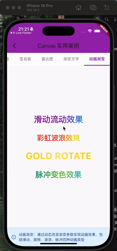
4.4 动画展示案例
class AnimatedGradientTextShowcase extends StatelessWidget {
const AnimatedGradientTextShowcase({Key? key}) : super(key: key);
Widget build(BuildContext context) {
return Column(
mainAxisAlignment: MainAxisAlignment.center,
children: [
// 1. 滑动流动效果
AnimatedGradientText(
text: '滑动流动效果',
style: TextStyle(fontSize: 32, fontWeight: FontWeight.bold),
colors: [Colors.purple, Colors.blue, Colors.pink],
animationType: AnimationType.slide,
),
SizedBox(height: 30),
// 2. 彩虹波浪效果
AnimatedGradientText(
text: '彩虹波浪效果',
style: TextStyle(fontSize: 28, fontWeight: FontWeight.bold),
colors: [
Colors.red, Colors.orange, Colors.yellow,
Colors.green, Colors.blue, Colors.purple
],
animationType: AnimationType.wave,
duration: Duration(seconds: 2),
),
SizedBox(height: 30),
// 3. 金色旋转效果
AnimatedGradientText(
text: 'GOLD ROTATE',
style: TextStyle(fontSize: 36, fontWeight: FontWeight.bold),
colors: [
Color(0xFFFFD700),
Color(0xFFFFE55C),
Color(0xFFFFD700)
],
animationType: AnimationType.rotate,
duration: Duration(seconds: 4),
),
SizedBox(height: 30),
// 4. 脉冲变色效果
AnimatedGradientText(
text: '脉冲变色效果',
style: TextStyle(fontSize: 30, fontWeight: FontWeight.bold),
colors: [
Colors.cyan, Colors.teal,
Colors.green, Colors.lightGreen
],
animationType: AnimationType.pulse,
duration: Duration(seconds: 2),
),
],
);
}
}
五、最佳实践与性能优化
5.1 CustomPainter性能优化要点
5.1.1 正确实现shouldRepaint
// ❌ 错误:总是返回true
bool shouldRepaint(GradientTextPainter oldDelegate) => true;
// ✅ 正确:只在必要时重绘
bool shouldRepaint(GradientTextPainter oldDelegate) {
return oldDelegate.text != text ||
oldDelegate.textStyle != textStyle ||
oldDelegate.gradient != gradient;
}
5.1.2 避免在paint中创建对象
// ❌ 错误:每次paint都创建新对象
void paint(Canvas canvas, Size size) {
final paint = Paint() // 每帧都创建!
..color = Colors.red;
canvas.drawCircle(center, radius, paint);
}
// ✅ 正确:复用对象
class MyPainter extends CustomPainter {
final Paint _paint = Paint()..color = Colors.red; // 复用
void paint(Canvas canvas, Size size) {
canvas.drawCircle(center, radius, _paint);
}
}
5.1.3 使用shouldRebuildSemantics优化无障碍
bool shouldRebuildSemantics(CustomPainter oldDelegate) => false;
5.2 RenderBox层性能优化
5.2.1 使用RepaintBoundary隔离重绘
// 将频繁重绘的区域隔离
RepaintBoundary(
  child: CustomPaint(
    painter: AnimatedPainter(...),
  ),
)
5.2.2 使用Layer缓存
void paint(PaintingContext context, Offset offset) {
// 对于复杂但不变的内容,使用layer缓存
context.pushOpacity(offset, 255, (context, offset) {
super.paint(context, offset);
});
}
5.3 内存优化
5.3.1 及时释放资源
class MyPainter extends CustomPainter {
final ui.Image image;
MyPainter(this.image);
void paint(Canvas canvas, Size size) {
canvas.drawImage(image, Offset.zero, Paint());
}
// ✅ 实现dispose释放资源
void dispose() {
image.dispose();
}
}
5.3.2 避免内存泄漏
// ❌ 错误:AnimationController未释放
class _MyWidgetState extends State<MyWidget> {
late AnimationController _controller;
void initState() {
super.initState();
_controller = AnimationController(vsync: this, duration: Duration(seconds: 1));
}
// 忘记dispose!
}
// ✅ 正确:及时释放
void dispose() {
_controller.dispose();
super.dispose();
}
5.4 调试技巧
5.4.1 使用Flutter DevTools
# 开启性能叠加层
flutter run --profile
在DevTools中查看:
- Performance:帧率、GPU/CPU使用率
- Timeline:绘制耗时分析
- Memory:内存占用
5.4.2 添加性能标记
void paint(Canvas canvas, Size size) {
Timeline.startSync('MyPainter.paint'); // 开始标记
// 绘制代码...
Timeline.finishSync(); // 结束标记
}
5.5 常见陷阱
| 陷阱 | 问题 | 解决方案 |
|---|---|---|
| 频繁重建Widget | 导致不必要的重绘 | 使用const构造函数 |
| paint中创建对象 | GC压力大 | 对象复用 |
| 未实现shouldRepaint | 过度重绘 | 正确判断是否需要重绘 |
| 忘记dispose | 内存泄漏 | 及时释放资源 |
| 过大的Canvas | GPU负担重 | 使用合适的尺寸 |
六、总结
6.1 核心要点回顾
-
架构理解:
- CustomPaint是Widget层的配置入口
- CustomPainter定义绘制策略
- RenderCustomPaint执行实际渲染
-
渐变文字实现:
- 使用Shader实现文字渐变
- 需要两次TextPainter计算和绘制
- foreground属性是关键
-
动画实现:
- AnimationController + AnimatedBuilder
- 动态计算Gradient参数
- 多种动画模式的算法设计
-
性能优化:
- 正确实现shouldRepaint
- 避免在paint中创建对象
- 使用RepaintBoundary隔离重绘
6.2 学习路径建议
- 基础阶段:掌握Canvas基本API(drawCircle、drawRect等)
- 进阶阶段:理解RenderObject和布局算法
- 高级阶段:自定义RenderBox、处理手势和动画
- 实战阶段:实现复杂的图表、游戏等
6.3 参考资源
附录:完整代码关注私信我
作者:911hzh
最后更新:2025年11月
版权声明:本文采用CC BY-NC-SA 4.0协议,转载请注明出处。
评论区互动
如果这篇文章对你有帮助,欢迎:
- 👍 点赞支持
- 💬 评论交流
- 🔖 收藏备用
- 🚀 分享给需要的朋友
有任何问题欢迎在评论区讨论!

开源鸿蒙跨平台开发社区汇聚开发者与厂商,共建“一次开发,多端部署”的开源生态,致力于降低跨端开发门槛,推动万物智联创新。
更多推荐


 26
26 0
0- 0


 已为社区贡献7条内容

所有评论(0)